Isabella Whitworth

probably more than natural and synthetic dyes, wax, resists, and history


2 Comments

AGWSD Summer School 2015

There is a lot to say about Summer School and I’m short of time, so pictures will have to do their ‘thousand words’ thing. But here’s a quick summary. The Summer School of the Association of Guilds of Weavers, Spinners and Dyers (AGWSD) takes place every two years, in a different location. (If you want to know about the AGWSD, follow the link at the bottom of the post).

This year we convened at Moreton Morrell, at an agricultural college in Warwickshire not far from Stratford-upon-Avon. The arrangements for the 17 courses were immaculately prepared by the organisers, although some tutors and students faced various challenges in their allotted teaching spaces. In mine, for instance, wooden wall panels had been fitted to cover walls, and the holes in them had been cut too small to allow a plug into the sockets behind. As we were working in the joinery department, this caused considerable merriment, and resulted in creative arrangements of extension leads – the admiration of all knitters at Summer School. I should add that the department staff came to cut the panel holes larger and were more than helpful.

The intensely blue floor was an unexpectedly complicated colour distraction when working on sheer scarves stretched flat. It was hard to see the true colours of the dyes. Needing somewhere to hang drying work, I searched in vain in the workroom for suitable points to fix a line. Eventually a group of rebels set up a washing line, trespassing into the stables (no, no horses, just heaps of old chairs).

The course

I taught two identical courses on wax resist which ran back-to-back, and lasted two-and-a-half days each. These short courses, taught by several of the tutors, were designed so that students could follow two sets of studies in the week, and allow the possibility of a shorter stay. I have to admit that as an ageing tutor I found the two-course arrangement tiring. It demanded two inputs of ‘startup’ energy in an already exhausting week: on the plus side it meant that I could teach 20 students, not just 10.

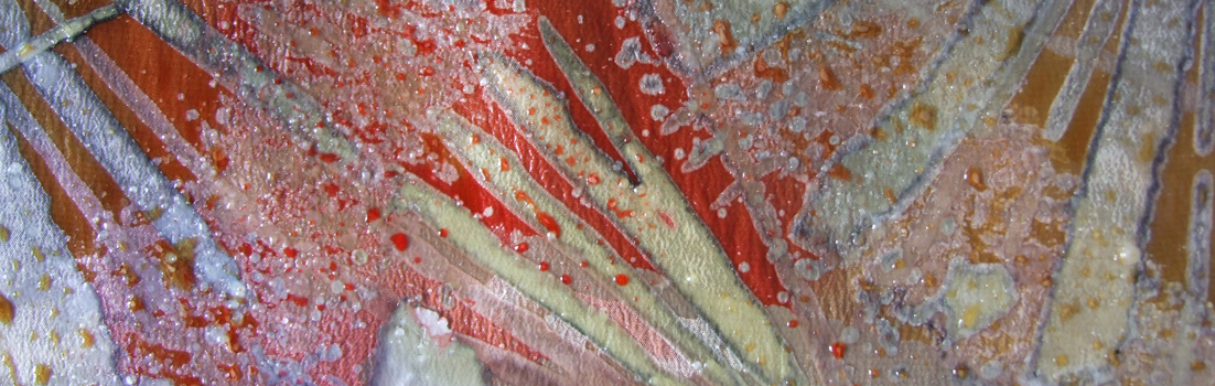
Students used a range of traditional tools such as Indonesian tjantings, Ukrainian kystkas, Japanese ro-fude brushes and a Gambian tool made of a handle wound with copper wire. I also brought a motley crew of household brushes, kitchen forks, tractor washers, odd bits of wire and wood which were used to dip into the wax to make marks on the fabric. Students then dyed the fabric surface and built up the work up layer by layer.

The students rose to all manner of challenges, whether creative, personal, age, or health-related, as I realised from the ‘thank you’ card given to me at the end. Their work was inspired and inspiring, many tackling creative dyeing for the first time and declaring themselves somewhat anxious at the beginning. Teaching a few students who already had some experience was good for the group, allowing beginners to see more developed work and to talk through techniques and ideas. I was delighted to re-meet one student I first taught 17 years ago, and see how her work has developed.

The Summer School organisers faced considerable challenges with the demands made on them by the premises and some of the students, dealing with them with patience and grace. They had set up a full après-teach programme to keep us all out of trouble when darkness fell. Our Monday evening talk was given by Association President Jenny Balfour Paul with characteristic enthusiasm and energy. She outlined her travels with indigo, and how it led to writing her recently-published book Deeper than Indigo. Jenny gave a further day of her time to visit all studios and courses the next day, engaging with students and their work.

Jenny

Jenny Balfour Paul addresses students at the Summer School

There were tours (I went to RSC Stratford); a Silent Auction; barbecues; a hog roast; a fashion show, a Trade Fair; and a Fifties party to celebrate the Association’s 60th year. Students stayed up into the wee hours to make Fifties outfits and fascinators. I’m afraid I was too tired to join in the fun and went to bed unfascinatored.

My thanks to all hard-working Summer School organisers, particularly Chris, plus the support team whose names I do not necessarily know. And thanks to my students, for their trust, good humour, co-operation and enthusiasm. Please look at Katie’s blog, linked below, for a student’s view of my course (and the Rigid Heddle course taught by Dawn Willey) at this year’s Summer School. You can see Katie in the images above, painting the four panels. She based them on the Four Seasons.

Links

Hilltop Katie’s blog about her experience of Summer School here

For an overview of Summer School plus a Storify read her account here

Association of Guilds of Weavers, Spinners and Dyers website here

The Journal of the Association of Guilds of Weavers, Spinners and Dyers here

Deeper than Indigo website here


4 Comments

Thinking Positive

If you signed up to my blog solely on the basis of posts on natural dyes and history, I offer apologies. This is about neither.  As well as researching the history of natural dyes (in particular, orchil), I still produce work as a textile artist. Some of this uses natural dyes, but I also work with synthetic dyes on silk for resist techniques such as wax and shibori.

The Devon Guild of Craftsmen is holding an exhibition called Life Illustrated from 2nd October – 15th November 2015. Sketchbooks are the theme of Life Illustrated, showing them both as source material and as part of the creative process. A number of Devon Guild members are contributing new work, plus their precious books.

My training as an illustrator in the late 1960s was drawing-based, and I have used sketchbooks as source material for over 50 years. For Life Illustrated I decided to revisit an ‘old’ design and see how it adapted to current techniques and materials.  Back then I was using a simple gutta outliner to draw the design and control the dye. Now I prefer to use wax. The design was based on drawings I made of fritillary butterfly wings. Here are sketchbook studies from 17 years ago:

The design formula divided the scarf into about nine sections. A sinuous line bisected all sections, running down on the scarf’s vertical. You can see this drawn out in the sketchbook images above although the scarf is imagined from the side. Shapes either side of the sinuous line are either ‘positive’ (dark on a light ground) or ‘negative’ (light out of a dark ground). This polarity swapped from side to side and line to line. It was logical to look at, but entirely silly to explain. Below, you’ll find a sketch showing the basic structure.

Although I sometimes archive samples, I don’t have any of Fritillary. They were large, on very good quality silk and they sold well. So I was probably too money-grabbing to keep one, which I now regret. All I have left are sketches and a rather poor image rescued from my old website.

For the exhibition Life Illustrated I made new sketches to remind myself of what had inspired me. Then I stretched a scarf, dyed the background and outlined the design with wax – in much the same way as I remembered doing with gutta. I found I was able to reproduce the old design pretty well, although the quality of the outlining wax marks is looser than with gutta. That’s not a problem with this design. So I went ahead and made two or three scarves.

One of the reasons I became tired of gutta is that it is an outlining process. All design elements are drawn carefully with the gutta pen, and dye is filled in up to the gutta line. It’s a tight technique – even a bit tedious at times because one is often reproducing a pre-planned scheme. The reason I love wax is that spontaneous brush marks can create the shapes in a design (by instantly blocking out further application of dye). Of course, one can use wax tools such as tjantings or kystkas to draw outlines, just like gutta. But I find larger waxed marks more expressive and the design evolves in a more fluid way. So my next step was to try to adapt the old design to this preferred use of waxed marks instead of outlines.

I soon realised that ‘block-out’ marks needed more space around them than the simpler outlined shapes I used years ago. Large brush marks are often textured, oddly shaped and  ‘whiskery’ at the edges. In the same nine-section format, my next waxed scarf looked crammed and overcrowded. I reduced the number of horizontal divisions to five and it works better, but that’s as far as I’ve got. I’m not done with it yet.

Positive and negative: To make the ‘negative’ marks (lighter on a dark ground) I make a large waxed shape with a brush that blocks out the background. Then the background is dyed around that mark.  To make ‘positive’ marks (darker on a light ground) I create an island of unwaxed silk surrounded by a sea of freely waxed marks.

Teaching: On Sunday I’m off to Warwickshire to teach at the Summer School of the Association of Weavers, Spinners and Dyers. I’ll be running two courses back-to-back introducing wax resist on silk.

I will be teaching three times at West Dean next year (March, May and July) but if you want a place, please book early. The March course already has a waiting list.

I’m also running a one-day introduction to wax resist on silk at Ardington School of Crafts next month (September). Please contact these venues for information (links below) and see my courses page.

Links

Devon Guild of Craftsmen

West Dean College

Ardington School of Crafts

Association of Weavers, Spinners and Dyers


2 Comments

Year Ending

How long have I been dyeing? Not as long as I have been rubbish at maths. A recent experience, when I messed up percentage calculations of mordant, has reminded me how useful it is to keep records. (If you aren’t a dyer, these percentages refer to the mordant weight required against the fibre/fabric weight to be dyed).

My end-of-year project has been to test my Rubia cordifolia, or Indian Madder. I ordered it in the summer from KMA Exports of Tamil Nadu, but haven’t yet had time to use it. A week or so ago I mordanted two Merino wool scarves, calculating the mordant at  8% alum + 5% cream of tartar. Only it wasn’t: my notebook later confirmed I had mordanted at about 1% each. Results on the first set of dyeings were disappointing (it was a surprisingly good red, considering inadequate mordant, but certainly not eye-popping) so I checked out my notes and revealed the serious mistake.

At this dark end of the year I was hoping to dye the cheery Meltdown Orange achieved with Indian Madder on the Carmarthen Association Summer School Workshop, run by Deb Bamford, in 2013. In trying to convey Meltdown Orange on this blog, I hit a regular problem. Colour inaccuracies accrue between camera, screens and editing programmes. Obviously, colour portrayed via a screen isn’t going to look the same as the actual item, but my phone and camera come up with strange slants on reality which I often have to rectify when trying to pin down a ‘true’ colour. It can be vital if I’m working with a researcher or conservator, or a client who needs to know the exact colour of a scarf they propose to buy.

There are three images below. In the image of wool dyed with Rubia cordifolia from Carmarthen (image 1), the colour on my screen is as near as possible to the original yarn I hold up against it. That’s because I fiddled with the settings. I have no idea what you will see.

I had a nerdy idea. With the MyPANTONE app on my phone, I used a photo of the dyed yarn to see how MyPANTONE could analyse the colour range. Image 2 is a screenshot from MyPANTONE. By the time the image has cybered from the yarn to the phone to MyPANTONE to email to an editing programme to WordPress and the screen I see here, it seems that the image had shifted to something stronger and sharper. On the app itself, I had selected what I thought were three typical ‘hues’.  This is done in the same way as an ‘eyedropper’ is used to select colour on an editing programme. The colours I chose were Warm Red C, Pantone 179 C, and Pantone 171 C. They are shown at the bottom of the screenshot (image 2) and seemed a reasonable representation of Meltdown Orange seen through my own, and MyPANTONE’s, eyes.

From a former life in the graphics industry I retain a printed Pantone set of colours. I checked the MyPANTONE colours against my printed set and compared the yarn to each printed colour. Warm Red was ‘too red’, Pantone 179 was brownish and Pantone 171 too weak. But Pantone 172, one shift away from 171, was an accurate representation. This is shown in image 3.

I am not sure what any of that proves, except that colour is a tricky old business.

Silks and wool dyed with various strengths of Indian Madder (and correct mordant)

Silks and wool dyed with various strengths of Indian Madder (and correct mordant)

Reverting to the dyepot story, I repeated the dyeing with correct percentages of mordant and was rewarded by much sharper and more intense orange-reds, on silk and wool. As well as recording the mordant I kept notes on the percentage of dyestuff needed to achieve deep shades on the scarves and found it to be higher than expected – at about 20%. That’s one fifth of a weight, I shall remind myself. I’ll try to do the calculations better next time.

Links: My blog about buying Rubia cordifolia here.

KMA Exports

Deb Bamford (The Mulberry Dyer)

MyPANTONE (for iPhone)

MyPANTONE (for Android)

Pantone UK


5 Comments

A Scottish Post

I’m just home after a fortnight in Scotland, which started at the annual DHA (Dyes in History and Archaeology) conference at the University of Glasgow. I tend to know people by their research – and that’s how they know me. Someone at DHA greeted me as Mrs Orchil: she could also have hailed a Dr Indigo, a Ms Madder and Professor Purple. It’s a friendly conference attended by many world experts in the fields of dyes and pigments, but it welcomes independent scholars like me as well as dyers and textile makers.

I wasn’t giving a paper this year so it was an entirely stress-free conference and I sat back and enjoyed it, or at least, all the bits I understood. There are always some technical papers at DHA concerning dye analysis; the ones packed with acronyms, graphs and molecular structures streak comet-like above my head. But factual gems can lurk amongst figures and statistics, so it’s worth not totally tuning out.

I took a small ‘suitcase’ exhibition with me about orchil and my research studies; most delegates came to look at it and talk to me, and as a result I learned new things about orchil from new perspectives.

The conference tour, after two packed days of papers, took us to Glengoyne Distillery for a fortifying wee dram preceding a tour of the plant, and thence to Stirling Castle where we visited the Tapestry Studios to see the final piece in the Unicorn Series nearing completion.

Sherry and tannins

The Glengoyne tour outlined the lengthy procedure for ageing whisky in casks. Casks are made from different types of oak, but have once held sherry (and some, if I remember correctly, Bourbon). The ageing whisky gradually absorbs colour and flavour from the sherry, and the tannins in the oak cask. The two images above illustrate ageing over thirty years in two different types of cask, with coloration intensifying every year. Evaporation is also evident, with around half the liquid being lost over the period. This lost alcohol is called ‘The Angels’ Share’.

Textile Tweets

About the pictures

Above is a small selection of textile-related images from Scotland, most of which I tweeted during our trip. My obsession with dye lichens was rewarded by finding Ochrolechia tartarea alongside Loch Ewe, and Lobaria pulmonaria  at Oban; Parmelia saxatilis and P. omphalodes were growing at many locations.  Note: I was looking, not collecting. A Gaelic-English Dictionary in a hotel room confirmed that in Gaelic crotal refers to boiling water method lichens, but corcur to orchil lichens. If you want to know what orchil is, or read more about my research and views on dyeing with lichens, please visit this page.

Turkey Red

I spent a week with Deb Bamford (aka The Mulberry Dyer) learning how to dye Turkey Red at a Summer School in 2013. Read about it from this blog post forwards. In Scotland I found remnants of the Turkey Red industry buildings at Alexandria, on Levenside. There is a great website about the Turkey Red industry here. And read this wonderful book:

Colouring the Nation: The Turkey Red Printed Cotton Industry in Scotland c1840-1940 by Stana Nenadic and Sally Tuckett. Published by National Museums Scotland. From Amazon here.

Unicorn Series: Stirling Castle and West Dean Tapestries

For more on the Unicorn Series, go here for the Stirling Castle story, and here for West Dean’s version.

 Glengoyne Distillery, Dumgoyne Glengoyne Distillery


2 Comments

Harvesting Japanese indigo

photo

Blue stains which developed after rubbing Japanese indigo leaves onto paper

I planted out my Japanese indigo (Persicaria tinctoria) several weeks ago, having grown it all from seed. This week I picked some leaves and rubbed them on the page of my sketchbook to see if any blue appeared. It did (ignore the buff coloured stain to the left of the image, which is nothing to do with it). From this I knew that I could make a vat from the crop.

I began by picking half a bucketful and testing it as a small vat. I achieved a very good blue, which was used to overdue some cochineal-dyed scarves I had shibori-tied ready and waiting. You can see the result in the gallery below.

On the second vat I used a whole bucketful of leaves, rammed down hard. I just pick the tips, like tea: not the whole stalk. I sometimes weigh the leaves before processing but the material was wet after rain and there didn’t seem much point. I don’t always strip the leaves from stalks either, so a known dry weight is somewhat academic because the stalks don’t, as far as I know, produce any colouring matter.

On the day I dyed the second bucket I live-tweeted the various stages with images and received a good response. I think more and more people are trying to grow, and dye with, their own indigo.

With colleague Christina Chisholm I co-authored a piece on growing and using Japanese indigo for the Journal for Weavers, Spinners and Dyers in 2011. It was a free download and you can still access it here so I don’t have to write it all out again. We included some information on growing the plant in two distinct climates (Devon and north east Scotland). Christina has much more experience with dyeing wool, so fibre dyers might find her comments useful. If I were to be able to edit the article I’d make a couple of additions / amendments: 

1. I have since found that I don’t always see a blue froth when I whisk up the strained dye bath. Instead, the sherry-coloured liquid darkens and looks greener – but the froth is often colourless. Why? No idea. These days I have stopped using soda crystals and use washing soda instead. Maybe that’s the reason. 

2. I have found that leaves are often ready whether or not they have the red/blue tinge shown in the Journal download document. What I have heard since (but don’t know if it’s true) is that you need to use the leaves before the plant produces flowers.  

3. I try to encourage flowers for seeds each year and there is some urgency about this as in the UK the plants die with the first big frost. I mark a few vigorous stalks early on by tying a conspicuous ribbon round each one. Then I can’t pick them by mistake. I let these stalks develop flowers as early as possible.


Leave a comment

Summer schools…

No posting recently because I’ve had a month of intensive teaching followed by intensive feet-putting-up. I ran three courses at Ardington in Oxfordshire and then four days in Nether Stowey at the studio of Janet Phillips.

At Ardington School of Crafts I taught my synthetic dyes shibori day, plus two one-day (repeated) courses on natural dyes. The natural dye course is a taster to a fascinating subject with some practical work at the dyepots, but also intended as an eye-opener to textiles seen at a stately home, museum etc. It’s even relevant to looking at paintings: I often wonder what dyestuffs were used on garments represented (with pigments) in a historic portrait. We had to move fast, with all fibre and fabric pre-mordanted, and an indigo vat ready to go. Most students dyed a scarf using simple immersion methods. We used madder, weld, cochineal and two indigo vats (one weak, one strong).

At Nether Stowey, I taught a three-day-dye course to several of Janet’s graduates from her Masterclass.  On day one they learned some shibori folds using steam-fixed dyes; day two gave them a taster of wax resist, and day three was a full day with indigo. At the same time as I taught dyes, Janet was teaching ‘shibori on the loom’ to students from the London Guild. In this technique, removable weft threads are incorporated into the weaving. They are later used to draw up the cloth tight. According to how the shibori threads are woven, patterns emerge after the piece is dyed, then opened up.

Students used coloured and plain warps, on different pieces. Some of this shibori work was put into my indigo vat on day four; others used Janet’s fibre-reactive dyes which were applied by placing woven pieces into a short length of gutter (brilliant idea) and painting by hand.  I am used to folding, tying and clamping for indigo work and although I have seen loom shibori before, I haven’t watched the whole process from start to finish. A combination of enthusiastic and knowledgeable students,  Janet’s teaching and the imaginative arrangements made by Janet and Nigel made for a very enjoyable week. Did I mention glorious weather?


Many thanks to students at Ardington and Nether Stowey for permission to use images of their work.

Teaching in 2015

Dates of next years’ courses are accumulating. I will be tutoring two courses at the Association of Guilds of Weavers, Spinners and Dyers Summer School in August 2015 at Moreton Morrell. Details of the entire event can be seen here and there are details on this page.

I am teaching a new one-day introductory course in wax-resist at Ardington School of Crafts in 2015 as well as days on shibori scarves, indigo dyeing.  The Vibrant World of Natural Dyes proved very popular this year and I will be teaching it again in 2015: I have one course at West Dean scheduled for March. If you want to sign in, do so soon because my October course has been full since April.


4 Comments

Oddments

photo

Packs of indigo and Rubia cordifolia, (Indian madder) shown with Phytosanitary Certificate

My latest excitement is today’s arrival of a parcel from India, containing indigo and Indian madder (Rubia cordifolia) from the excellent KMA Exports. I am sharing the consignment with a friend because the freight is expensive and costs more than the dyestuff, but it took just one day to arrive from Tamil Nadu. Sometimes a parcel takes longer from Okehampton. It would have been here earlier but import regulations into the UK now require fumigation which takes a bit longer; the Phytosanitary Certificate confirms that my consignment is free of Khapra beetle (Trogoderna granarium) and other quarantine pests.

Having tried Rubia cordifolia with Deb Bamford at Summer School last year I can’t wait to have another go. It produced the most astonishing colour on wool.

A highspot of recent weeks was a short trip to Finistère in Brittany, in the glorious weather also enjoyed in the UK that week. I enjoyed seeing fine examples of Breton embroidery, something about which I knew nothing, in the Musée Bigouden, Pont l’Abbé. There is an informative page about traditional Breton costume here from which I’ve learned a lot. You can see a photo of the embroiderers of Pont l’Abbé at the top of the page. Until I studied the caption I thought it was a very old photo, but it is dated to 1976, when I was about the age of some women in the picture. Perhaps that does make it a very old photo, come to think of it.

Several walks along the coast west of Douarnenez offered stunning views over the sea and as always, I was on the lookout for lichen. I don’t collect it, but I like to find it; my views on actually using lichen for dyeing are here. A knowledgeable colleague has told me that one of my images probably shows an orchil lichen, one of the Roccellae, which cheers me up now I’m back and the weather has changed.

The historic cork floats and netting tools, which I found rather beautiful, were in the window of shop selling fish in Audièrne. Without a given explanation, I must assume the carved names once indicated owners of nets. When I lived on the west coast of Scotland I remember several vitriolic exchanges over ownership of creels, buoys and nets. This appears to be a simple way of marking equipment.


I’m teaching three courses at Ardington School of Crafts from Wednesday. Natural dyes on Wednesday 9th and Thursday 10th, and shibori with synthetic dyes on Friday 11th. If you’re coming, I look forward to seeing you there.


Leave a comment

The Journal and a few bossy leaves

I’ve recently been up to London to the first Journal meeting of 2014. Whatever time of the year, this long day trip involves a very early start to drive to the station and travel up to London. We start at 11 am and the whole day, even lunch, forms a meeting to discuss Journal matters and plan forthcoming issues. On the chime of 4 pm the meeting ends and the room empties so swiftly you’d think we were all going to turn into pumpkins.  Members disappear to catch their trains – and occasionally, their planes. There is a great intensity to Journal meeting days, quite a few biscuits are eaten and sometimes it’s a bit frustrating. One has the day-long company of interesting textile-y people with whom one exchanges no more than a sentence or two of nothing-to-do-with-Journal conversation. But that’s the way it is. We are all volunteers giving time for a registered charity / organisation and we keep our expenses to a minimum: most of us are able to complete our round-trip to London within the day. If  you don’t know the Journal, have a look at the website.

Australian Journey: Leaves at Katherine

Australian Journey: Leaves at Katherine

Back at home I have been working on a new piece of wax-resist work which started off with one idea in mind but was intruded on, in a most impolite and insistent way, by the shapes of eucalyptus leaves. The direction of the work (and my hand) changed totally. It’s weird when this happens and is, I assume, a luxury not open to certain types of craft work such as weaving, which require more advance planning.

I’m not sure whether the bossy leaves idea will work, but I have dewaxed the silk and it will go into the steamer this week, along with several shibori scarves of a – thankfully – more compliant nature. Then I will creep up on the leaf-piece and see if it’s any good.

This new work is part of the series I call Australian Journey because the designs are based on colours, shapes and ideas from our trip to Western Australia in 2012. There is a bit more about it here and you can find other posts and images by clicking the Australian Journey link in the tag cloud.


Leave a comment

Poly-heading: and that’s not funny

Poly-heading

No, that’s not something that nasty pirates do*. It’s me, head-switching again. There’s a copy deadline coming up for the Journal for Weavers, Spinners and Dyers so I have had temporarily to drop the write-up of the DHA paper.  I also need to continue making scarves. One is a commission (yes, RD, there will be a choice for you!) but also a batch for the Burton Gallery and Museum, Bideford, where I am demonstrating working with wax all day on 14th December as part of their Meet the Burton Makers family programme.

The Burton Gallery and Museum, Bideford, Devon

I am a devoted fan of the Burton Gallery and Museum. I urge anyone visiting Bideford to go. I happen to love the ceramics of North Devon; they have an excellent permanent display from the RJ Lloyd Collection and I never tire of looking at it. Related to the collection is a brick-built bottle-kiln adjacent to the Gallery in Victoria Park and wood firings regularly take place there. In the images above you can see a sherd of pottery I found in our vegetable patch. There is an entire plate with almost the same pattern in the RJ Lloyd collection, dated to the 16th century, so my find is rather special and I keep looking for more of it under the carrots and chard. The historic Devon pottery tradition carries on today with the work of many local potters, including that of Clive Bowen. We have several pieces of his work at home.

The Burton has a permanent collection of watercolours and drawings containing evocative marine and local scenes but also shows touring art exhibitions of international standard. It also has rather a good and child-friendly French café…

Wax resist work

The images of the scarf in progress show the final layer of dye applied over about five layers of wax and dye. You will see that in two images there are beads of dye on the wax surface. On other images they have been removed. This is because if they dry on the wax surface, they will eventually deposit themselves on the silk when the wax melts out and I don’t like the often fuzzy, mottled effect this produces. So I wipe it off, carefully. Minute quantities of residual dye attach themselves to the textured surface of waxed shapes which produces unpredictable but often subtle textures. These I do like. The wiping-up process is rather like cleaning an etching plate before printing: I do it in a whizzy, upwards, circular motion. Thank you Mr Sellars, who taught me how to do this fifty years ago.

* Apologies to those reading this whose mother tongue isn’t English. Poly-heading is meant to be a joke – a pun – because ‘Polly’ is the name people often give to pet parrots, and as we all know parrots always sit on old-fashioned Long John Silver-type pirates’ shoulders saying ‘Pieces of Eight’. A pirate might want to knock its head off if it went on and on…

The other thing we all know is that when one attempts to explain a joke, it ceases to be in any way amusing…


8 Comments

Reasons to be Stressful

Presentations

I’m halfway between two presentations. The first was for the 6 Guilds of Weavers, Spinners and Dyers at Stratford where I spoke about orchil and how the trade in lichen dyestuff reached global proportions in the late nineteenth century. I thoroughly enjoyed my day at Stratford which included a talk by co-speaker Joan Baxter on the way the East Sutherland landscape influences her tapestries. Her recent collaborative work with dancers Between the Web and the Loom was interesting and she showed some video clips. But I can’t find any images on the internet to provide a link beyond this one (about the dance) and this one (about the tapestry she wove).

The second presentation is for the Dyes in History and Archaeology Conference (DHA) in La Rochelle, France. That’s later this week, is about something else entirely, and it’s going to be rather sensational.

Friday 4th October

11:45          Treasures from a Leeds Dye Chemist: A Century-Old “Tyrian Purple”?

                   Isabella Whitworth, Zvi C. Koren

If you want to know more about the sensational, come to La Rochelle. Otherwise, I’m sorry, you may have to wait a little. To download the whole DHA La Rochelle programme, visit this page and follow the links at the bottom.

For the moment, here is a taster in the form of some images. You will see two men, both chemists. There is a brother and a sister, and the son of a famous father.

Lectures and technology

Those who are of ‘a certain age’ will remember that one of the worst things that could happen when giving a lecture was that you dropped all the slides just prior to going on stage then reloaded them upside down, in the wrong order and back to front.

Technology wasn’t satisfied with such piffling levels of stress. So it created Macs and PCs and system updates; memory sticks and SD cards and PowerPoint and embedding. It now arranges that hosts provide an ancient laptop unable to read anything post 1910;  it organises missing leads, the wrong leads, deflating batteries, clickers that die, videos that won’t load and projectors which will have nothing to do with your laptop.

I have watched entirely respectable speakers show a presentation devoid of images because they haven’t checked their Mac presentation on a PC – or haven’t embedded their photos.

As a result I am obsessive about options. At the 6 Guilds event I took my own Mac laptop, own projector, requisite leads plus a boggling array of memory sticks and SD cards correctly formatted and checked out on a neighbour’s PC. In fact, the options proved unnecessary as the 6 Guilds laptop was up-to-date, the memory stick loaded, and two super-calm techies were in control.

For DHA, all presentations have to be sent in advance of the Conference which is good sense – in theory. You will be informed that something has arrived, but you still don’t know if the presentation shows exactly the way you designed it. So, when you get there, you need to check – and have some options up your sleeve. I didn’t do the DHA PowerPoint: my co-author did, for which I am deeply grateful. It can all be his fault.