Isabella Whitworth

probably more than natural and synthetic dyes, wax, resists, and history


13 Comments

Getting to Blue

In my last blog A Purple Pursuit, I wrote about Browning’s Popularity, in which he referred to shellfish dye in a complex poem on inspiration, skill and genius. What I didn’t say, but others wisely pointed out, was the oddity of Browning referring to the dye as blue throughout the poem. Shellfish dye (from the ‘Tyrian shells’) is quite definitely purple and the colour, history and source of Imperial Purple were well known in Browning’s time. So, why blue?

Who has not heard how Tyrian shells
Enclosed the blue, that dye of dyes

Whereof one drop worked miracles,
And coloured like Astarte’s eyes
Raw silk the merchant sells?

I scratched around many sources but failed to find a historical reference, or image, defining Astarte’s eyes as blue. Maybe I have missed something. But the Resident Poetry Advisor says that Browning was more than capable of implying non-existent references, or even inventing them. This seems most perverse, but Browning was a poet and that’s the kind of thing poets do.

indigo

Author’s indigo-dyed wool yarn, using increasing vat strength

Putting Browning firmly aside, I happened across a reference to William Gladstone’s Studies on Homer and the Homeric Age. Gladstone (1809 – 1908) was a British Liberal politician, three times Prime Minister, living at a time when politicians digested more than soundbites.

Gladstone studied the Iliad page by page, and as he did so he recorded the occurrence of words for colour. What he noticed was rather remarkable. He came across much mention of black, some white, less red, very little yellow, tiny amounts of green…but no blue. Was Homer ‘colourblind’, or unable to perceive colours? Were all Greeks the same, and their perception of colours (and the words to describe them) inherited, building over several generations? It left me wondering whether Astarte’s eyes could have been blue if there wasn’t yet a word for it, which was a head-spinning prospect.

Lazarus Geiger (1829-1870), a philosopher and philologist, took Gladstone’s research further and studied other ancient texts (for instance, Icelandic sagas, Vedic literature, and the original Hebrew version of the Bible) finding that none of them contained a word for blue. Geiger concluded that across ancient cultures, words for colour developed in an oddly consistent order. Black was always first, followed by white, red, yellow, green. Blue came next, eventually.

If this intrigues you, I suggest you listen to the Radiolab broadcast linked below. It makes more sense of it than I can here, but still left me wondering what exactly was being said. One of the programme’s guests is linguist Guy Deutscher. Listen, particularly, to the account of his little daughter trying to name the colour of the sky.

buddhist_edited-1

Author’s watercolour from sketchbook, 1995, recording the many dyed colours and fading shades of Buddhist monks’ robes in Sikkim and North India

My head can’t get itself round the concept that without an object to attach it to, a colour didn’t ‘exist’ and didn’t acquire a name. But that’s partly what is being said and it leads me to dyeing, and the need to name colours. I was dyeing felt last week, trying to achieve a good range of reds. I used different amounts of mordant, varied the percentages of weld, cochineal and madder and overdyed in different sequences. Small variations occurred in the reds and I sought to describe these to a client in words. Colours need adjectives like ‘bright’, ‘dark’, ‘dull’ etc but one inevitably ends up with a comparison to a universally understood coloured object, such as a poppy, a pillarbox, a brick, a patch of rust, a rose. We take this for granted but it’s very sophisticated, relying on a well-established set of understandings. We often need an object when we describe colour.

In her book Tintes y Tintoreros de América, Ana Roquero records the many changes that took place in Central and South American textile practice during the Spanish colonial period. One of the imports from Spain to the New World was an entire vocabulary for textiles. As well as words for machinery, tools, technical terms and cloth and fabric, this included words for colour. These colour words are still alive in parts of Latin America amongst mestizo weavers and dyers, when their use in today’s Spain is long lost.

In this case it’s the itinerant word that has preserved the colour, and I find that fascinating.


Links

Radiolab broadcast ‘Why Isn’t the Sky Blue’ here

The Himba and the perception of colour Anthropology and the Human Condition: here

Books:

Roquero, Ana, 2006, Tintes y tintoreros de América: catálogo de materias primas y registro etnográfico de México, Centro América, Andes Centrales y Selva Amazónica, Ministerio de Cultura, España

Deutscher, Guy, 2010, Through the Language Glass, Heinemann

Comments

Please also check out the very interesting links offered in comments for this page. Many thanks to those who have written and included them


8 Comments

A Purple Pursuit

Orchil: For a few years I have been researching a (mostly) nineteenth century archive relating to a Leeds dye manufacturer. The early fortune and later success of this Leeds company were built on the manufacturers’ skill in the making of a dye called orchil. Orchil is an ancient dye, made from lichens of several varieties, and it dyes silk and wool various shades of purple. It does not need a mordant, a fact that was valuable to the historical dyer as it omitted the expense in the mordant process, and additionally avoided any harshening which mordanting can impose on silk. Purple could normally be achieved with natural dyes only with overdyes, such as indigo over cochineal, but orchil ‘got there in one’.

In its clearest and most beautiful form, orchil dye will give a glorious fuchsia colour and the clarity of this shade is assisted by the purity of the ammonia in which dyestuff is prepared. Historically, orchil was known to impart a freshness and bloom in ‘bottoming’ other dyes – e.g. when used as a base before overdyeing. Orchil was a much used and valuable dye throughout history, although its use is sometimes an enigma. It is often found in costly tapestries, which is surprising as orchil is not at all lightfast – a fact that was well-known.

With the advent of synthetic dyes in the later nineteenth century the use of orchil began to decline. Records in the Leeds archive indicate that large sums of money were still tied up in stocks of lichen in the 1870s and in trying to comprehend the place of orchil in the nineteenth century I found the archive inextricably linked to the history of the colour purple. We will publish in due course but an extract from the abstract of my co-authored paper with Professor Zvi Koren at DHA 32 offers a clue:

One of the more astounding discoveries associated with this archive was that it included a small envelope signed by Charles Samuel Bedford declaring the content of the packet to be ‘Tyrian Purple’. But what was really inside the envelope? Was it truly Tyrian Purple…?

Shellfish dyes: Much has been written on the history of the shellfish dye Tyrian Purple (Imperial Purple, The Purple of the Ancients, murex etc) and its association with wealth and status. There is a lot of utter rubbish online about Tyrian Purple, so beware if you are researching and look for reliable sources, such as those listed in Chris Cooksey’s Tyrian Purple Bibliography, linked below.

Nucella lapillus shells, Somerset

Nucella lapillus shells, Somerset

For the purposes of this particular post, it’s important to realise that long after the method of shellfish dyeing* was lost, probably around the fifteenth century, the reputation of purple as a high status colour lived on. Purple retained a kind of status independent of its original connections to shellfish dyes. There are contemporaneous references to shellfish dyeing (e.g. in Vitruvius, and Pliny the Elder in his Natural History) and something has always been known of the preparation process, although modern interpretations of commentaries vary.

Since the mid nineteenth century chemists, scholars and dyers have researched shellfish dyes and the ancient dye process has been patiently and painstakingly rediscovered. Shellfish dyeing can again be undertaken although it is only seriously done for research purposes: you will see how small some shells can be from the image and only the tiny hypobranchial gland yields dye. In the mid nineteenth century, no-one knew the full process, which is why I found Robert Browning’s poem Popularity (1850s) so interesting when I came across it this week.  Crucially within it is a several-verse reference to Tyrian Purple and shellfish dye. As I couldn’t fathom what the whole poem was about, this reference was a puzzle. I sought out the RPA (Resident Poetry Advisor) who explained it to me, along with some literary context which includes Browning’s life and work, a knowledge of Keats and the poets that imitated him. Popularity is dense and complicated.

Popularity: As I now understand it, and in simple terms, the poem is about inspiration and skill. Browning asks himself about genius, as he did when studying, say, the paintings of Old Masters.  What is genius? Where does it come from? When some ‘poets’ recognised genius in others, as in the work of Keats, they picked up superficial, outward facets of the verse and imitated them. They basked in their hollow cleverness. Browning describes the humbleness of the shells, or conches (‘Mere conchs!’) and celebrates the ‘cunning’ of those who learned how to refine this costliest ‘dye of dyes‘. What’s the humble origin of Keats’ unique genius, he wonders wittily in his last line:

What porridge had John Keats?

Contemporary knowledge in the 1850s

Considering the knowledge that Browning appears to have of dye preparation:

Till cunning come to pound and squeeze
And clarify,—refine to proof
The liquor filtered by degrees

it could be that he knew a little more about the process than was available through classic texts. Henri de Lucaze Duthiers was working on shellfish dyes in the 1850s, but not for dyeing. He was demonstrating the potential to use the molluscs for a photographic printing process. I don’t see enough evidence to draw any conclusions about what Browning knew, but it’s been fun speculating, and a reminder of the magic we dyers experience liberating colour from simple, natural materials.

To read the whole poem Popularity, you can go here, but two key verses are below.

VI.

Who has not heard how Tyrian shells
Enclosed the blue, that dye of dyes
Whereof one drop worked miracles,
And coloured like Astarte’s eyes
Raw silk the merchant sells?

XI.

Mere conchs! not fit for warp or woof!
Till cunning come to pound and squeeze
And clarify,—refine to proof
The liquor filtered by degrees,
While the world stands aloof.


NOTE: *Dyeing, as opposed to smearing. Traditional use of shellfish to colour threads and cloth, such as in Oaxaca, Mexico, is not true vat dyeing, but more akin to  surface smearing.


Links about my research, on this blog

Overview  Dyes, History and a chilly trip to Yorkshire

About orchil: Talking Orchil

My research information: Historical Dye studies


Bibliography

Cooksey, Chris (2013) Tyrian Purple: the first four thousand years, Science Progress, 96(2), p 171 – 186

Jordan, Maria (2012) Recreating the life of a tapestry: Fading dyes and the impact on the tapestry image available online from The Institute of Conservation here

Chris Cooksey’s Tyrian Purple Bibliography

Wikipedia on Tyrian Purple


Thanks

With thanks to Dr Maurizio Aceto for some input on dates, Nigel Phillips for giving me the Nucella lapillus shells in Somerset last summer, and especially to the RPA.


2 Comments

Year Ending

How long have I been dyeing? Not as long as I have been rubbish at maths. A recent experience, when I messed up percentage calculations of mordant, has reminded me how useful it is to keep records. (If you aren’t a dyer, these percentages refer to the mordant weight required against the fibre/fabric weight to be dyed).

My end-of-year project has been to test my Rubia cordifolia, or Indian Madder. I ordered it in the summer from KMA Exports of Tamil Nadu, but haven’t yet had time to use it. A week or so ago I mordanted two Merino wool scarves, calculating the mordant at  8% alum + 5% cream of tartar. Only it wasn’t: my notebook later confirmed I had mordanted at about 1% each. Results on the first set of dyeings were disappointing (it was a surprisingly good red, considering inadequate mordant, but certainly not eye-popping) so I checked out my notes and revealed the serious mistake.

At this dark end of the year I was hoping to dye the cheery Meltdown Orange achieved with Indian Madder on the Carmarthen Association Summer School Workshop, run by Deb Bamford, in 2013. In trying to convey Meltdown Orange on this blog, I hit a regular problem. Colour inaccuracies accrue between camera, screens and editing programmes. Obviously, colour portrayed via a screen isn’t going to look the same as the actual item, but my phone and camera come up with strange slants on reality which I often have to rectify when trying to pin down a ‘true’ colour. It can be vital if I’m working with a researcher or conservator, or a client who needs to know the exact colour of a scarf they propose to buy.

There are three images below. In the image of wool dyed with Rubia cordifolia from Carmarthen (image 1), the colour on my screen is as near as possible to the original yarn I hold up against it. That’s because I fiddled with the settings. I have no idea what you will see.

I had a nerdy idea. With the MyPANTONE app on my phone, I used a photo of the dyed yarn to see how MyPANTONE could analyse the colour range. Image 2 is a screenshot from MyPANTONE. By the time the image has cybered from the yarn to the phone to MyPANTONE to email to an editing programme to WordPress and the screen I see here, it seems that the image had shifted to something stronger and sharper. On the app itself, I had selected what I thought were three typical ‘hues’.  This is done in the same way as an ‘eyedropper’ is used to select colour on an editing programme. The colours I chose were Warm Red C, Pantone 179 C, and Pantone 171 C. They are shown at the bottom of the screenshot (image 2) and seemed a reasonable representation of Meltdown Orange seen through my own, and MyPANTONE’s, eyes.

From a former life in the graphics industry I retain a printed Pantone set of colours. I checked the MyPANTONE colours against my printed set and compared the yarn to each printed colour. Warm Red was ‘too red’, Pantone 179 was brownish and Pantone 171 too weak. But Pantone 172, one shift away from 171, was an accurate representation. This is shown in image 3.

I am not sure what any of that proves, except that colour is a tricky old business.

Silks and wool dyed with various strengths of Indian Madder (and correct mordant)

Silks and wool dyed with various strengths of Indian Madder (and correct mordant)

Reverting to the dyepot story, I repeated the dyeing with correct percentages of mordant and was rewarded by much sharper and more intense orange-reds, on silk and wool. As well as recording the mordant I kept notes on the percentage of dyestuff needed to achieve deep shades on the scarves and found it to be higher than expected – at about 20%. That’s one fifth of a weight, I shall remind myself. I’ll try to do the calculations better next time.

Links: My blog about buying Rubia cordifolia here.

KMA Exports

Deb Bamford (The Mulberry Dyer)

MyPANTONE (for iPhone)

MyPANTONE (for Android)

Pantone UK


5 Comments

A Scottish Post

I’m just home after a fortnight in Scotland, which started at the annual DHA (Dyes in History and Archaeology) conference at the University of Glasgow. I tend to know people by their research – and that’s how they know me. Someone at DHA greeted me as Mrs Orchil: she could also have hailed a Dr Indigo, a Ms Madder and Professor Purple. It’s a friendly conference attended by many world experts in the fields of dyes and pigments, but it welcomes independent scholars like me as well as dyers and textile makers.

I wasn’t giving a paper this year so it was an entirely stress-free conference and I sat back and enjoyed it, or at least, all the bits I understood. There are always some technical papers at DHA concerning dye analysis; the ones packed with acronyms, graphs and molecular structures streak comet-like above my head. But factual gems can lurk amongst figures and statistics, so it’s worth not totally tuning out.

I took a small ‘suitcase’ exhibition with me about orchil and my research studies; most delegates came to look at it and talk to me, and as a result I learned new things about orchil from new perspectives.

The conference tour, after two packed days of papers, took us to Glengoyne Distillery for a fortifying wee dram preceding a tour of the plant, and thence to Stirling Castle where we visited the Tapestry Studios to see the final piece in the Unicorn Series nearing completion.

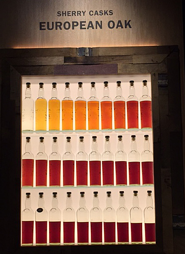
Sherry and tannins

The Glengoyne tour outlined the lengthy procedure for ageing whisky in casks. Casks are made from different types of oak, but have once held sherry (and some, if I remember correctly, Bourbon). The ageing whisky gradually absorbs colour and flavour from the sherry, and the tannins in the oak cask. The two images above illustrate ageing over thirty years in two different types of cask, with coloration intensifying every year. Evaporation is also evident, with around half the liquid being lost over the period. This lost alcohol is called ‘The Angels’ Share’.

Textile Tweets

About the pictures

Above is a small selection of textile-related images from Scotland, most of which I tweeted during our trip. My obsession with dye lichens was rewarded by finding Ochrolechia tartarea alongside Loch Ewe, and Lobaria pulmonaria  at Oban; Parmelia saxatilis and P. omphalodes were growing at many locations.  Note: I was looking, not collecting. A Gaelic-English Dictionary in a hotel room confirmed that in Gaelic crotal refers to boiling water method lichens, but corcur to orchil lichens. If you want to know what orchil is, or read more about my research and views on dyeing with lichens, please visit this page.

Turkey Red

I spent a week with Deb Bamford (aka The Mulberry Dyer) learning how to dye Turkey Red at a Summer School in 2013. Read about it from this blog post forwards. In Scotland I found remnants of the Turkey Red industry buildings at Alexandria, on Levenside. There is a great website about the Turkey Red industry here. And read this wonderful book:

Colouring the Nation: The Turkey Red Printed Cotton Industry in Scotland c1840-1940 by Stana Nenadic and Sally Tuckett. Published by National Museums Scotland. From Amazon here.

Unicorn Series: Stirling Castle and West Dean Tapestries

For more on the Unicorn Series, go here for the Stirling Castle story, and here for West Dean’s version.

 Glengoyne Distillery, Dumgoyne Glengoyne Distillery


Leave a comment

Summer schools…

No posting recently because I’ve had a month of intensive teaching followed by intensive feet-putting-up. I ran three courses at Ardington in Oxfordshire and then four days in Nether Stowey at the studio of Janet Phillips.

At Ardington School of Crafts I taught my synthetic dyes shibori day, plus two one-day (repeated) courses on natural dyes. The natural dye course is a taster to a fascinating subject with some practical work at the dyepots, but also intended as an eye-opener to textiles seen at a stately home, museum etc. It’s even relevant to looking at paintings: I often wonder what dyestuffs were used on garments represented (with pigments) in a historic portrait. We had to move fast, with all fibre and fabric pre-mordanted, and an indigo vat ready to go. Most students dyed a scarf using simple immersion methods. We used madder, weld, cochineal and two indigo vats (one weak, one strong).

At Nether Stowey, I taught a three-day-dye course to several of Janet’s graduates from her Masterclass.  On day one they learned some shibori folds using steam-fixed dyes; day two gave them a taster of wax resist, and day three was a full day with indigo. At the same time as I taught dyes, Janet was teaching ‘shibori on the loom’ to students from the London Guild. In this technique, removable weft threads are incorporated into the weaving. They are later used to draw up the cloth tight. According to how the shibori threads are woven, patterns emerge after the piece is dyed, then opened up.

Students used coloured and plain warps, on different pieces. Some of this shibori work was put into my indigo vat on day four; others used Janet’s fibre-reactive dyes which were applied by placing woven pieces into a short length of gutter (brilliant idea) and painting by hand.  I am used to folding, tying and clamping for indigo work and although I have seen loom shibori before, I haven’t watched the whole process from start to finish. A combination of enthusiastic and knowledgeable students,  Janet’s teaching and the imaginative arrangements made by Janet and Nigel made for a very enjoyable week. Did I mention glorious weather?


Many thanks to students at Ardington and Nether Stowey for permission to use images of their work.

Teaching in 2015

Dates of next years’ courses are accumulating. I will be tutoring two courses at the Association of Guilds of Weavers, Spinners and Dyers Summer School in August 2015 at Moreton Morrell. Details of the entire event can be seen here and there are details on this page.

I am teaching a new one-day introductory course in wax-resist at Ardington School of Crafts in 2015 as well as days on shibori scarves, indigo dyeing.  The Vibrant World of Natural Dyes proved very popular this year and I will be teaching it again in 2015: I have one course at West Dean scheduled for March. If you want to sign in, do so soon because my October course has been full since April.