Isabella Whitworth

probably more than natural and synthetic dyes, wax, resists, and history


7 Comments

Exeter Cloth Dispatch Book 1763 – 1765 (1)

Passavant_edited-1

Detail of the Exeter cloth dispatch book shows several wool samples and their associated bale-mark. Image courtesy of the London Metropolitan Archives. For full reference to this document please see link at foot of page

Late last year I was contacted by a friend with a very interesting proposal. She had been invited to write a chapter on dyes and dyeing for a ‘book about a book’ and asked if I would be interested in co-authoring. A very rare, cloth merchant’s dispatch book had been found in the London Metropolitan Archives by Todd Gray, a well-known Exeter-based historian, and as yet – amazingly – no-one had made a study of it.

Todd was editing a book (Exeter Cloth Dispatch Book 1763 – 5) about his find, to be published by the Devon and Cornwall Record Society (DCRS) this autumn. He was assembling specialist authors to write chapters giving a wide context to the dispatch book. These were to include a history of Exeter’s cloth merchants, the archaeology of the cloth industry in Exeter, fulling mills, Exeter’s dyers, lead cloth merchants’ seals, and tillet blocks (look them up, they’re fascinating). And, of course, a chapter on dyes and dyeing.

A dispatch book is neither a ‘sales‘ book to show potential customers, nor a dyer’s book recording dyestuffs and recipes. It records dyed cloth sold, in this case exported, between 1763 and 1765, and relates to the South West. There are bale-marks drawn on many pages. It is a collection of wool cloth samples (all 2,475 of them) and was the one-time property of a wealthy Swiss émigré of Huguenot descent, named Claude Passavant. Passavant had strong connections to the city of Exeter and in the 1750s established a factory producing high quality Gobelin-style carpets there; he was also a cloth merchant. 

The friend who invited me to co-author is Jenny Balfour Paul, a world authority on indigo. In the early 1990s I attended one of her lectures at the Crafts Council in London and her knowledge and enthusiasm for indigo pushed me in the entirely new direction of natural dyes, and we also became friends. So I wasn’t going to say no, was I?

figured_edited-1

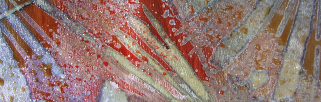
Four figured fabrics from the Exeter cloth dispatch book. The bale mark from the page reverse can be seen in mirror image, bottom centre. Image courtesy of the London Metropolitan Archives. For full reference to this document please see link at foot of page

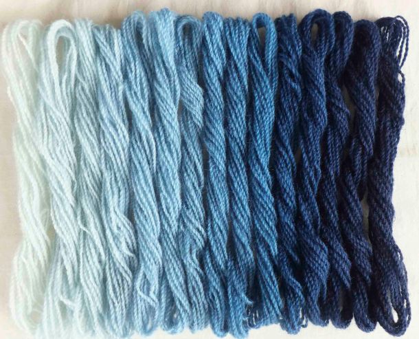
Colours are hard to describe, but in my vocabulary the range covered in the dispatch book includes scarlets, dusty and dark salmon pinks, russets, golden browns, tans, beiges, and all manner of blues. There are soft watery-blue-greens, olive and grassy greens and there are blacks and greys. There are several figured weaves among the samples. We have no dye analysis for these cloths but we could make educated guesses about how they were dyed by studying contemporary sources, and literature. Together with Dominique Cardon and Anita Quye, Jenny has been researching the Crutchley Archive, an important set of pattern, recipe and account books from the eighteenth century Crutchley dyeing business in Southwark. This source, and Jenny’s knowledge of it, was a vital part of our interpreting the likely dyes and chemicals used in the dispatch book. We also researched Standerwick’s Somerset Pattern Book (c 1760) located in the Somerset Heritage Centre, maps and journals held at the Devon Heritage Centre in Exeter and other papers located by Todd Gray in Devon archives.

————————————————————————————————————————————————————————-

UPDATE January 2021

The publication of this book, originally scheduled for Autumn 2020, was postponed as a result of the pandemic. It is now scheduled for release on 19th February 2021 and can be ordered from the publishers Boydell and Brewer here

————————————————————————————————————————————————————————-

London Metropolitan Archives 

Cloth book of an Exeter wool merchant, 1763-1765 (London Metropolitan Archives, City of London reference CLC/B/227/MS09803)

Somerset Heritage Centre

Standerwick’s Somerset Pattern Book at Somerset Heritage Centre: SHC, A/ALU/1, ‘John Standerwick of Rydiness [Buckland St Mary] and Hermitage [Broadway], 1717-1777’

Devon Heritage Centre

Devon and Cornwall Record Society homepage

Extract from full bibliography used in chapter 

Crutchley Archive: Anita Quye, Dominique Cardon and Jenny Balfour Paul‘The Crutchley Archive: red colours on wool fabrics from master dyers in Southwark, London 1716-1744’ in Textile History (forthcoming 2020)

By Dominique Cardon: Mémoires de teinture: Voyage dans le temps chez un maître des couleurs (Paris, 2013); The Dyer’s Handbook: Memoirs of an 18th Century Master Colourist (Oxford and Philadelphia, 2016); Des couleurs pour les Lumières: Antoine Janot, teinturier occitan 1700-1778 (Paris, 2019);  Le Cahier de Couleurs d’Antoine Janot /Workbook, Antoine Janot’s Colours (Paris, 2020).

William Partridge: A Practical Treatise on the Dying of Woollen Cloth, Cotton and Skein Silk (New York, 1823)

Carolyn Griffiths, ‘Woad to This’ and the Cloth Trade of Frome (Frome, 2017)


13 Comments

Getting to Blue

In my last blog A Purple Pursuit, I wrote about Browning’s Popularity, in which he referred to shellfish dye in a complex poem on inspiration, skill and genius. What I didn’t say, but others wisely pointed out, was the oddity of Browning referring to the dye as blue throughout the poem. Shellfish dye (from the ‘Tyrian shells’) is quite definitely purple and the colour, history and source of Imperial Purple were well known in Browning’s time. So, why blue?

Who has not heard how Tyrian shells
Enclosed the blue, that dye of dyes

Whereof one drop worked miracles,
And coloured like Astarte’s eyes
Raw silk the merchant sells?

I scratched around many sources but failed to find a historical reference, or image, defining Astarte’s eyes as blue. Maybe I have missed something. But the Resident Poetry Advisor says that Browning was more than capable of implying non-existent references, or even inventing them. This seems most perverse, but Browning was a poet and that’s the kind of thing poets do.

indigo

Author’s indigo-dyed wool yarn, using increasing vat strength

Putting Browning firmly aside, I happened across a reference to William Gladstone’s Studies on Homer and the Homeric Age. Gladstone (1809 – 1908) was a British Liberal politician, three times Prime Minister, living at a time when politicians digested more than soundbites.

Gladstone studied the Iliad page by page, and as he did so he recorded the occurrence of words for colour. What he noticed was rather remarkable. He came across much mention of black, some white, less red, very little yellow, tiny amounts of green…but no blue. Was Homer ‘colourblind’, or unable to perceive colours? Were all Greeks the same, and their perception of colours (and the words to describe them) inherited, building over several generations? It left me wondering whether Astarte’s eyes could have been blue if there wasn’t yet a word for it, which was a head-spinning prospect.

Lazarus Geiger (1829-1870), a philosopher and philologist, took Gladstone’s research further and studied other ancient texts (for instance, Icelandic sagas, Vedic literature, and the original Hebrew version of the Bible) finding that none of them contained a word for blue. Geiger concluded that across ancient cultures, words for colour developed in an oddly consistent order. Black was always first, followed by white, red, yellow, green. Blue came next, eventually.

If this intrigues you, I suggest you listen to the Radiolab broadcast linked below. It makes more sense of it than I can here, but still left me wondering what exactly was being said. One of the programme’s guests is linguist Guy Deutscher. Listen, particularly, to the account of his little daughter trying to name the colour of the sky.

buddhist_edited-1

Author’s watercolour from sketchbook, 1995, recording the many dyed colours and fading shades of Buddhist monks’ robes in Sikkim and North India

My head can’t get itself round the concept that without an object to attach it to, a colour didn’t ‘exist’ and didn’t acquire a name. But that’s partly what is being said and it leads me to dyeing, and the need to name colours. I was dyeing felt last week, trying to achieve a good range of reds. I used different amounts of mordant, varied the percentages of weld, cochineal and madder and overdyed in different sequences. Small variations occurred in the reds and I sought to describe these to a client in words. Colours need adjectives like ‘bright’, ‘dark’, ‘dull’ etc but one inevitably ends up with a comparison to a universally understood coloured object, such as a poppy, a pillarbox, a brick, a patch of rust, a rose. We take this for granted but it’s very sophisticated, relying on a well-established set of understandings. We often need an object when we describe colour.

In her book Tintes y Tintoreros de América, Ana Roquero records the many changes that took place in Central and South American textile practice during the Spanish colonial period. One of the imports from Spain to the New World was an entire vocabulary for textiles. As well as words for machinery, tools, technical terms and cloth and fabric, this included words for colour. These colour words are still alive in parts of Latin America amongst mestizo weavers and dyers, when their use in today’s Spain is long lost.

In this case it’s the itinerant word that has preserved the colour, and I find that fascinating.


Links

Radiolab broadcast ‘Why Isn’t the Sky Blue’ here

The Himba and the perception of colour Anthropology and the Human Condition: here

Books:

Roquero, Ana, 2006, Tintes y tintoreros de América: catálogo de materias primas y registro etnográfico de México, Centro América, Andes Centrales y Selva Amazónica, Ministerio de Cultura, España

Deutscher, Guy, 2010, Through the Language Glass, Heinemann

Comments

Please also check out the very interesting links offered in comments for this page. Many thanks to those who have written and included them


7 Comments

Fit – for some kind of purpose

There can’t be many households in agricultural areas which don’t have some baler twine in their house.  It’s used by farmers principally for the binding of hay or straw bales. Wikipedia states: Baling twine or baler twine is a small diameter sisal or synthetic twine used to bind a quantity of fibrous material (notably hay or straw) into a more compact and easily stacked form. Tensile strengths of single-ply baling twine range from 95 psi (0.66 MPa) to 325 psi (2.24 MPa).

IMG_6275

Synthetic baler twine: dropped by roadside ready-wound into a length to be used for an as yet unknown task

Down here you can find useful discarded lengths of it in the hedgerows, on the moors and in the fields. I’ve seen the multitude of uses to which it is put: holding a fence together; as a temporary gate-hinge; keeping a car-boot lid closed; as an improvised dog-lead; in birds’ nests and more crucially, holding up a farmer’s trousers. People collect it where it drops, saving it for a multitude of future unknown tasks. There is a kind of simple human optimism in this.

Here in Devon, local farmers have been completing the harvest, which includes baling and the generous distribution of baler twine to keep errant boot-lids down and trousers up. Recently they have been cutting moor grassland to use for animal bedding. The grass is cut and allowed to dry before being baled into cylinders for storage and I recently noticed a group of these, bound up in what looked like black and white stripes of baler twine. Only they weren’t, and it wasn’t.

I had a look up close to discover the ‘twine’ was actually a wide plastic mesh. It contracts widthwise when wound onto the bales under tension. I was intrigued by its structure and complexity, wondered who sat and designed it, where it is made, and whether its structure was solely suited to this one baling process. I started to research it online – and found it’s called bale netwrap and is sold by suppliers of agricultural bindings, such as good old baler twine. Not so useful in the trouser department, I suspect, and might be hazardous for birds that become caught up in it.

I have been moderately unfit for purpose myself recently, hence my lack of posts. Now I’m better and I have just completed teaching my final course of the year at West Dean, only to return with a heavy cold. Unfortunately I can think of no way in which baler twine will alleviate the symptoms.

My March 27th – 30th  2015  course Rhythm and Pattern is nearly full so if you want a place, contact West Dean as soon as possible. I will be teaching a further course from 17th – 19th July 2015.


2 Comments

Harvesting Japanese indigo

photo

Blue stains which developed after rubbing Japanese indigo leaves onto paper

I planted out my Japanese indigo (Persicaria tinctoria) several weeks ago, having grown it all from seed. This week I picked some leaves and rubbed them on the page of my sketchbook to see if any blue appeared. It did (ignore the buff coloured stain to the left of the image, which is nothing to do with it). From this I knew that I could make a vat from the crop.

I began by picking half a bucketful and testing it as a small vat. I achieved a very good blue, which was used to overdue some cochineal-dyed scarves I had shibori-tied ready and waiting. You can see the result in the gallery below.

On the second vat I used a whole bucketful of leaves, rammed down hard. I just pick the tips, like tea: not the whole stalk. I sometimes weigh the leaves before processing but the material was wet after rain and there didn’t seem much point. I don’t always strip the leaves from stalks either, so a known dry weight is somewhat academic because the stalks don’t, as far as I know, produce any colouring matter.

On the day I dyed the second bucket I live-tweeted the various stages with images and received a good response. I think more and more people are trying to grow, and dye with, their own indigo.

With colleague Christina Chisholm I co-authored a piece on growing and using Japanese indigo for the Journal for Weavers, Spinners and Dyers in 2011. It was a free download and you can still access it here so I don’t have to write it all out again. We included some information on growing the plant in two distinct climates (Devon and north east Scotland). Christina has much more experience with dyeing wool, so fibre dyers might find her comments useful. If I were to be able to edit the article I’d make a couple of additions / amendments: 

1. I have since found that I don’t always see a blue froth when I whisk up the strained dye bath. Instead, the sherry-coloured liquid darkens and looks greener – but the froth is often colourless. Why? No idea. These days I have stopped using soda crystals and use washing soda instead. Maybe that’s the reason. 

2. I have found that leaves are often ready whether or not they have the red/blue tinge shown in the Journal download document. What I have heard since (but don’t know if it’s true) is that you need to use the leaves before the plant produces flowers.  

3. I try to encourage flowers for seeds each year and there is some urgency about this as in the UK the plants die with the first big frost. I mark a few vigorous stalks early on by tying a conspicuous ribbon round each one. Then I can’t pick them by mistake. I let these stalks develop flowers as early as possible.


5 Comments

Follow-up on gall ink

Gall ink

Just before Christmas I wrote about my experiment making ink from oak galls. Read it here. I tried using the mixture as an ink fairly early on in the experiment, using recipes found on the internet, with disappointing results. It came out very pale and did not darken with exposure to light as I had read that it would. That could be for many reasons.  I maybe didn’t use enough galls, or fresh ones, or I hadn’t left it all to soak enough; maybe the mixture was insufficiently concentrated; maybe I hadn’t added enough iron. I also learned that ink would flow better with the addition of gum arabic. I couldn’t find my stock of gum arabic, so I sent off for some (in powder form).

When the gum arabic arrived I decanted some of the gall liquid, added an iron mixture (made from rusty nails and vinegar) and allowed it to reduce naturally by leaving the jar in a warm dry place. I hoped to concentrate the pigment. I then added a small quantity of powdered gum arabic and made some drawings and scribbles using sharpened twigs: a proper quill pen would have been great, but I was short of a goose.  The second ink result was somewhat better than the first, but having looked at some manuscripts written in gall ink, I think it could be a more intense brown/black. I’m leaving the galls to continue soaking and will try again later in the year – as well as looking for more samples in late summer when they will be fresh.

Time will tell if I have used too much iron and my ink rots through the paper – definitely a problem with ‘over-ironed’ dyes of the past which ate their way through wools and silk.

I spent my childhood in the New Forest and have enjoyed following artist Stephen Turner’s blog about his year in the ‘Exbury Egg’. I know the area he is writing about intimately. Coincidentally, Stephen has undertaken a similar experiment with gall ink and you might like to look at two of his posts. He describes collecting galls here, and his ink results here. Stephen’s observations on the Turkey oak (Quercus cerris) were completely new to me: apparently this species was reintroduced into the British Isles in the eighteenth century and there were concerns that acorn production, vital for the local feeding of pigs, was affected by the arrival of the Turkey oak and its attendant galls. The Oak Marble Gall Wasp (Andricus kollari), for which a Turkey oak is vital, is responsible for the marble galls Stephen used.

The galls I collected in Devon are not the same thing as Stephen’s New Forest marble galls. They were found on a different type of oak and produced by a different wasp. But as far as I know all galls are tannin-rich and can be used to produce ink. So I’ll keep try-ink. Sorry, couldn’t resist that one.


Breaking news.. extra course at West Dean: Brilliant with Pattern

Because my West Dean course in March has a waiting list double the size of the course itself, the organisers have scheduled an extra course from 9th – 11th  May. See the West Dean programme here. You can also download the full West Dean College Course programme here.


3 Comments

Installations, pasties and Turkey red

I’ve found a link between art installations and our family’s Pasty Evaluation Test. We live in the South West, the traditional home of the pasty. Most local bakers produce pasties and whole businesses are devoted to their making, including one of our favourites, The Original Pasty House in Tavistock. What is the Pasty Evaluation Test? Taste and healthy ingredients are part of it, but the initial stage is to check how many bites it takes before you achieve something other than pastry-coated air.

It’s the same with installations. I’ve seen many that beckon appealingly but prove increasingly unrewarding and wearisome post-first-bite. I don’t want to pre-read screeds of explanation telling me what to think, so if an installation doesn’t communicate after a decent period of interaction, then for me it’s a non-starter. 

I remember some good ones such as Jaume Plensa’s gongs at The Baltic in 2002. (Note: YouTube link shows them at the Yorkshire Sculpture Park where they seem arranged in a different way). They glowed in changing light and there was a timeless, temple-like quality to the space where silence and sound defined each other. People sounded the gongs with great intensity and contemplated powerful reverberations. Others seemed embarrassed to hit the gongs, as if they needed permission. A further cohort transformed into delighted children, shattering reverence with indiscriminate boing-ing and restaging the experience as wicked fun. It ended up as much about watching people as listening to gongs.

Not quite on the same scale, but I did enjoy two installations at the Devon Guild of Craftsmen this week. The first was Tina Hill’s Excavating Babel, a striking, tall spiral of over 2000 once-discarded books set in dust on a dark plinth. The books had been stripped of their covers, and thus identity, revealing a structure of sections and linen stitches, showing that books are, or can be, sewn together.  Created with books set uniformly with spines outwards, the inner spiral could be entered. It enclosed, isolated and insulated the visitor with a dense paper barrier. One was aware of millions of pages of muffling, unknown stuff.  What was this no-longer-needed information? There were interesting supporting notes to read, which afterwards I did. But Excavating Babel worked on several  levels without explanation, and thus passed the equivalent of the Pasty Evaluation Test.  You can see more about it on Tina’s own site here. Excavating Babel is part of the Devon Guild of Craftsmen exhibition Narrative Remains and you can see it until 23 March.

In the Riverside Gallery, also at the Devon Guild, is another exhibition called Love, Loss and Laundry.  This can be seen until March 16th. Through stitch and fabric Jacqui Parkinson commemorates the lives of destitute women and girls who worked in Devon House, Bovey Tracey. Devon House was run by Anglican nuns of the Clew Sisterhood – the notes record that they were largely a kindly organisation.  The refuge they offered allowed some girls, at least, to obtain respectable jobs in service and even to marry and have families of their own.

Women and girls were mostly occupied with laundry and sewing. Dirty sheets were washed, torn clothing darned, linen patched. But many inmates of Devon House lived or were buried unnamed. If it were not for the 1911 census records, their lives might have left no trace.  Anne Liebermann’s embroidered linen squares record some of these lives in the delicate red cross-stitching of their names from the census. Jacqui has sewn these onto squares of an old bedspread where layers of old fabrics can be seen. The squares resemble the padded fabric the girls would have used to hold an iron and the names are haunting and moving.

I have just enjoyed reading ‘Colouring the Nation’, a book about the Turkey red industry which set up along the Clyde and Vale of Leven in the nineteenth and twentieth centuries. One of the fabrics in the installation (the one on the right, above, with the fan) looked very like a Turkey red or Turkey red derived pattern, and the dates fit.

Thanks to the Devon Guild of Craftsmen and the artists involved in the two exhibitions for permitting photography of their work.

book

Colouring the Nation: The Turkey Red Printed Cotton Industry in Scotland c1840-1940

by Stana Nenadic and Sally Tuckett. Published by National Museums Scotland

From Amazon here

There is an associated website which is well worth a visit for its text and searchable images. There are 501 available to see from the full 40,000 contained in the pattern books now held by National Museums Scotland.

http://www.nms.ac.uk/turkey_red/colouring_the_nation.aspx


2 Comments

French Connections

I’m back from a trip to the DHA (Dyes in History and Archaeology) Conference in La Rochelle. La Rochelle hosted the ISEND Conference in 2011 and so I was already familiar with the conference venue – a former fishmarket, now the exhibition and conference centre  L’espace Encan.

This is a text-heavy post, so here’s a picture of La Rochelle to keep you going.

LaRochelle

La Rochelle

A DHA conference annually attracts a wide variety of delegates from various disciplines. This year there were about 90 of us. Our number included chemists, conservators, artists, historians, researchers working with natural dyes, and students at various academic levels. At a DHA conference you can find yourself sitting next to someone from the British Museum, the Louvre or the Rijksmuseum, or an independent scholar who is simply passionate about parchment. It is a friendly assembly and all are welcome. Even if, as a non-chemist, you sometimes sit boggle-eyed through muscular technical papers full of graphs, analysis and molecular data, there is always something to be learned. I’m told that in early DHA days (this was the 32nd meeting!) there was a heavy bias towards these more scientific analytical papers but that nowadays the balance is more even, with a good mix of historic /scientific presentations. The selection committee who choose proposed papers must have an intensely hard job. Of the 24 or so papers accepted, several intrigued me but as none have yet been published this handful of comments remains general.

Purple Parchments

One paper involved the analysis of  purple-dyed parchments. Very little work has been done to analyse the source of the purple colour in such codices and as far as I understand, there is currently no scientific evidence that shellfish dyes were used on the parchments. Non-invasive methods are normally used in their analysis, essential if precious manuscripts are to be studied without damage, and these methods can make it more difficult to identify dyestuffs. (With a parchment it isn’t so easy to remove a physical sample as it can be from a textile, where a loose fibre may be available).

There was a mention of dyeing parchment with orchil, and my ears twitched. Last year I was asked to dye some parchment samples with orchil – and dye they certainly did. But it was apparent that the temperatures and immersion involved in dyeing with orchil stiffened and damaged the parchment quality. I felt that this method wasn’t viable. Cold-dyeing seemed to yield a more sympathetic result but I have no idea to what extent the parchment quality was affected as I was only sent miniscule pieces of parchment to dye.

In the post-presentation question session it emerged that the term ‘dyeing’ means different things to different people. Some delegates considered ‘dyeing’ could be the layered painting on of dye and not dyeing by immersion, as working dyers think of it. Now, I should say that I tried painting orchil on too, but soon lost the will to live. It would be immensely protracted to paint on sufficient orchil to build up a good colour. That’s not to say it would be impossible, I just didn’t have the time or the resources to continue.

It will be interesting to learn more about this research. Maybe at Glasgow and DHA 33 next year? The dates are October 30th – 31st 2014.

Shearings and Clippings

Magnified images had been studied by the presenters which showed lumpy-looking particles in the red lake used in several medieval paintings. These indicated that they were reclaimed dyes from red-dyed wool, made into lakes for painting. The reclaiming of red lake pigment dyestuffs from clippings of dyed wool revealed that it made good economic sense to extract the dyes and to reuse them as painting materials. The dyeing of red, from whichever dye source, was expensive and thus waste material might be reprocessed. Again, I encountered problems with a mutual understanding. Initially I was confused by the words ‘shearings and clippings’ which were used by the presenters. I associate these words primarily with sheep-shearing!  In the paper the words referred to waste dyed cloth after cutting woven material – or yarn.

The finding of these ‘reclaimed reds’ isn’t in itself new. A 1996 paper by Jo Kirby and Raymond White goes into great detail (find it here) and also lists a  number of paintings in which red lake pigment dyestuffs have been found. Have a look. You may be amazed.

Networking

A couple of years ago, at DHA in Lisbon, I presented a paper about the trade in dye lichens from Angola through Lisbon. I have yet to publish this, for several complicated reasons. But I had an interesting conversation with another delegate which led me to sending a very small quantity of dye lichen and a recipe to the University of Évora. I heard no more, and forgot all about it. At La Rochelle my Portuguese colleague and  her team presented a paper in which they had measured and tracked the breakdown of the depsides and depsidones (the dye precursors) in the orchil preparation process until purple chromophores formed. Chromophores are the part of the molecule responsible for colour. The chemistry was patiently explained to me in a coffee break and I now understand rather more about the process that before – although I wouldn’t like to take an exam just yet. DHA is great for this kind of contact and co-operation.

DHA=GFZ: A Gremlin Free Zone

If you read the previous post you will now that I was co-presenting a paper at DHA 32  and I wrote about the snaggly-toothed IT gremlins that lurk for unprepared presenters. I am pleased to report that my eminent co-author, Zvi Koren, had done an admirable job on gremlin-bashing (he’s ace at puns too) and everything loaded and presented totally as expected. So did everyone else’s, and we all benefited from calm, unobtrusive technical expertise delivered by Florent Glatard of ARRDH- CRITT Horticole. Our presentation was really well-received but I will not be writing about it until formal publication.

Thanks to DHA 32 organisers Anne de la Sayette and Dominique Cardon

Anne de la Sayette is the Directrice of ARRDHOR – CRITT Horticole, a ‘centre of research, innovation and technology transfer in horticulture’. Dominique Cardon is well known to most natural dyers as author of Natural Dyes: Sources, Tradition, Technology and Science. She is also Emerita Senior Researcher at CNRS, the French national centre of scientific research. CIHAM UMR 5648 CNRS  (an institution, not a mathematical  equation..)  is one of the most important research centres in France for history, literature and archaeology of the Middle Ages. A new book by Dominique is about to be published but I don’t have the details: as soon as I do I will add them to a post.

Carnac

If you have got this far you deserve a pictorial prize. Using photos from DHA is tricky as I feel I should ask people’s permission before posting their images on a blog, so here is something rather special from the trip home.

I had never been to Carnac in Brittany until last week and I had no idea of the scale and breadth of the entire site. But it seemed most serendipitous to discover, on some stones of the alignments, a quantity of orchil lichen. Naturally, I did not touch it. But here are some images to reward stalwart readers. The orchil lichen is in the left hand image only.


Leave a comment

Talking Orchil

Canterbury graveyard, 1960s sketchbook

Lichens in a Canterbury graveyard: from my 1960s sketchbook

In my last post I started to write about orchil, and how I became fascinated by its story through my researches on an eighteenth / nineteenth century Wood & Bedford / Yorkshire Chemicals archive.

To start at the beginning, orchil (pronounced or-kil) comes from lichens. It has been used for millennia to dye wool and silk a purple colour. There is some confusion over ancient recipes for purple. It isn’t always possible to decipher which recipes refer to lichen and which to shellfish dyes. Both dyestuffs produce a remarkably similar colour, were to be found in the same areas (e.g. the Mediterranean coast) and descriptions of lichen are often a little vague. For instance, dyestuff might be referred to as a plant, or a moss, or a seaweed.

There is evidence (Pliny, Theophrastus, Dioscorides) that orchil was used in conjunction with shellfish purple and it’s a ready assumption that this was done  to defraud – which of course it may have been. The processing of orchil would have been significantly cheaper than for shellfish dye. But the combination was also undertaken to produce a legitimately cheaper alternative to pure shellfish-dyed cloth. Nevertheless, orchil and shellfish-dyed cloth seems regarded with disdain because of the great and unique reputation of shellfish purple, and orchil’s tendency to fade.

The beauty of fresh orchil on woollen yarn

The beauty of fresh orchil on woollen yarn

Orchil dye is extremely beautiful in its first, fresh bloom of colour but it normally proceeds to fade fast. It is therefore interesting to read a 2012 paper (link below) in which Casselman and Terada demonstrated that a combination of orchil and shellfish dye may in certain circumstances, stabilise the orchil. They also reported that the  use of orchil as a base dye would to some extent neutralise the intensely unpleasant odour of shellfish-dyed cloth. Those facts cast an entirely different light on the historic combination of orchil and shellfish dye.

It occurs to me that in more recent days, far from being ‘poor man’s purple’, orchil could have been considered a great luxury. If you could afford the rich glories of orchil-dyed silk, and these would be obvious to all by the colour, it might indicate one’s financial indifference to fading and the realities of a soon-spoiled garment.

Dye lichens

Not all lichens will dye, not all dye lichens will make orchil. Orchil-producing lichens (and there are innumerable species) contain precursors of the dye and to make this available the dyestuff must be crushed in ammonia or stale urine and water and then kept well-oxygenated. It undergoes a type of fermentation, and the purple colour develops over several weeks.

Orchil is very sensitive to changes in pH and by adjusting vat strength and acidity, a wide variety of colours can be achieved, ranging from browny reds to reds, pinks and purples.

Crotal / crottles

There are lichens that will dye rusty reds, browns and golds. They are often referred to as ‘crotal’, (a Gaelic word) or crottle, lichen. These require no fermentation and are normally boiled up together with fibre, yarn or cloth. They have been in traditional use in Scotland for centuries and the warm, earthy smell of crotal-dyed yarn is also a moth deterrent. But crotals are not orchils!

Mordants

Neither orchil nor crotal requires a mordant although some historical recipes recommend an alum mordant for orchil.


The Wood & Bedford Orchil Story

I found a vast number of items in the archive which related to the nineteenth and twentieth century trade in orchil. A couple of them can be seen in the previous post. The records defined several sources of orchil lichen. Around 1830 these included Scandinavia, Sardinia, the Azores, Madeira,  the Canary Islands and Cape Verde. Political changes and colonial interests affected trading in the later 1800s, as did the slave trade and, eventually, its abolition. A picture emerged of a voracious trade that reached an industrial and even global scale by the mid nineteenth century. There is a certain irony in the fact that stocks of what, in effect, is a non-renewable product were saved by the synthesis of mauveine by Perkin in 1856. The demand for lichen then dropped. Nevertheless, Wood & Bedford,  later the Yorkshire Dyeware and Chemical Company, continued to buy and process orchil lichen well into the twentieth century. I understand that the last unused lichen stocks went to Johnsons of Hendon who presumably used lichen to make their indicator papers.

Lichen ethics

You will see that I have learned to make orchil and to dye samples for research purposes but I don’t use it in my studio work. You can read some of my thoughts on lichen use here. I am extremely grateful to all those who taught me about making orchil and how to dye with it.

Pronunciation

How do you pronounce lichens? I say it to rhyme with kitchens. Most people and academics (ok, sorry, academics are also people)  say ‘likens’. The OED pronunciation makes it official: you can say it either way:
/ˈlʌɪk(ə)n, ˈlɪtʃ(ə)n/

References:

The Politics of Purple: Dyes from Shellfish and Lichens Karen Diadick Casselman and Takako Terada

Natural Dyes: Sources, Tradition, Technology and Science; Dominique Cardon, Archetype Publications

The Colourful Past: Origins, Chemistry and Identification of Natural Dyestuffs; Judith H. Hofenk de Graaff, Archetype Publications

Lichen Dyes: The New Sourcebook and Craft of the Dyer by Karen Diadick / Leigh Casselman


Leave a comment

Day 4 and madder: sorry about the quilts

I have been writing Summer School blogs late at night and I am forgetting to include things. Here’s what I forgot yesterday: images of the textiles from the Welsh Quilt Centre at Lampeter. They should have been attached to yesterday’s post.

Today, Turkey Red preparations continued and we started to plan the ordering, labelling and displaying of the various samples dyed on the course. We are working in the art college (Coleg Sir Gar) in a Life Room; it’s part of a larger suite divided by folding screens. The screens are also whiteboards and we can write on them with markers, which makes displaying and explaining samples a bit easier. An exchange visit with students on Helen Melvin’s eco-dyeing course took place this afternoon and they could see the first samples together with their recipes and comments from the groups that had dyed them.

‘If you would dye wool into a perfect red colour..’ begins Gervaise Markham’s 1615 recipe from his book The English Huswife. I am in a group-within-a-group on the course; we excel at producing dispiriting pinks from recipes which boast all manner of ‘perfect reds’ as their outcome.  I think we have even astonished tutor Debbie by our unerring skill in this regard.

From the selection above, guess which yarn is ours after trying Markham’s recipe. No prizes.


Leave a comment

Madder, wool and Welsh quilts

In the dye room this morning we reground the fourth and final exhaust dyestuff for the Turkey Red samples and heated it to temperature so that it could cool before dyeing tomorrow. Debbie has hung the Turkey Red-prepared cloth in the college smoking shelter – which might well discourage smokers from entering and be very good for overall Welsh health.

smoking

Smelly smoking shelter

Many madder recipes state that one should not raise the temperature of the dyepot above a certain point or the colours will turn brown.  On the other hand, many recipes have silk or wool boiling for as much as an hour. So what’s going on?

Jill Goodwin advises a maximum of 158 F (70 C). We were careful to follow her recipe yesterday, but today someone suggested we should boil one of the Goodwin skeins to see if  it would affect the colour.

So we did, and it didn’t…. and it set us thinking where such advice originates and under what, if any, circumstances it might be true.

If you read yesterday’s blog you’ll know I wasn’t sure where we were going on our outing: it turned out to be the National Wool Museum at Dre-fach Felindre and the Welsh Quilt Centre at Lampeter.

Our visit to the museum was interesting but short and there were far too many of us for a comfortable visit. Nevertheless, I enjoyed watching the spinning mule in action, and touring the finishing and weaving sheds. Across in the field was a tenterframe for stretching and finishing cloth, and a windhouse for drying more delicate fabric. The tenterframe looked squeaky-new and unhistoric (do Ikea offer a selection?)  but gave some idea of how the field might once have looked.

I came across a set of natural-dyed yarns produced by David and Margaret Redpath who, until 2002, ran Wallis Mill in Pembrokeshire. It was the last commercial mill in Wales to dye with plant materials. The dye garden behind the wool museum was sadly neglected and overgrown with weeds, although some madder was struggling plantfully on.

The Quilt Centre at Lampeter is in the old Town Hall. Currently, and until November, a collection of antique Welsh quilts is on display with work by Kaffe Fassett and other contemporary quiltmakers. There was a time when this modern work would have held all my attention, but now I am old and grey it was the monochrome historic textiles I found the most beautiful. The collection has been put together by Jen Jones, who realised several years ago that these lovely bedcovers were being discarded as having no value. In a short address to the group, Jen said that she had once seen a farmer using an old quilt to keep a sick cow warm. The Quilt Centre exhibition was superbly done, with work suspended at different angles and heights from an immensely high ceiling. Complexities of lighting were skilfully handled so that nothing appeared overshadowed.

crossover

This collection is by Moda Fabrics and is called Indigo Crossing

In Calico Kate,  a shop for quilting enthusiasts almost next door, I found a set of printed cottons in the blue and white derived from the traditional patterns of resist-dyed indigo. These fabrics seem to be following me around: see this post from earlier this year.

A reminder to anyone following in real time that you can follow AGWSD Summer School at Carmarthen through the posts of several students here on Twitter, using the hashtag #wsdsschool