How long have I been dyeing? Not as long as I have been rubbish at maths. A recent experience, when I messed up percentage calculations of mordant, has reminded me how useful it is to keep records. (If you aren’t a dyer, these percentages refer to the mordant weight required against the fibre/fabric weight to be dyed).
My end-of-year project has been to test my Rubia cordifolia, or Indian Madder. I ordered it in the summer from KMA Exports of Tamil Nadu, but haven’t yet had time to use it. A week or so ago I mordanted two Merino wool scarves, calculating the mordant at 8% alum + 5% cream of tartar. Only it wasn’t: my notebook later confirmed I had mordanted at about 1% each. Results on the first set of dyeings were disappointing (it was a surprisingly good red, considering inadequate mordant, but certainly not eye-popping) so I checked out my notes and revealed the serious mistake.
At this dark end of the year I was hoping to dye the cheery Meltdown Orange achieved with Indian Madder on the Carmarthen Association Summer School Workshop, run by Deb Bamford, in 2013. In trying to convey Meltdown Orange on this blog, I hit a regular problem. Colour inaccuracies accrue between camera, screens and editing programmes. Obviously, colour portrayed via a screen isn’t going to look the same as the actual item, but my phone and camera come up with strange slants on reality which I often have to rectify when trying to pin down a ‘true’ colour. It can be vital if I’m working with a researcher or conservator, or a client who needs to know the exact colour of a scarf they propose to buy.
There are three images below. In the image of wool dyed with Rubia cordifolia from Carmarthen (image 1), the colour on my screen is as near as possible to the original yarn I hold up against it. That’s because I fiddled with the settings. I have no idea what you will see.


I had a nerdy idea. With the MyPANTONE app on my phone, I used a photo of the dyed yarn to see how MyPANTONE could analyse the colour range. Image 2 is a screenshot from MyPANTONE. By the time the image has cybered from the yarn to the phone to MyPANTONE to email to an editing programme to WordPress and the screen I see here, it seems that the image had shifted to something stronger and sharper. On the app itself, I had selected what I thought were three typical ‘hues’. This is done in the same way as an ‘eyedropper’ is used to select colour on an editing programme. The colours I chose were Warm Red C, Pantone 179 C, and Pantone 171 C. They are shown at the bottom of the screenshot (image 2) and seemed a reasonable representation of Meltdown Orange seen through my own, and MyPANTONE’s, eyes.
From a former life in the graphics industry I retain a printed Pantone set of colours. I checked the MyPANTONE colours against my printed set and compared the yarn to each printed colour. Warm Red was ‘too red’, Pantone 179 was brownish and Pantone 171 too weak. But Pantone 172, one shift away from 171, was an accurate representation. This is shown in image 3.
I am not sure what any of that proves, except that colour is a tricky old business.

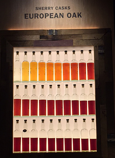
Silks and wool dyed with various strengths of Indian Madder (and correct mordant)
Reverting to the dyepot story, I repeated the dyeing with correct percentages of mordant and was rewarded by much sharper and more intense orange-reds, on silk and wool. As well as recording the mordant I kept notes on the percentage of dyestuff needed to achieve deep shades on the scarves and found it to be higher than expected – at about 20%. That’s one fifth of a weight, I shall remind myself. I’ll try to do the calculations better next time.
Links: My blog about buying Rubia cordifolia here.
Deb Bamford (The Mulberry Dyer)
MyPANTONE (for iPhone)
MyPANTONE (for Android)