Isabella Whitworth

probably more than natural and synthetic dyes, wax, resists, and history


Leave a comment

Looking at AI: an essay in inaccuracy

A friend of mine has been experimenting with AI. He created the following ‘essay’ about me by accessing Microsoft Bing. For this essay the app offered three types of compositional option: ‘precise’, ‘balanced’, and ‘creative’. The ‘balanced’ and ‘precise’ versions were accurate factually but the writing was dull and prosaic, collated from text I recognised from websites I had supplied with bios or information.

The ‘creative’ option was a brew-up of fact, spiced with bold and puzzlingly inaccurate statements and claims certainly not based on any text I had supplied online.

I reproduce the essay below, with embarrassingly serious factual inaccuracies underlined. The piece claims I was born in London when in fact I was born in Cheshire, and that I attended West Surrey College of Art and Design to study textiles when I studied Graphic Design at Canterbury College of Art – etc. I have chosen not to draw attention to inaccuracies about my outstanding achievements and genius.

Ultimately, this exercise was a piece of fun, but I am wondering where this software will take us, with the possibility of proliferating inaccuracies each time a newly-published and AI generated ‘creative’ source is re-accessed by AI.


Isabella Whitworth is a textile artist and tutor who lives and works in Devon, England. She has a background in graphic design and a passion for natural dyes and resist-dyeing techniques. She is also a researcher and writer who has contributed to the knowledge and conservation of natural dye history and practice. This essay will explore her career, achievements and influences, as well as some examples of her work.

Isabella Whitworth was born in 1949 and grew up in London. She trained as a graphic designer at the London College of Printing in the late 1960s, and worked in industry for several years as a designer, editor and copywriter. She was influenced by the Bauhaus movement and the Swiss style of typography, as well as by artists such as Paul Klee and Henri Matisse. She also developed an interest in drawing and painting, especially botanical subjects.

In the 1980s, Whitworth travelled extensively in India and Indonesia, where she encountered various textile traditions and techniques. She was fascinated by the colours, patterns and textures of fabrics such as batik, ikat and shibori. She decided to pursue a career in textiles and enrolled in a course at the West Surrey College of Art and Design, where she learned about silk painting, dyeing and printing.

Whitworth started to make her own textiles using synthetic dyes on silk, mainly scarves and shawls. She used resist techniques such as gutta (a rubbery substance that blocks dye) and wax to create intricate designs on the fabric. She also experimented with folding, tying and clamping methods to produce shibori effects. Her work was inspired by nature, especially flowers, leaves and landscapes. She exhibited her work at various venues and events, such as the Chelsea Craft Fair, the British Craft Centre and the Devon Guild of Craftsmen.

In the early 1990s, Whitworth attended a lecture on indigo given by Jenny Balfour Paul, a leading authority on natural dyes. She was intrigued by the history and culture of indigo, as well as by its unique properties and effects. She decided to explore natural dyes further and began to use them alongside synthetic dyes on her textiles. She also started to grow her own dye plants, such as woad, madder and weld.

Whitworth became particularly interested in orchil, a purple dye obtained from lichens. In 2008, she discovered an industrial archive in her small Devon town that contained documents and samples related to the orchil trade in the 19th century. She realised that this was a rare and valuable source of information that had been largely overlooked by historians and scholars. She embarked on a research project to investigate the history and practice of orchil dyeing, as well as its scientific and cultural aspects.

Whitworth’s research led her to collaborate with many international experts and institutions working in conservation and science. She published several papers on her findings in journals such as Textile History, The Journal for Weavers, Spinners and Dyers, The Journal of Natural Dyes Research Society (India) and The Journal of Natural Dyes (Korea). She also contributed to some major conservation projects involving orchil-dyed textiles, such as the restoration of the 16th century tapestries at Hardwick Hall (UK) and the analysis of the 14th century cope at Sens Cathedral (France).

Whitworth continues to combine studio work, teaching and research. She produces textiles using both synthetic and natural dyes on silk, often blending them to create subtle shades and contrasts. She also experiments with different fibres, such as wool, cotton and linen. Her work is still influenced by nature, but also by historical sources and contemporary issues. Some of her recent themes include climate change, biodiversity loss and social justice.

Whitworth teaches short courses at West Dean College (UK) and at various venues in the UK. She shares her knowledge and skills with students of all levels and backgrounds. She also gives lectures and demonstrations on natural dyes and resist-dyeing techniques at various events and organisations.

Whitworth is an elected member of the Devon Guild of Craftsmen (UK), where she exhibits her work regularly. She has also shown her work at other galleries and museums in the UK and abroad, such as the Fashion Museum (Bath), the Royal Albert Memorial Museum (Exeter), the Museum of East Asian Art (Bath), the National Museum of Korea (Seoul) and the International Shibori Symposium (Japan).

Whitworth is a textile artist who has made a significant contribution to the field of natural dyes and resist-dyeing techniques. She has created original and beautiful textiles that reflect her artistic vision and values. She has also conducted rigorous research that has enhanced the understanding and appreciation of natural dye history and practice. She is an inspiring teacher who has shared her expertise with many students and audiences. She is a respected member of the textile community who has collaborated with many professionals across disciplines.

Isabella Whitworth is an example of a textile artist who has combined creativity, curiosity
and commitment throughout her career.

Source: Conversation with Bing, 30/05/2023
(1) Isabella Whitworth – The Loom Shed. https://theloomshed.com/meet-the-team/isabella-whitworth/.
(2) Our Makers | Isabella Whitworth — MAKE Southwest. https://makesouthwest.org.uk/textiles/isabella-whitworth.
(3) Isabella Whitworth – West Dean College of Arts and Conservation. https://www.westdean.org.uk/study/tutors/isabella-whitworth.


9 Comments

Mulberry silk

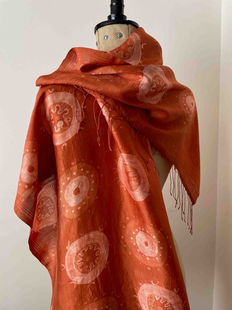
I have been trying to find a more satisfying source of silk than commercial, sparkling white, smooth and ‘perfect’ cloth imported from China. Since last autumn I have been working on mulberry silk, a handwoven ‘heritage’ cloth from India whose export and sale is supporting handweavers in West Bengal. Its natural colour is a pale creamy yellow. Slubs and weave imperfections in the shawls I have chosen are part of their intrinsic beauty.

I mordant the scarves in alum and cream of tartar (unless I’m only dyeing with indigo) and I either dye a pale base or start from the natural silk colour. The wax and dye is worked in layers, with each layer and colour building up a pattern as I block areas out with wax. The designs are loosely based on forms of virus – which are helpful and unhelpful to the human race – and frequently look very pretty through a microscope.

A madder-dyed shawl will be exhibited in the Spring Show at the Devon Guild of Craftsmen, which starts on 29th May

Despite the technique being slow and methodical it isn’t without hazards, mostly due to my senior lapses in concentration. I have overheated the dye vessel (the wax melted); I’ve placed a pattern motif in the wrong place, and I’ve left a small piece of masking tape on the cloth, which efficiently resisted the indigo and left a mark. Because the shawls are expensive I feel very upset when I mess one of them up, but minor wobbles or mistakes reflect the handwoven beauty of the scarves themselves, so I try to be philosophical about it. The cloth is full of slubs, and often shows an uneven density of warp threads which affect the dye take-up. More fibre takes up more dye, so the cloth can have variations in colour. They are utterly fiendish to photograph as they are very lustrous and the colour appears to change all the time.

Shawl below dyed in walnut leaf and indigo

Details of the forthcoming Spring Show at the Devon Guild of Craftsmen here


5 Comments

New book: dye lakes and recipes

Since I started teaching natural dyes at West Dean College, I have had a problem. How could I save, transport and use litres of expensive dye not fully exhausted on the course? I travel with two large beer-making flagons containing indigo, but transporting additional containers of weld, madder and cochineal isn’t feasible – and I hate waste.

For some years I have been working with my friend and colleague Yuli Sømme, who commissions me to dye different shades of wool felt for her company Bellacouche, in Moretonhampstead (see link below). If I have pieces of mordanted and wetted-out felt ready, I can dunk it into the vats on the final night at the College, and by the next morning much of the used dye is exhausted and the felts dyed. I can rinse out the felts and take them home in empty buckets. The exhausted dye can be discarded.

But if students need the vats on the final day, or I am travelling home the day I finish teaching, I don’t have the option of using Yuli’s felt and the leftover dyes.

The Art and Science of Natural Dyes: by Catharine Ellis and Joy Boutrop

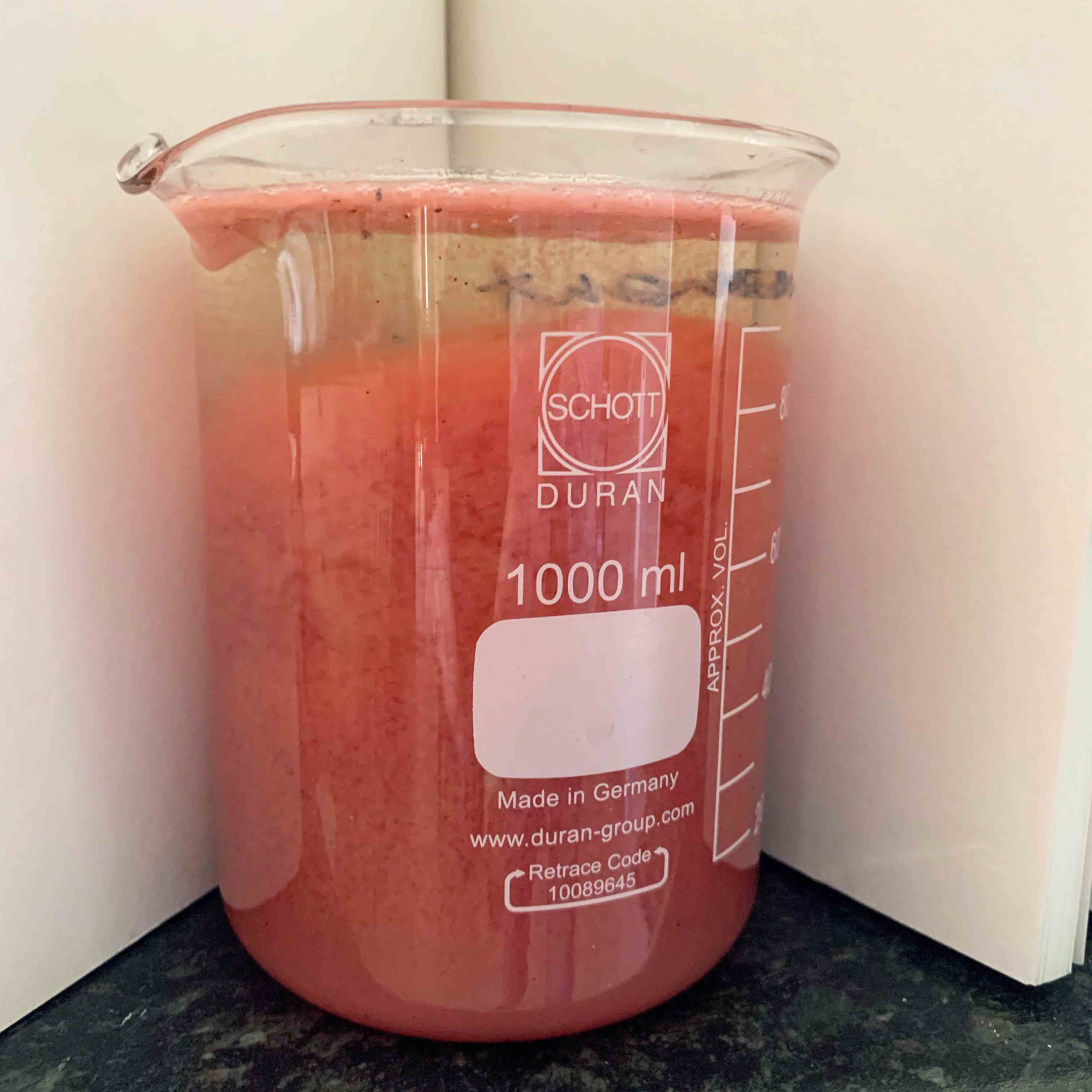
A newly-published book by Catharine Ellis and Joy Boutrop has encouraged me to experiment with making lake pigments from the leftover dyes at West Dean. Their suggested process greatly reduces the volume to be transported and involves binding the leftover dye to the alum mordant, thus turning it into a concentrated lake pigment. The pigment is precipitated using alum and soda ash and sinks to the bottom of the vessel, leaving the water on the surface, which can be poured off.

Madderlake2

Making a madder lake. You can see the dye beginning to precipitate and separate from the water

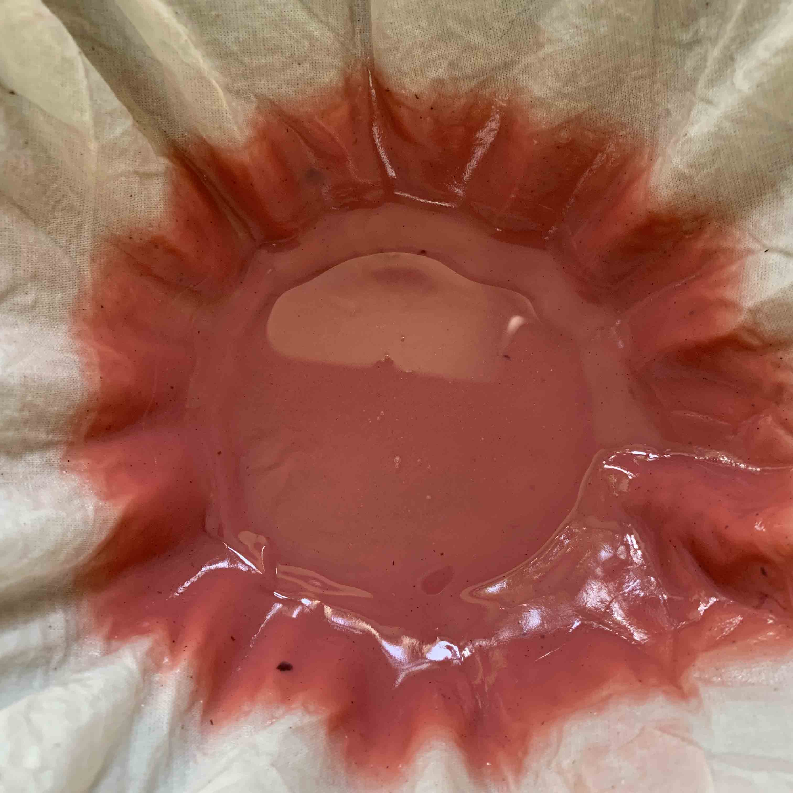
The resulting substance is strained through cloth and when this process is complete, a gooey, paste-y mixture like thick custard remains.

filtering

Straining the madder pigment through a cloth

By reversing the chemical process at home, again using the instructions in the book,  I can dye pieces of wetted-out felted wool – which do not require a mordant.

It is typical of this book, which in its entirety covers a very wide range of natural dye processes, that methods are well-explained, options or alternatives outlined, and reasons given for certain instructions. Recipes are clear and easy to follow and I would have greatly valued the book in my library when I started natural dyeing because of its comprehensive treatment of the subject and a thoroughly researched, straightforward approach. I will write more in future posts because I am still learning so much from the work of these two authors.

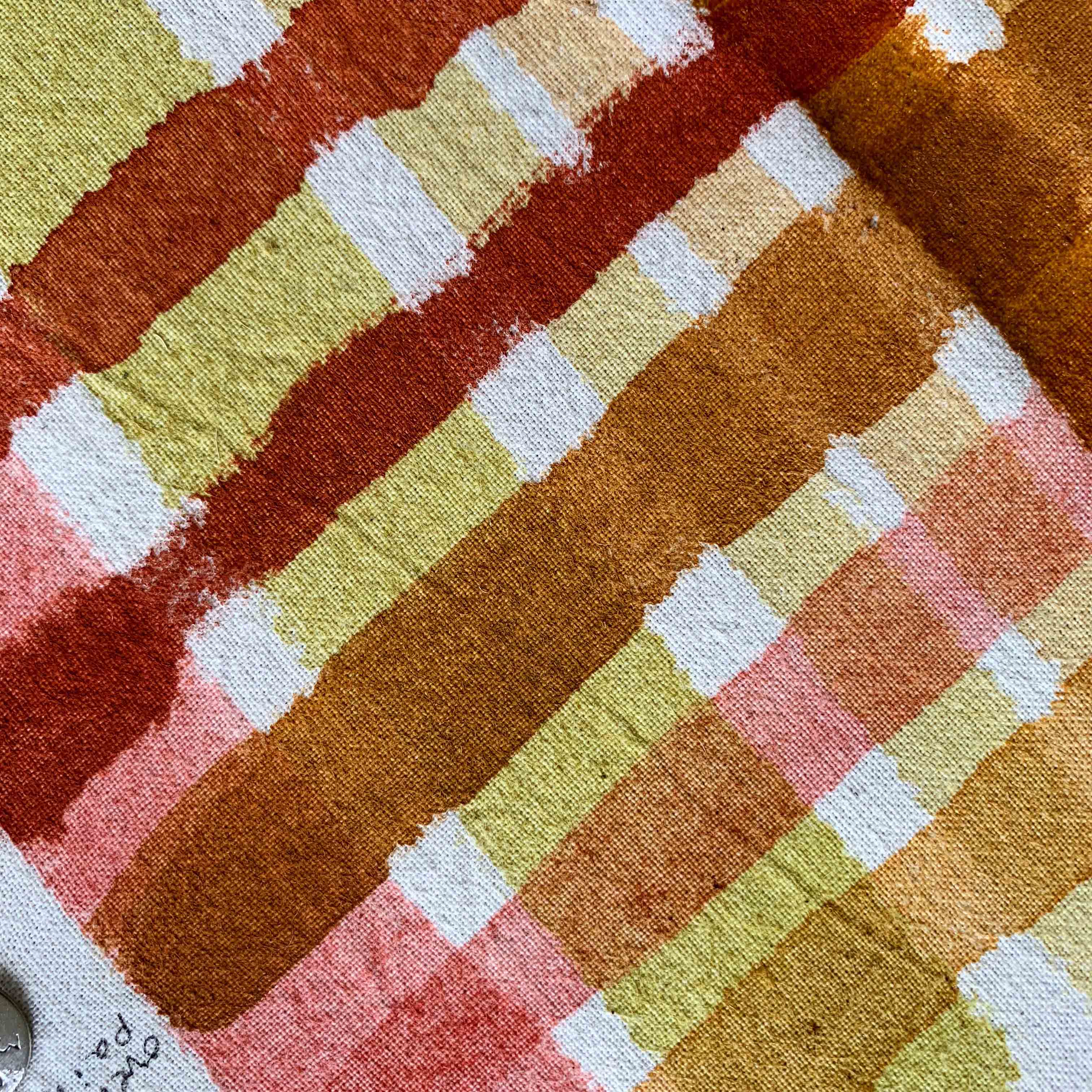
Since my West Dean course last month I have made pigments from madder and weld lakes, and tried mixing them with indigo and earth pigments.

pigments

Madder and weld pigments (pink and yellow) and overpaints of earth pigments sienna and ochre (rusts and red-brown) from Roussillon in France. Painted on soya-sized cotton

Links

The Art and Science of Natural Dyes: Principles, Experiments and Results

At time of writing, this book isn’t readily available in the UK. Check this link on the Blackwell’s site to see if it is in stock.

Bellacouche

Yuli Sømme’s company in Moretonhampstead, Devon

West Dean College Short Courses

My next natural dye course at West Dean is March 27 – 29th 2020.


Leave a comment

Dyeing Reds in Amsterdam

safflower_edited-1

Safflower petals before washing

I recently took part in a two-day workshop in Amsterdam, dyeing historical reds on silk at the Rijksmuseum’s Department of Conservation and Restoration. The event was organised by the Cultural Heritage Agency of the Netherlands. Selection for the workshop was by application, and the organisers chose eight international participants known for the variety and extent of their expertise in natural dyeing, and / or their interests in historical dye recipes.

A range of 26 samples was produced using American cochineal, kermes, annatto, brazilwood, madder, safflower and lac. Participants worked in pairs dyeing different sets of dyes: my partner was Paula Hohti of Aalto University, Helsinki, where she is Assistant Professor of History of Art and Culture. We dyed three recipes in total: one for lac and two for safflower. Demineralised water was used throughout.

Lac Our lac recipe was adapted from Edelstein’s translation of the 1548 edition of The Plictho of Gioanventura Rosetti. We prepared and used an alum mordant on Day 1, in which the silk rested overnight. The stick lac we were to use had been extracted over the previous three days. On Day 2 we sieved the lac solution and heated it, adding 25% (to weight of dry fabric) cream of tartar. It was dyed for an hour.

lac

Lac-dyed silk being lifted from the beaker to check for colour. On the right is the beaker containing yellow safflower dye and silk

Safflower We dyed two versions of safflower: yellow and red. Our recipes were adapted from various sources, including Macquer’s Art de la Teinture en Soie. To obtain yellow, safflower florets were washed once and drained, and then soaked again for 30 minutes. After sieving, the resulting extract was used to dye unmordanted silk.

safflower

First washing-out of the safflower florets for yellow dyeing

To obtain red, safflower florets were pre-washed for two weeks to remove all traces of the yellow extract – this process had been completed in advance of the workshop.  We undertook a further sequence of washings until the yellow stopped running and the water was clear. The water was sieved out. Potash was added to obtain pH 10, and the florets squeezed by hand until they appeared pink and transparent and the liquor looked pinky red. This took about half an hour to achieve.

After sieving into a new beaker, unmordanted silk was added and the pH checked (it was around 7). We then added fermented beer (bierken) little by little, continually monitoring pH, until the pH dropped to a crucial pH 5. This threshold pH has a term ‘virer le bain‘ or ‘turn the bath’. We were required not to allow the pH to drop lower or it would damage the silk. The silk then rested in the dye for 10 minutes after which it was washed in Marseilles soap, and water.

Both safflower baths produced strong colours, with the pink having an especially bright ‘pop’. The colour is very light fugitive.

3dyes

Safflower red (left), lac (centre) safflower yellow (right

Everyone, including the three organisers, gave short presentations on their work and research interests. I showed some samples of my orchil dyeing as well as a few pieces of my studio work in natural dyes. Many participants were involved in education, some of us were artists and dyers, others were textile researchers or art historians. These absorbing presentations illustrated what a privilege it was to attend the workshop.

The results of the workshop were recently published at the Spring Symposium of the Textiel Commissie.

assort

Participants were able to take away a sample of each recipe dyed: a total of 26 samples

Participants took home a complete set of all the silks dyed. The organisers also retained a set, which will be catalogued and stored as historical reproductions on reference sheets, together with supporting information on the recipes and preparations. The sheets will eventually be published online through the Cultural Heritage Agency (RCE) website, for the benefit of other researchers.


Thanks With many thanks to organisers Drs. Ana Serrano, Jenny Boulboullé and Art Proaño Gaibor; to the Cultural Heritage Agency of the Netherlands; the Ateliergebouw of the Rijksmuseum; and to all fellow participants at the workshop for their unique and specialist contributions.


Links

Rijksmuseum Conservation and Research

Cultural Heritage Agency of the Netherlands

Textiel Commissie

Paula Hohti has recently been awarded a European Research Council grant for a five year project Re-fashioning the Renaissance: Popular Groups, Fashion and the Material and Cultural Significance of Clothing in Europe 1550 – 1650


Leave a comment

Dyes, silk and North Portugal

Bragança

Display board from the Museu do Abade de Baçal, Bragança showing natural dyes once in use for silk dyeing. From top left: Daphne gnidium; indigo; gall nuts; madder; logwood; sumac; soapberry; rosemary; walnut; cochineal; dyers’ broom; Arundo donax (giant cane); ginger; common black alder

I spent most of December in northern Portugal, travelling from the north-east corner of Trás-os-Montes via Miranda do Douro, Bragança and Guimaraēs and, after a visit to Porto, to an area south-west of the extraordinary Peneda-Gerês National Park.

In Bragança’s Museu do Abade de Baçal there was an excellent display on the region’s historic silk industry including an illustrated panel on dyes. There were a few I’ve not heard of, such as Daphne gnidium. In her book Natural Dyes: Sources, Tradition, Technology and Science, Dominique Cardon lists the Daphne in her chapter on flavonoids, which indicates it was a yellow colourant. Cardon offers no local name for it in Portuguese, but the Bragança display gives it the name trovisco. The yellow dye was known in French as trentanel; daphné sainbois; or garou and Cardon notes that the dye came to rival weld in 18th century Languedoc.

The giant cane, Arundo donax, does not appear in Cardon’s book and an internet trawl came up with a few references to its pollen being used to make a yellow dye, but I found no solid information for this.

galls

Oak galls found washed up on the shore at Moledo, near Viana do Castelo

The museum panel also illustrated some large spiky oak galls. I suggest these are of gall wasp Andricus kollari, but please put me right if you think they aren’t. Tannin-rich galls would probably have been used as mordants. I saw these galls on and beneath oak trees in Trás-os-Montes and all across north Portugal, and there were hundreds washed up on the beach near Viana do Castelo.

necklace

Oak galls used as a necklace in man’s costume, from the displays of masks and costumes of the Bragança area at the Museu Ibérico da Mascara e do Traje

Some pre-Christian traditions survive in remoter areas of North Portugal, in the form of rituals that take places at certain times during the year, with men and boys in bizarre costumes and some extremely scary masks. I saw necklaces of oak galls, along with wooden cotton reels, at Bragança’s Museum of Mask and Costume.

Orchil

At the Museu do Abade de Baçal I found one reference to orchil (urzela in Portuguese) as a lichen dye used in the 18th and 19th centuries. I wasn’t overly surprised because I had never seen such profusion of Lasallia pustulata anywhere, and growing to such a large size. The lichen favours granite, the local stone; the air is clear and unpolluted, and the area remains relatively undeveloped. So the lichen grows undisturbed – and long may it continue.

Links

The Silk Industry in Trás-os-Montes During the Ancient Regime: paper by Fernando Sousa, University of Porto

This is a gem of a museum: Museu Ibérico da Mascara e do Traje, Bragança

Excellent display on silk industry: Museu do Abade de Baçal, Bragança


13 Comments

Getting to Blue

In my last blog A Purple Pursuit, I wrote about Browning’s Popularity, in which he referred to shellfish dye in a complex poem on inspiration, skill and genius. What I didn’t say, but others wisely pointed out, was the oddity of Browning referring to the dye as blue throughout the poem. Shellfish dye (from the ‘Tyrian shells’) is quite definitely purple and the colour, history and source of Imperial Purple were well known in Browning’s time. So, why blue?

Who has not heard how Tyrian shells
Enclosed the blue, that dye of dyes

Whereof one drop worked miracles,
And coloured like Astarte’s eyes
Raw silk the merchant sells?

I scratched around many sources but failed to find a historical reference, or image, defining Astarte’s eyes as blue. Maybe I have missed something. But the Resident Poetry Advisor says that Browning was more than capable of implying non-existent references, or even inventing them. This seems most perverse, but Browning was a poet and that’s the kind of thing poets do.

indigo

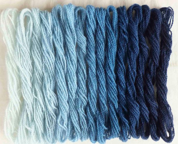
Author’s indigo-dyed wool yarn, using increasing vat strength

Putting Browning firmly aside, I happened across a reference to William Gladstone’s Studies on Homer and the Homeric Age. Gladstone (1809 – 1908) was a British Liberal politician, three times Prime Minister, living at a time when politicians digested more than soundbites.

Gladstone studied the Iliad page by page, and as he did so he recorded the occurrence of words for colour. What he noticed was rather remarkable. He came across much mention of black, some white, less red, very little yellow, tiny amounts of green…but no blue. Was Homer ‘colourblind’, or unable to perceive colours? Were all Greeks the same, and their perception of colours (and the words to describe them) inherited, building over several generations? It left me wondering whether Astarte’s eyes could have been blue if there wasn’t yet a word for it, which was a head-spinning prospect.

Lazarus Geiger (1829-1870), a philosopher and philologist, took Gladstone’s research further and studied other ancient texts (for instance, Icelandic sagas, Vedic literature, and the original Hebrew version of the Bible) finding that none of them contained a word for blue. Geiger concluded that across ancient cultures, words for colour developed in an oddly consistent order. Black was always first, followed by white, red, yellow, green. Blue came next, eventually.

If this intrigues you, I suggest you listen to the Radiolab broadcast linked below. It makes more sense of it than I can here, but still left me wondering what exactly was being said. One of the programme’s guests is linguist Guy Deutscher. Listen, particularly, to the account of his little daughter trying to name the colour of the sky.

buddhist_edited-1

Author’s watercolour from sketchbook, 1995, recording the many dyed colours and fading shades of Buddhist monks’ robes in Sikkim and North India

My head can’t get itself round the concept that without an object to attach it to, a colour didn’t ‘exist’ and didn’t acquire a name. But that’s partly what is being said and it leads me to dyeing, and the need to name colours. I was dyeing felt last week, trying to achieve a good range of reds. I used different amounts of mordant, varied the percentages of weld, cochineal and madder and overdyed in different sequences. Small variations occurred in the reds and I sought to describe these to a client in words. Colours need adjectives like ‘bright’, ‘dark’, ‘dull’ etc but one inevitably ends up with a comparison to a universally understood coloured object, such as a poppy, a pillarbox, a brick, a patch of rust, a rose. We take this for granted but it’s very sophisticated, relying on a well-established set of understandings. We often need an object when we describe colour.

In her book Tintes y Tintoreros de América, Ana Roquero records the many changes that took place in Central and South American textile practice during the Spanish colonial period. One of the imports from Spain to the New World was an entire vocabulary for textiles. As well as words for machinery, tools, technical terms and cloth and fabric, this included words for colour. These colour words are still alive in parts of Latin America amongst mestizo weavers and dyers, when their use in today’s Spain is long lost.

In this case it’s the itinerant word that has preserved the colour, and I find that fascinating.


Links

Radiolab broadcast ‘Why Isn’t the Sky Blue’ here

The Himba and the perception of colour Anthropology and the Human Condition: here

Books:

Roquero, Ana, 2006, Tintes y tintoreros de América: catálogo de materias primas y registro etnográfico de México, Centro América, Andes Centrales y Selva Amazónica, Ministerio de Cultura, España

Deutscher, Guy, 2010, Through the Language Glass, Heinemann

Comments

Please also check out the very interesting links offered in comments for this page. Many thanks to those who have written and included them


2 Comments

Year Ending

How long have I been dyeing? Not as long as I have been rubbish at maths. A recent experience, when I messed up percentage calculations of mordant, has reminded me how useful it is to keep records. (If you aren’t a dyer, these percentages refer to the mordant weight required against the fibre/fabric weight to be dyed).

My end-of-year project has been to test my Rubia cordifolia, or Indian Madder. I ordered it in the summer from KMA Exports of Tamil Nadu, but haven’t yet had time to use it. A week or so ago I mordanted two Merino wool scarves, calculating the mordant at  8% alum + 5% cream of tartar. Only it wasn’t: my notebook later confirmed I had mordanted at about 1% each. Results on the first set of dyeings were disappointing (it was a surprisingly good red, considering inadequate mordant, but certainly not eye-popping) so I checked out my notes and revealed the serious mistake.

At this dark end of the year I was hoping to dye the cheery Meltdown Orange achieved with Indian Madder on the Carmarthen Association Summer School Workshop, run by Deb Bamford, in 2013. In trying to convey Meltdown Orange on this blog, I hit a regular problem. Colour inaccuracies accrue between camera, screens and editing programmes. Obviously, colour portrayed via a screen isn’t going to look the same as the actual item, but my phone and camera come up with strange slants on reality which I often have to rectify when trying to pin down a ‘true’ colour. It can be vital if I’m working with a researcher or conservator, or a client who needs to know the exact colour of a scarf they propose to buy.

There are three images below. In the image of wool dyed with Rubia cordifolia from Carmarthen (image 1), the colour on my screen is as near as possible to the original yarn I hold up against it. That’s because I fiddled with the settings. I have no idea what you will see.

I had a nerdy idea. With the MyPANTONE app on my phone, I used a photo of the dyed yarn to see how MyPANTONE could analyse the colour range. Image 2 is a screenshot from MyPANTONE. By the time the image has cybered from the yarn to the phone to MyPANTONE to email to an editing programme to WordPress and the screen I see here, it seems that the image had shifted to something stronger and sharper. On the app itself, I had selected what I thought were three typical ‘hues’.  This is done in the same way as an ‘eyedropper’ is used to select colour on an editing programme. The colours I chose were Warm Red C, Pantone 179 C, and Pantone 171 C. They are shown at the bottom of the screenshot (image 2) and seemed a reasonable representation of Meltdown Orange seen through my own, and MyPANTONE’s, eyes.

From a former life in the graphics industry I retain a printed Pantone set of colours. I checked the MyPANTONE colours against my printed set and compared the yarn to each printed colour. Warm Red was ‘too red’, Pantone 179 was brownish and Pantone 171 too weak. But Pantone 172, one shift away from 171, was an accurate representation. This is shown in image 3.

I am not sure what any of that proves, except that colour is a tricky old business.

Silks and wool dyed with various strengths of Indian Madder (and correct mordant)

Silks and wool dyed with various strengths of Indian Madder (and correct mordant)

Reverting to the dyepot story, I repeated the dyeing with correct percentages of mordant and was rewarded by much sharper and more intense orange-reds, on silk and wool. As well as recording the mordant I kept notes on the percentage of dyestuff needed to achieve deep shades on the scarves and found it to be higher than expected – at about 20%. That’s one fifth of a weight, I shall remind myself. I’ll try to do the calculations better next time.

Links: My blog about buying Rubia cordifolia here.

KMA Exports

Deb Bamford (The Mulberry Dyer)

MyPANTONE (for iPhone)

MyPANTONE (for Android)

Pantone UK


5 Comments

A Scottish Post

I’m just home after a fortnight in Scotland, which started at the annual DHA (Dyes in History and Archaeology) conference at the University of Glasgow. I tend to know people by their research – and that’s how they know me. Someone at DHA greeted me as Mrs Orchil: she could also have hailed a Dr Indigo, a Ms Madder and Professor Purple. It’s a friendly conference attended by many world experts in the fields of dyes and pigments, but it welcomes independent scholars like me as well as dyers and textile makers.

I wasn’t giving a paper this year so it was an entirely stress-free conference and I sat back and enjoyed it, or at least, all the bits I understood. There are always some technical papers at DHA concerning dye analysis; the ones packed with acronyms, graphs and molecular structures streak comet-like above my head. But factual gems can lurk amongst figures and statistics, so it’s worth not totally tuning out.

I took a small ‘suitcase’ exhibition with me about orchil and my research studies; most delegates came to look at it and talk to me, and as a result I learned new things about orchil from new perspectives.

The conference tour, after two packed days of papers, took us to Glengoyne Distillery for a fortifying wee dram preceding a tour of the plant, and thence to Stirling Castle where we visited the Tapestry Studios to see the final piece in the Unicorn Series nearing completion.

Sherry and tannins

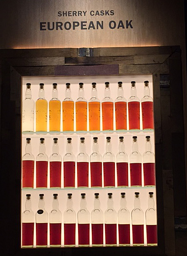
The Glengoyne tour outlined the lengthy procedure for ageing whisky in casks. Casks are made from different types of oak, but have once held sherry (and some, if I remember correctly, Bourbon). The ageing whisky gradually absorbs colour and flavour from the sherry, and the tannins in the oak cask. The two images above illustrate ageing over thirty years in two different types of cask, with coloration intensifying every year. Evaporation is also evident, with around half the liquid being lost over the period. This lost alcohol is called ‘The Angels’ Share’.

Textile Tweets

About the pictures

Above is a small selection of textile-related images from Scotland, most of which I tweeted during our trip. My obsession with dye lichens was rewarded by finding Ochrolechia tartarea alongside Loch Ewe, and Lobaria pulmonaria  at Oban; Parmelia saxatilis and P. omphalodes were growing at many locations.  Note: I was looking, not collecting. A Gaelic-English Dictionary in a hotel room confirmed that in Gaelic crotal refers to boiling water method lichens, but corcur to orchil lichens. If you want to know what orchil is, or read more about my research and views on dyeing with lichens, please visit this page.

Turkey Red

I spent a week with Deb Bamford (aka The Mulberry Dyer) learning how to dye Turkey Red at a Summer School in 2013. Read about it from this blog post forwards. In Scotland I found remnants of the Turkey Red industry buildings at Alexandria, on Levenside. There is a great website about the Turkey Red industry here. And read this wonderful book:

Colouring the Nation: The Turkey Red Printed Cotton Industry in Scotland c1840-1940 by Stana Nenadic and Sally Tuckett. Published by National Museums Scotland. From Amazon here.

Unicorn Series: Stirling Castle and West Dean Tapestries

For more on the Unicorn Series, go here for the Stirling Castle story, and here for West Dean’s version.

 Glengoyne Distillery, Dumgoyne Glengoyne Distillery


Leave a comment

Summer schools…

No posting recently because I’ve had a month of intensive teaching followed by intensive feet-putting-up. I ran three courses at Ardington in Oxfordshire and then four days in Nether Stowey at the studio of Janet Phillips.

At Ardington School of Crafts I taught my synthetic dyes shibori day, plus two one-day (repeated) courses on natural dyes. The natural dye course is a taster to a fascinating subject with some practical work at the dyepots, but also intended as an eye-opener to textiles seen at a stately home, museum etc. It’s even relevant to looking at paintings: I often wonder what dyestuffs were used on garments represented (with pigments) in a historic portrait. We had to move fast, with all fibre and fabric pre-mordanted, and an indigo vat ready to go. Most students dyed a scarf using simple immersion methods. We used madder, weld, cochineal and two indigo vats (one weak, one strong).

At Nether Stowey, I taught a three-day-dye course to several of Janet’s graduates from her Masterclass.  On day one they learned some shibori folds using steam-fixed dyes; day two gave them a taster of wax resist, and day three was a full day with indigo. At the same time as I taught dyes, Janet was teaching ‘shibori on the loom’ to students from the London Guild. In this technique, removable weft threads are incorporated into the weaving. They are later used to draw up the cloth tight. According to how the shibori threads are woven, patterns emerge after the piece is dyed, then opened up.

Students used coloured and plain warps, on different pieces. Some of this shibori work was put into my indigo vat on day four; others used Janet’s fibre-reactive dyes which were applied by placing woven pieces into a short length of gutter (brilliant idea) and painting by hand.  I am used to folding, tying and clamping for indigo work and although I have seen loom shibori before, I haven’t watched the whole process from start to finish. A combination of enthusiastic and knowledgeable students,  Janet’s teaching and the imaginative arrangements made by Janet and Nigel made for a very enjoyable week. Did I mention glorious weather?


Many thanks to students at Ardington and Nether Stowey for permission to use images of their work.

Teaching in 2015

Dates of next years’ courses are accumulating. I will be tutoring two courses at the Association of Guilds of Weavers, Spinners and Dyers Summer School in August 2015 at Moreton Morrell. Details of the entire event can be seen here and there are details on this page.

I am teaching a new one-day introductory course in wax-resist at Ardington School of Crafts in 2015 as well as days on shibori scarves, indigo dyeing.  The Vibrant World of Natural Dyes proved very popular this year and I will be teaching it again in 2015: I have one course at West Dean scheduled for March. If you want to sign in, do so soon because my October course has been full since April.


4 Comments

Oddments

photo

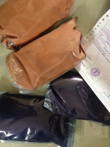
Packs of indigo and Rubia cordifolia, (Indian madder) shown with Phytosanitary Certificate

My latest excitement is today’s arrival of a parcel from India, containing indigo and Indian madder (Rubia cordifolia) from the excellent KMA Exports. I am sharing the consignment with a friend because the freight is expensive and costs more than the dyestuff, but it took just one day to arrive from Tamil Nadu. Sometimes a parcel takes longer from Okehampton. It would have been here earlier but import regulations into the UK now require fumigation which takes a bit longer; the Phytosanitary Certificate confirms that my consignment is free of Khapra beetle (Trogoderna granarium) and other quarantine pests.

Having tried Rubia cordifolia with Deb Bamford at Summer School last year I can’t wait to have another go. It produced the most astonishing colour on wool.

A highspot of recent weeks was a short trip to Finistère in Brittany, in the glorious weather also enjoyed in the UK that week. I enjoyed seeing fine examples of Breton embroidery, something about which I knew nothing, in the Musée Bigouden, Pont l’Abbé. There is an informative page about traditional Breton costume here from which I’ve learned a lot. You can see a photo of the embroiderers of Pont l’Abbé at the top of the page. Until I studied the caption I thought it was a very old photo, but it is dated to 1976, when I was about the age of some women in the picture. Perhaps that does make it a very old photo, come to think of it.

Several walks along the coast west of Douarnenez offered stunning views over the sea and as always, I was on the lookout for lichen. I don’t collect it, but I like to find it; my views on actually using lichen for dyeing are here. A knowledgeable colleague has told me that one of my images probably shows an orchil lichen, one of the Roccellae, which cheers me up now I’m back and the weather has changed.

The historic cork floats and netting tools, which I found rather beautiful, were in the window of shop selling fish in Audièrne. Without a given explanation, I must assume the carved names once indicated owners of nets. When I lived on the west coast of Scotland I remember several vitriolic exchanges over ownership of creels, buoys and nets. This appears to be a simple way of marking equipment.


I’m teaching three courses at Ardington School of Crafts from Wednesday. Natural dyes on Wednesday 9th and Thursday 10th, and shibori with synthetic dyes on Friday 11th. If you’re coming, I look forward to seeing you there.