Isabella Whitworth

probably more than natural and synthetic dyes, wax, resists, and history


4 Comments

Blue and Black

Indigo pigment

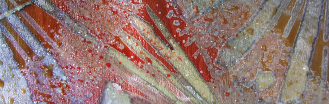
I’m trying to use my Japanese indigo (Persicaria tinctoria) before frost hits and kills it, and it won’t be long. I planted it late this year and have only managed 5 ‘picks’ which were made around 15 days apart, to allow for regrowth. I had enough prepared work to dye in the first vats, but for the last two ‘picks’ there was nothing ready. Not wanting to waste the precious crop I have endeavoured to make pigment, which basically involves reducing (by evaporating) the indigo, in its alkaline, oxygenated state, down to a thick paste, and then powder. This can be reconstituted into a dye vat at a later date.

A friend helped me with basic instructions but mostly I had to experiment. I probably wasted some indigo because I didn’t find a way of filtering efficiently. There also seems to be more leaf material in it than I hoped as it looked greeny-blue at paste stage. In a hot, dry climate like India shallow containers of liquid evaporate fast but here it took days, even on the top of the central heating boiler. It was a race to evaporate the goo before it went mouldy. I forgot to weigh the leaves but I think there was about 1 kg, which reduced to 5.3 grams of indigo pigment. There is a full explanation of the way I process Japanese indigo before the evaporation stage here so I won’t repeat the method.

Bideford Black

With pigment-making on my mind, I went to see the new exhibition at the Burton Art Gallery and Museum at Bideford. It’s called Bideford Black: The Next Generation and it centres on a rare and beautiful black earth pigment which emerges from the North Devon cliffs. In the past ‘Biddiblack’ (as it was known), has been used in paint manufacture, for making mascara, camouflaging military vehicles, in boatbuilding etc., and commercial mining for it continued until 1969. Artists working in a traditional manner, or with traditional materials, have valued its velvety dark strength and subtle tones. I had a chance to try it in the Burton Gallery last week, as can all visitors to the show. Bideford Black: The Next Generation is an unusual and unconventional exhibition and it’s certainly not traditional: participating artists responded to the pigment in diverse and often thought-provoking ways. Links below.

I wanted to find out if the pigment could be painted onto sized cloth and the exhibition organisers offered me some Bideford Black to take home and try out. Using a rare pigment 300 million years old was moderately inhibiting and my efforts also felt stuffy and old-hat after seeing the exhibition. Nevertheless, stuffy and old-hat is what I do, so I got on with it.

Using the soya milk recipe generously published online by John Marshall (see link below) I stretched and sized silk and cotton and worked experimental pieces. I wasn’t trying to make anything, just seeing what the pigment would do. The black was initially ground in a pestle and mortar and then mixed with more soya milk as a binder. I found that a small amount of gum arabic assisted in holding it together, stopping moisture bleeding outwards from painted shapes. The fabrics now need to cure.

Finally in this tale of blue and black, I was lucky to book a place on a monoprint workshop run at The Burton by Grizel Luttman-Johnson. We inked up perspex plates with Bideford Black printing pigment, which Grizel had prepared by grinding and mixing the Black with a binder and linseed oil. We then placed paper on the inked plate and made drawings on the reverse of the paper. Pressure caused ink to be picked up and an impression made on the front of the paper. The plate could be used again to pick up a ‘ghost print’, which created a kind of negative image. It was a very enjoyable day, well-led by Grizel.

Some links to the Blog for Bideford Black: The Next Generation 

The Geology of Bideford Black

The Nature of Black

Next Generation: Artists Selected

Launch and work information

Related links

Teachers’ Resource on North Devon Minerals

Grizel Luttman-Johnson

I am indebted to Michel Garcia and John Marshall for their freely published information:

Information on Michel Garcia’s DVD on natural dyes here

John Marshall instructions for making soy milk here


4 Comments

Thinking Positive

If you signed up to my blog solely on the basis of posts on natural dyes and history, I offer apologies. This is about neither.  As well as researching the history of natural dyes (in particular, orchil), I still produce work as a textile artist. Some of this uses natural dyes, but I also work with synthetic dyes on silk for resist techniques such as wax and shibori.

The Devon Guild of Craftsmen is holding an exhibition called Life Illustrated from 2nd October – 15th November 2015. Sketchbooks are the theme of Life Illustrated, showing them both as source material and as part of the creative process. A number of Devon Guild members are contributing new work, plus their precious books.

My training as an illustrator in the late 1960s was drawing-based, and I have used sketchbooks as source material for over 50 years. For Life Illustrated I decided to revisit an ‘old’ design and see how it adapted to current techniques and materials.  Back then I was using a simple gutta outliner to draw the design and control the dye. Now I prefer to use wax. The design was based on drawings I made of fritillary butterfly wings. Here are sketchbook studies from 17 years ago:

The design formula divided the scarf into about nine sections. A sinuous line bisected all sections, running down on the scarf’s vertical. You can see this drawn out in the sketchbook images above although the scarf is imagined from the side. Shapes either side of the sinuous line are either ‘positive’ (dark on a light ground) or ‘negative’ (light out of a dark ground). This polarity swapped from side to side and line to line. It was logical to look at, but entirely silly to explain. Below, you’ll find a sketch showing the basic structure.

Although I sometimes archive samples, I don’t have any of Fritillary. They were large, on very good quality silk and they sold well. So I was probably too money-grabbing to keep one, which I now regret. All I have left are sketches and a rather poor image rescued from my old website.

For the exhibition Life Illustrated I made new sketches to remind myself of what had inspired me. Then I stretched a scarf, dyed the background and outlined the design with wax – in much the same way as I remembered doing with gutta. I found I was able to reproduce the old design pretty well, although the quality of the outlining wax marks is looser than with gutta. That’s not a problem with this design. So I went ahead and made two or three scarves.

One of the reasons I became tired of gutta is that it is an outlining process. All design elements are drawn carefully with the gutta pen, and dye is filled in up to the gutta line. It’s a tight technique – even a bit tedious at times because one is often reproducing a pre-planned scheme. The reason I love wax is that spontaneous brush marks can create the shapes in a design (by instantly blocking out further application of dye). Of course, one can use wax tools such as tjantings or kystkas to draw outlines, just like gutta. But I find larger waxed marks more expressive and the design evolves in a more fluid way. So my next step was to try to adapt the old design to this preferred use of waxed marks instead of outlines.

I soon realised that ‘block-out’ marks needed more space around them than the simpler outlined shapes I used years ago. Large brush marks are often textured, oddly shaped and  ‘whiskery’ at the edges. In the same nine-section format, my next waxed scarf looked crammed and overcrowded. I reduced the number of horizontal divisions to five and it works better, but that’s as far as I’ve got. I’m not done with it yet.

Positive and negative: To make the ‘negative’ marks (lighter on a dark ground) I make a large waxed shape with a brush that blocks out the background. Then the background is dyed around that mark.  To make ‘positive’ marks (darker on a light ground) I create an island of unwaxed silk surrounded by a sea of freely waxed marks.

Teaching: On Sunday I’m off to Warwickshire to teach at the Summer School of the Association of Weavers, Spinners and Dyers. I’ll be running two courses back-to-back introducing wax resist on silk.

I will be teaching three times at West Dean next year (March, May and July) but if you want a place, please book early. The March course already has a waiting list.

I’m also running a one-day introduction to wax resist on silk at Ardington School of Crafts next month (September). Please contact these venues for information (links below) and see my courses page.

Links

Devon Guild of Craftsmen

West Dean College

Ardington School of Crafts

Association of Weavers, Spinners and Dyers


4 Comments

Made Not Manufactured: Steve Kenward

Back in 2011 photographer Steve Kenward started on a mission. It was to be an unfunded personal project, of more or less infinite scope, which he called Made Not Manufactured. His idea was to travel the British Isles to photograph ‘people that use traditional crafts to make something that still has relevance today.’ Steve’s paid work as a freelance photographer would fund the entire project which includes his travel, accommodation, and any other personal expenses.

He put the word out for craftspeople / participants through the Heritage Crafts Association (HCA) and soon found that makers of objects such as baskets, boats, rakes, bowls, knives and clocks began to contact him. You can see the results of this committed photographic portrait of British craftsmanship on Steve’s website here.  I contacted him as a dyer, and feeling that natural rather than synthetic dyes were more relevant to his ‘traditional’ aims, I made an indigo vat from my crop of Persicaria tinctoria for his day in my dyeroom. Up in my studio I worked with a beeswax resist on the beginning stages of a silk scarf. With Steve’s permission I am including some of his images below.

Steve has photographed 43 craftspeople (plus 13 dogs, including mine) and travelled 5,300 miles – at the last count. Until yesterday, I believed his arrangement to exhibit the complete body of work at the Weald and Dowland Museum in Sussex in August was still going ahead. It seemed the ideal venue to celebrate the work of so many makers, some of whom were prepared to demonstrate their craft, and show Steve’s unique collection of photographs. But something has gone seriously amiss; it seems there is no funding to support the exhibition project and the arrangement has been cancelled.

_MG_5484

Craftsperson’s dog. Now my  iPhone screensaver  © Steve Kenward

I feel disappointed for Steve who has worked extremely hard to achieve his aims. He is an unobtrusive but enquiring observer as his photographs demonstrate but also a delightful guest: even the dog approved, although she took exception to having a tripod in the house.

Steve is now looking for another exhibition venue for this body of work. If you know of somewhere suitable, please contact Steve through his website and while you’re there view other images of his impressive project.

Footnote: I resolved that my dog would never appear on this blog, but here she is, as seen by Steve Kenward. As today is her 100th birthday in doggy years, I think there is something to celebrate.


3 Comments

Installations, pasties and Turkey red

I’ve found a link between art installations and our family’s Pasty Evaluation Test. We live in the South West, the traditional home of the pasty. Most local bakers produce pasties and whole businesses are devoted to their making, including one of our favourites, The Original Pasty House in Tavistock. What is the Pasty Evaluation Test? Taste and healthy ingredients are part of it, but the initial stage is to check how many bites it takes before you achieve something other than pastry-coated air.

It’s the same with installations. I’ve seen many that beckon appealingly but prove increasingly unrewarding and wearisome post-first-bite. I don’t want to pre-read screeds of explanation telling me what to think, so if an installation doesn’t communicate after a decent period of interaction, then for me it’s a non-starter. 

I remember some good ones such as Jaume Plensa’s gongs at The Baltic in 2002. (Note: YouTube link shows them at the Yorkshire Sculpture Park where they seem arranged in a different way). They glowed in changing light and there was a timeless, temple-like quality to the space where silence and sound defined each other. People sounded the gongs with great intensity and contemplated powerful reverberations. Others seemed embarrassed to hit the gongs, as if they needed permission. A further cohort transformed into delighted children, shattering reverence with indiscriminate boing-ing and restaging the experience as wicked fun. It ended up as much about watching people as listening to gongs.

Not quite on the same scale, but I did enjoy two installations at the Devon Guild of Craftsmen this week. The first was Tina Hill’s Excavating Babel, a striking, tall spiral of over 2000 once-discarded books set in dust on a dark plinth. The books had been stripped of their covers, and thus identity, revealing a structure of sections and linen stitches, showing that books are, or can be, sewn together.  Created with books set uniformly with spines outwards, the inner spiral could be entered. It enclosed, isolated and insulated the visitor with a dense paper barrier. One was aware of millions of pages of muffling, unknown stuff.  What was this no-longer-needed information? There were interesting supporting notes to read, which afterwards I did. But Excavating Babel worked on several  levels without explanation, and thus passed the equivalent of the Pasty Evaluation Test.  You can see more about it on Tina’s own site here. Excavating Babel is part of the Devon Guild of Craftsmen exhibition Narrative Remains and you can see it until 23 March.

In the Riverside Gallery, also at the Devon Guild, is another exhibition called Love, Loss and Laundry.  This can be seen until March 16th. Through stitch and fabric Jacqui Parkinson commemorates the lives of destitute women and girls who worked in Devon House, Bovey Tracey. Devon House was run by Anglican nuns of the Clew Sisterhood – the notes record that they were largely a kindly organisation.  The refuge they offered allowed some girls, at least, to obtain respectable jobs in service and even to marry and have families of their own.

Women and girls were mostly occupied with laundry and sewing. Dirty sheets were washed, torn clothing darned, linen patched. But many inmates of Devon House lived or were buried unnamed. If it were not for the 1911 census records, their lives might have left no trace.  Anne Liebermann’s embroidered linen squares record some of these lives in the delicate red cross-stitching of their names from the census. Jacqui has sewn these onto squares of an old bedspread where layers of old fabrics can be seen. The squares resemble the padded fabric the girls would have used to hold an iron and the names are haunting and moving.

I have just enjoyed reading ‘Colouring the Nation’, a book about the Turkey red industry which set up along the Clyde and Vale of Leven in the nineteenth and twentieth centuries. One of the fabrics in the installation (the one on the right, above, with the fan) looked very like a Turkey red or Turkey red derived pattern, and the dates fit.

Thanks to the Devon Guild of Craftsmen and the artists involved in the two exhibitions for permitting photography of their work.

book

Colouring the Nation: The Turkey Red Printed Cotton Industry in Scotland c1840-1940

by Stana Nenadic and Sally Tuckett. Published by National Museums Scotland

From Amazon here

There is an associated website which is well worth a visit for its text and searchable images. There are 501 available to see from the full 40,000 contained in the pattern books now held by National Museums Scotland.

http://www.nms.ac.uk/turkey_red/colouring_the_nation.aspx


Leave a comment

Poly-heading: and that’s not funny

Poly-heading

No, that’s not something that nasty pirates do*. It’s me, head-switching again. There’s a copy deadline coming up for the Journal for Weavers, Spinners and Dyers so I have had temporarily to drop the write-up of the DHA paper.  I also need to continue making scarves. One is a commission (yes, RD, there will be a choice for you!) but also a batch for the Burton Gallery and Museum, Bideford, where I am demonstrating working with wax all day on 14th December as part of their Meet the Burton Makers family programme.

The Burton Gallery and Museum, Bideford, Devon

I am a devoted fan of the Burton Gallery and Museum. I urge anyone visiting Bideford to go. I happen to love the ceramics of North Devon; they have an excellent permanent display from the RJ Lloyd Collection and I never tire of looking at it. Related to the collection is a brick-built bottle-kiln adjacent to the Gallery in Victoria Park and wood firings regularly take place there. In the images above you can see a sherd of pottery I found in our vegetable patch. There is an entire plate with almost the same pattern in the RJ Lloyd collection, dated to the 16th century, so my find is rather special and I keep looking for more of it under the carrots and chard. The historic Devon pottery tradition carries on today with the work of many local potters, including that of Clive Bowen. We have several pieces of his work at home.

The Burton has a permanent collection of watercolours and drawings containing evocative marine and local scenes but also shows touring art exhibitions of international standard. It also has rather a good and child-friendly French café…

Wax resist work

The images of the scarf in progress show the final layer of dye applied over about five layers of wax and dye. You will see that in two images there are beads of dye on the wax surface. On other images they have been removed. This is because if they dry on the wax surface, they will eventually deposit themselves on the silk when the wax melts out and I don’t like the often fuzzy, mottled effect this produces. So I wipe it off, carefully. Minute quantities of residual dye attach themselves to the textured surface of waxed shapes which produces unpredictable but often subtle textures. These I do like. The wiping-up process is rather like cleaning an etching plate before printing: I do it in a whizzy, upwards, circular motion. Thank you Mr Sellars, who taught me how to do this fifty years ago.

* Apologies to those reading this whose mother tongue isn’t English. Poly-heading is meant to be a joke – a pun – because ‘Polly’ is the name people often give to pet parrots, and as we all know parrots always sit on old-fashioned Long John Silver-type pirates’ shoulders saying ‘Pieces of Eight’. A pirate might want to knock its head off if it went on and on…

The other thing we all know is that when one attempts to explain a joke, it ceases to be in any way amusing…


Leave a comment

Madder, wool and Welsh quilts

In the dye room this morning we reground the fourth and final exhaust dyestuff for the Turkey Red samples and heated it to temperature so that it could cool before dyeing tomorrow. Debbie has hung the Turkey Red-prepared cloth in the college smoking shelter – which might well discourage smokers from entering and be very good for overall Welsh health.

smoking

Smelly smoking shelter

Many madder recipes state that one should not raise the temperature of the dyepot above a certain point or the colours will turn brown.  On the other hand, many recipes have silk or wool boiling for as much as an hour. So what’s going on?

Jill Goodwin advises a maximum of 158 F (70 C). We were careful to follow her recipe yesterday, but today someone suggested we should boil one of the Goodwin skeins to see if  it would affect the colour.

So we did, and it didn’t…. and it set us thinking where such advice originates and under what, if any, circumstances it might be true.

If you read yesterday’s blog you’ll know I wasn’t sure where we were going on our outing: it turned out to be the National Wool Museum at Dre-fach Felindre and the Welsh Quilt Centre at Lampeter.

Our visit to the museum was interesting but short and there were far too many of us for a comfortable visit. Nevertheless, I enjoyed watching the spinning mule in action, and touring the finishing and weaving sheds. Across in the field was a tenterframe for stretching and finishing cloth, and a windhouse for drying more delicate fabric. The tenterframe looked squeaky-new and unhistoric (do Ikea offer a selection?)  but gave some idea of how the field might once have looked.

I came across a set of natural-dyed yarns produced by David and Margaret Redpath who, until 2002, ran Wallis Mill in Pembrokeshire. It was the last commercial mill in Wales to dye with plant materials. The dye garden behind the wool museum was sadly neglected and overgrown with weeds, although some madder was struggling plantfully on.

The Quilt Centre at Lampeter is in the old Town Hall. Currently, and until November, a collection of antique Welsh quilts is on display with work by Kaffe Fassett and other contemporary quiltmakers. There was a time when this modern work would have held all my attention, but now I am old and grey it was the monochrome historic textiles I found the most beautiful. The collection has been put together by Jen Jones, who realised several years ago that these lovely bedcovers were being discarded as having no value. In a short address to the group, Jen said that she had once seen a farmer using an old quilt to keep a sick cow warm. The Quilt Centre exhibition was superbly done, with work suspended at different angles and heights from an immensely high ceiling. Complexities of lighting were skilfully handled so that nothing appeared overshadowed.

crossover

This collection is by Moda Fabrics and is called Indigo Crossing

In Calico Kate,  a shop for quilting enthusiasts almost next door, I found a set of printed cottons in the blue and white derived from the traditional patterns of resist-dyed indigo. These fabrics seem to be following me around: see this post from earlier this year.

A reminder to anyone following in real time that you can follow AGWSD Summer School at Carmarthen through the posts of several students here on Twitter, using the hashtag #wsdsschool


4 Comments

Shibori, sheep and the power of six

Last week I tutored a day-course in shibori techniques at Ardington School of Crafts. Ardington is a village on the edge of the Berkshire Downs. The venue is housed in a Victorian school, and its large windows ensure good light at all times. It has been imaginatively and calmly adapted for its current incarnation as a craft school and overlooks a traditional English landscape of farmland and trees. This week, with fine weather and leaves at the multiple-greens stage, everything looked at its best.

Students were introduced to the basic principles of shibori and how patterns will build in the fabric through what is a mathematical logic of repeating folds and layers. We worked principally with the equilateral triangular fold which creates hexagon-based patterns through its geometry of six equilateral triangles. I prepared a set of triangular card units showing how this repeat principle works. The positioning (and shape) of the clamped and identical wooden blocks either side of the folded fabric is represented by the white areas in my patterns. The clamping inhibits the flow of dye through the fabric. The wood blocks can be any shape – there is a pattern created by the green-painted triangular blocks below – and placed in any practical position. Block position will dictate the basics of the pattern. You can see from the image (below right) that the blocks do not necessarily prevent dye from entering the fabric beneath the clamped area. They just affect the character of the final pattern which is based on dye dilutions, deliberate drying of work, overdyeing etc.

Students ironed vertical folds in a scarf length and converted the strip to a stack of triangular folds. They checked the wood blocks and protected them with new clingfilm. This enables a clean start each time the blocks are used: wood absorbs dye readily and will mark  work that follows. I advise beginners to work with three colours only, plus dilutant, to avoid shades of mud. Some students admitted they had been sceptical that their seemingly random application of dye would create something so ordered and I think all were pleased with their results.

Below, you can see me opening up the steamer. This has to be done with considerable care, hence the somewhat stressed expression. You can see the roll of paper and scarves, which has been protected with foil at top and bottom to prevent drips entering the folds and spoiling the work. Note that the top piece of foil was dislodged as I lifted the chamber from the boiler.

Many thanks to the students for allowing me to post these pictures and to Faith at Ardington for taking the photos.

Other news: On Thursday 13th June, Jane Deane and I will be working on our dye research at Leewood for the final open-to-the-public time. We haven’t finished our research, but from Thursday on you can’t come to watch us. To check on details, see here.

With shearing time in Devon arriving, local flocks are looking cooler and in the summer-ish sun my nest of mason bees (Osmia) is hyperactive. The bees don’t make honeycombs (that’s another hexagon-based subject) but are laying eggs in the tubes and sealing them in various shades of Devon clay. We are lucky to have culm meadow locally which is filling with textured grasses in some summer sun. But tomorrow it is going to rain.


Leave a comment

Bees, baskets, beasts and the bull’s-eye rash

Because the wax I use for resist work contains a proportion of beeswax, my enthusiasm for a world of healthy bees extends to work materials. I don’t have beehives but I have several nests of bee-tubes and last year they were occupied for the first time. The bees that use the tubes are Osmia rufa, also known as the Red Mason Bee. They aren’t wax producers, but they are excellent pollinators and in the recent warmer weather we watched several of them hatching. You can see the red and yellow clay plugs that the bees make to seal the tubes. Both clay colours are local (obviously, unless bees use the bus) and typical of this area of West Devon. Some of the tubes in the image weren’t occupied last year but where you see a hole in the clay, the bees have emerged. There is an interesting download here if you want to know more about these bees.

Next weekend there is a festival of basketry at Dartington in south Devon. It’s called Basketry and Beyond and it focuses on the themes of fishing, farming and fashion. The festival features several workshops and demonstrations given by international makers, a parade, residencies, etc. A beautiful exhibition of baskets called From Bare Stems is currently showing at High Cross House, Dartington, as part of the festival. It has been curated by fellow Devon Guild of Craftsmen member Hilary Burns. We went to see it this week on a thoroughly wet day, the dripping woodland surrounding High Cross House smelling intensely of wild garlic. The two baskets shown above were loaned to the exhibition by Jenny Balfour Paul. Many thanks to her for supplying captions.

The little stone beast is not connected to anything on this page except that I like it and beast begins with B. Like the baskets, I went to visit it this week. It’s from a tiny, ancient church called Honeychurch; the building has hardly been touched since it was built in the 12th Century.

One final B. The bull’s-eye rash that sometimes develops with Lyme Disease can be seen in this link . If you walk your dog in the country (particularly where there are deer), work with sheep, or live where GP’s aren’t clued up on the disease, please read it. I noticed a bull’s-eye rash some years ago from an infected tickbite and had to go to considerable lengths to be prescribed the correct antibiotic. The incorrect antibiotic won’t clobber Lyme Disease. If I hadn’t once seen an image of this rash, I wouldn’t have known to persist and might have suffered long-term consequences.