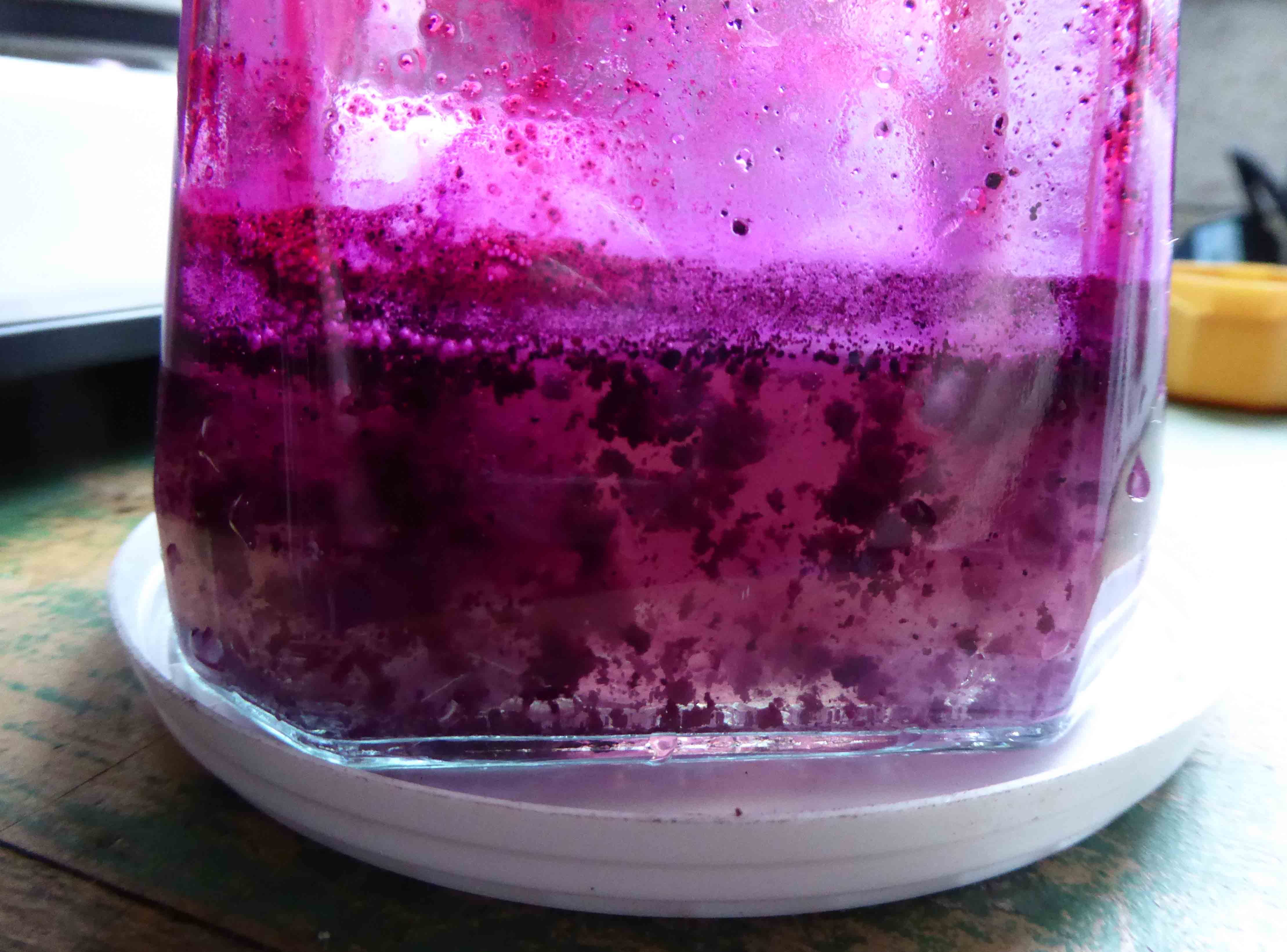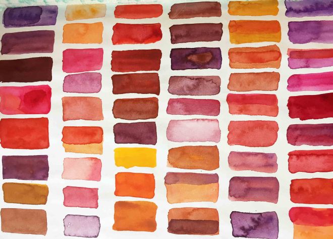
Orchil
Orchil is a beautiful, purple historical dye made from several varieties of lichens. As the image above indicates, many of them bear no resemblance to each other. Orchil dye cannot be directly extracted by straightforward soaking, as with many natural dyes, but must be fermented for several weeks in aerated ammonia. Its use stretches back to ancient times and orchil dye recipes and references appear throughout recorded history. The use of orchil is revealed by modern dye analysis and shown to be present on precious textiles and parchments, despite the fact that it is very light fugitive: it isn’t very lightfast and fades quickly to a pinky-beige, and then, visually, to virtually nothing.
The archive
I’ve not been occupied on it every second, but for the last 16 years I have been working on an industrial archive. A collection of nineteenth – twentieth century documents relating to a Leeds dye manufacturer resurfaced in my home town in Devon and I became thoroughly absorbed in its story of the enterprising Bedford family and the purple dye called orchil. The company effectively launched in the 1820s, when a young Leeds chemist called James Bedford began to specialise in manufacturing orchil and cudbear (a powdered form of orchil). This same, Bedford-run company amalgamated with others over the next 100 years by which time it was known as the Yorkshire Dyeware and Chemical Company. The Bedford family were no longer on the Board after the early 1940s but the company never underwent a takeover. In the early 2000’s, on the same Kirkstall Road site in Leeds that it had occupied since the early 1850s, Yorkshire Chemicals faced financial collapse and finally closed. Before its demise it had become a world-famous company and at one time the fourth largest dye manufacturer in the world.
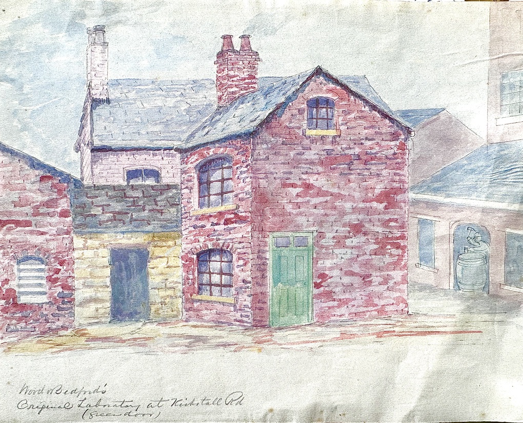
Above: Watercolour of Wood & Bedford’s original laboratory (with the green door) on Kirkstall Road. Note the cooper at work in the workshops to the right: orchil and cudbear were sold in casks
The commercial orchil trade
When my obsession with orchil began I knew virtually nothing about it. But I have since learned from and worked with several experts. I know a little about lichen species and identification; I can make and dye with orchil and I understand something of the history and relationship with other purple dyes such as murex or shellfish purple. In spite of my science-and-maths-resistant brain I have learned chemical principles by which dyes operate, how contemporary dye analysis is undertaken and something of the science behind processes. I am very grateful for the patience and generosity of scientists who have enlightened me along the way.
As my studies continued, I became uncomfortably aware of the enormity of the trade. Until the mid nineteenth century, lichen species would have been under mounting and unsustainable pressure from the commercial dye trade’s constant demand for orchil. Lichen grows slowly and cannot be cultivated, so wild material was always collected for the dye trade and as a result, lichen populations collapsed from islands and coasts and the inland moorland where they grew. Lichen gatherers were paid poorly, consequently they had to gather ever more lichen to make a living wage. This speeded up local depletion. While earlier sources of lichen may have been the islands of the Atlantic such as the Azores, the Canary Islands or Cape Verde, nineteenth century prospecting for the voracious European trade extended across continents, to India, Ceylon, South America, Africa and as far as West and East Timor.
The orchil dyestuff trade was competitive and stocks fluctuated with various aspects of supply such as depleted sources, wars affecting trade routes, etc. There were huge profits to be made by selling when the price was high, so merchants often hoarded stocks. Dye manufacturers could also sustain large losses if they had to ‘buy high’ and their manufacturing process failed. Orchil can spoil easily in manufacture and only efficient, experienced orchil and cudbear makers would be likely to survive.
Research
Back in 2008 I approached the The Worshipful Company of Dyers for some financial assistance in finding a permanent home for this important collection. As well as assisting me with a grant, they put me in touch with former employees of Yorkshire Chemicals – and a new phase of the story unfolded. Former employees had retained many documents relating to their company in the synthetic age but, curiously, knew very little of its early beginnings with natural dyes. The papers in their possession were then archived by Dr Howard Varley, a former employee of Yorkshire Chemicals, and passed over to the West Yorkshire Archive Service in 2017. They are now available for public study (see the link below). In late October 2024 I will be handing over remaining documents, largely relating to orchil. The amalgamated collections cover the entire life of the company, from orchil beginnings of James Bedford in the 1820s to the final synthetic dyes produced by Yorkshire Chemicals in the late twentieth century. The fascinating period where manufacturers faced the challenges of the new synthetic age is illustrated by patents, technical notes, sales material and financial reports. The entire archive very much reflects its times, through the company’s many achievements in science, to social and political events through the centuries that affected the life of a highly enterprising and innovative company.
Link to West Yorkshire Archive Services Catalogue here


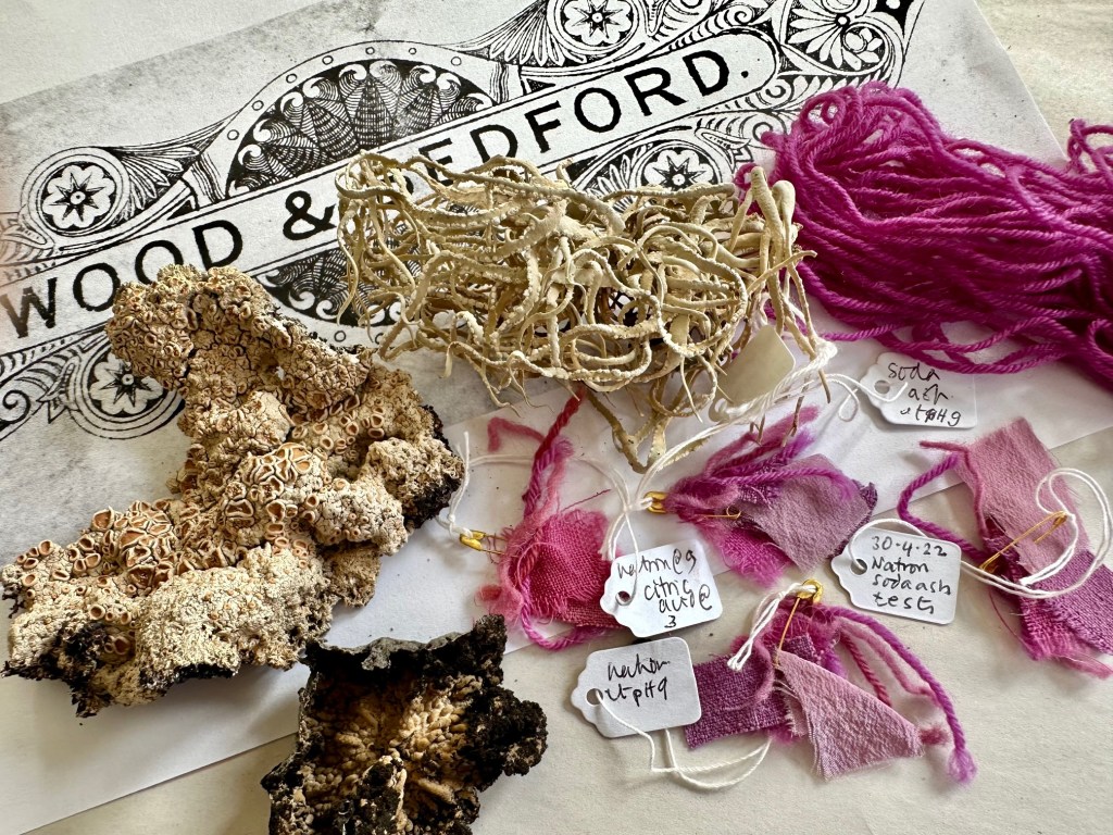
Above: A selection of items and images related to the archive of Wood & Bedford / Yorkshire Chemicals
Conservation work and publications
I have presented research at several conferences over the past 16 years, particularly at DHA (Dyes in History and Archaeology). Because of my experience with orchil dye, and as an experienced natural dyer, I have been asked to help or advise on conservation or research projects where the use of orchil has been detected in a precious object.
On this website I have published several blogs which can be found by using Search words orchil, Wood and Bedford, Yorkshire Chemicals etc, in the word cloud to the right. Details of my research and publications can be found here.
Endnote: using wild material for research in the UK
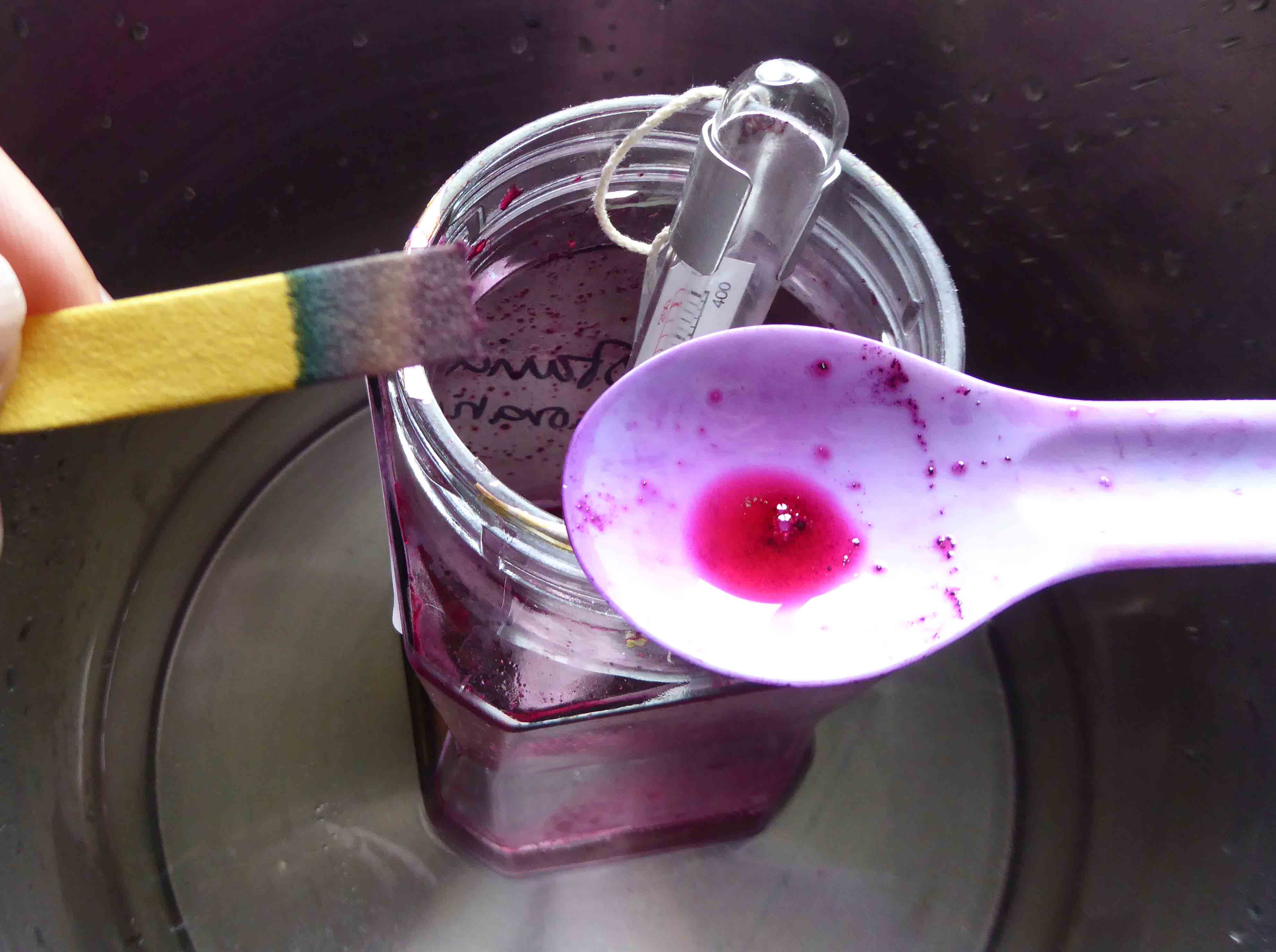
Involvement in some major conservation projects has made it necessary for me to make small batches of orchil over the last few years. These normally use about 5 grams of ground lichen per orchil batch. I have been fortunate that many dyers and friends have donated their old dye lichen collections to me as they no longer feel comfortable about using lichens of any kind in their studio work. They would prefer this increasingly vulnerable wild material to be used for conservation or research purposes and not for commercial gain. I have spent many years of my working life as an artist and dyer but I have never used lichens in my studio work.
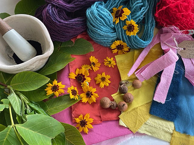
Over the past three years I have been working closely with Susan Dye and Ashley Walker of Nature’s Rainbow, Deb Bamford ASDC and Jane Deane ASDC, to research the subject of foraging for dyes in the UK. Our article on the first stage of the project was published by The Journal for the Association of Weavers, Spinners and Dyers, 288, Winter 2023. Subsequent contact with the British Lichen Society confirms that they will be issuing new guidelines about dyeing and foraging soon.