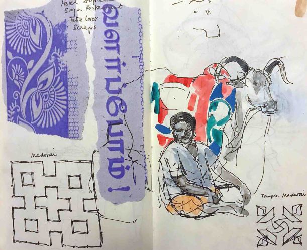
Sketchbook pages from Madurai showing kolam designs recreated after photographing in situ
I’m recently back from a few weeks in Tamil Nadu, Southern India and this post strays from dyes and textiles to celebrate kolam. Kolam are the daily drawings drawn freehand at the threshold of houses by women, using rice flour. Designs are sinuous or angular; sometimes figurative, but usually abstract. They incorporate lines enclosing series of dots called pulli. Kolam can be found in many parts of India, where they are known by other names, such as rangoli and muggulu.
Kolam have religious and ornamental significance and there are several websites devoted to explanations on their history, making and meaning – as well as their complex mathematics. I’ve put some links below but I warn you, it’s addictive stuff.
Kolam, Pondicherry
Kolam, Pondicherry
Kolam, Thanjavore
Kolam, Pondicherry
I began to photograph kolam in Tamil Nadu because I was instantly attracted to them for their apparent simplicity, only to find them much too complex to sketch accurately in a busy, scorching street. I photographed them so that I could study them in more depth and back at the hotel I found the internet generous with explanations and video demonstrations. Thus I realised (duh) that the dots were not the embellishments I had at first thought. They were the key to the structure of each kolam and created a guide for freehand drawing of the design.
One of my courses teaches students to create patterned scarves and shawls on silk using wax resist. I discourage students drawing a design onto the silk with pencil or a textile marker to follow with wax or fluid resist. Apart from being difficult to remove, it normally saps fluidity and freedom from the drawing. I have taught that the use of small guide marks can greatly assist freehand drawing on the silk. With some experience of kolam structure I will be able to pass on these examples as inspirational freehand, yet guided, drawings.
In my last blog A Purple Pursuit, I wrote about Browning’s Popularity, in which he referred to shellfish dye in a complex poem on inspiration, skill and genius. What I didn’t say, but others wisely pointed out, was the oddity of Browning referring to the dye as blue throughout the poem. Shellfish dye (from the ‘Tyrian shells’) is quite definitely purple and the colour, history and source of Imperial Purple were well known in Browning’s time. So, why blue?
Who has not heard how Tyrian shells
Enclosed the blue, that dye of dyes Whereof one drop worked miracles, And coloured like Astarte’s eyes Raw silk the merchant sells?
I scratched around many sources but failed to find a historical reference, or image, defining Astarte’s eyes as blue. Maybe I have missed something. But the Resident Poetry Advisor says that Browning was more than capable of implying non-existent references, or even inventing them. This seems most perverse, but Browning was a poet and that’s the kind of thing poets do.
Author’s indigo-dyed wool yarn, using increasing vat strength
Putting Browning firmly aside, I happened across a reference to William Gladstone’s Studies on Homer and the Homeric Age. Gladstone (1809 – 1908) was a British Liberal politician, three times Prime Minister, living at a time when politicians digested more than soundbites.
Gladstone studied the Iliad page by page, and as he did so he recorded the occurrence of words for colour. What he noticed was rather remarkable. He came across much mention of black, some white, less red, very little yellow, tiny amounts of green…but no blue. Was Homer ‘colourblind’, or unable to perceive colours? Were all Greeks the same, and their perception of colours (and the words to describe them) inherited, building over several generations? It left me wondering whether Astarte’s eyes could have been blue if there wasn’t yet a word for it, which was a head-spinning prospect.
Lazarus Geiger (1829-1870), a philosopher and philologist, took Gladstone’s research further and studied other ancient texts (for instance, Icelandic sagas, Vedic literature, and the original Hebrew version of the Bible) finding that none of them contained a word for blue. Geiger concluded that across ancient cultures, words for colour developed in an oddly consistent order. Black was always first, followed by white, red, yellow, green. Blue came next, eventually.
If this intrigues you, I suggest you listen to the Radiolab broadcast linked below. It makes more sense of it than I can here, but still left me wondering what exactly was being said. One of the programme’s guests is linguist Guy Deutscher. Listen, particularly, to the account of his little daughter trying to name the colour of the sky.
Author’s watercolour from sketchbook, 1995, recording the many dyed colours and fading shades of Buddhist monks’ robes in Sikkim and North India
My head can’t get itself round the concept that without an object to attach it to, a colour didn’t ‘exist’ and didn’t acquire a name. But that’s partly what is being said and it leads me to dyeing, and the need to name colours. I was dyeing felt last week, trying to achieve a good range of reds. I used different amounts of mordant, varied the percentages of weld, cochineal and madder and overdyed in different sequences. Small variations occurred in the reds and I sought to describe these to a client in words. Colours need adjectives like ‘bright’, ‘dark’, ‘dull’ etc but one inevitably ends up with a comparison to a universally understood coloured object, such as a poppy, a pillarbox, a brick, a patch of rust, a rose. We take this for granted but it’s very sophisticated, relying on a well-established set of understandings. We often need an object when we describe colour.
In her book Tintes y Tintoreros de América, Ana Roquero records the many changes that took place in Central and South American textile practice during the Spanish colonial period. One of the imports from Spain to the New World was an entire vocabulary for textiles. As well as words for machinery, tools, technical terms and cloth and fabric, this included words for colour. These colour words are still alive in parts of Latin America amongst mestizo weavers and dyers, when their use in today’s Spain is long lost.
In this case it’s the itinerant word that has preserved the colour, and I find that fascinating.
The Himba and the perception of colour Anthropology and the Human Condition: here
Books:
Roquero, Ana, 2006, Tintes y tintoreros de América: catálogo de materias primas y registro etnográfico de México, Centro América, Andes Centrales y Selva Amazónica, Ministerio de Cultura, España
Deutscher, Guy, 2010, Through the Language Glass, Heinemann
Comments
Please also check out the very interesting links offered in comments for this page. Many thanks to those who have written and included them
Last week I found some oak-galls, or oak apples, in a hedge. They were easy to spot after the final fall of leaves. Oak galls are nothing to do with acorns. They result from chemicals injected into a developing leaf bud when a female gall wasp lays eggs.
Oak galls spotted in a hedge
The galls contain high proportions of tannin and, mixed with iron salts, were historically the source of a purple-black or brown ink. The comprehensive and scholarly Iron Gall Ink Website has an ink history here. The fourth century Codex Sinaiticus, one of the most complete versions of the Bible, was written in iron gall ink, in Greek. Follow the link to read about a great collaborative project, and an entire website devoted to the Codex. Because the manuscript has been broken up and spread worldwide, the project exists to reunite it digitally.
Anyway, I picked the galls and am soaking them out. Apparently I can use a solution of rusty nails to make up the ink, according to Wikipedia’s recipe, and I shall try it in the New Year when I have found my Gum Arabic.
All this think-ink reminded me of an encounter with shaggy ink caps (Coprinus comatus) a few Novembers back. I found an ink-cap-ink recipe – and the delightful word deliquesce – on Regia Anglorum’s site here, recipe number 3. No cauldrons were available that week, so a plastic pot emptied of E numbers sufficed for deliquescing. The fungi did their thing and weren’t particularly smelly at first. They just looked a bit sinister (shaggy ink caps aren’t poisonous, although I wasn’t planning an omelette). I put the increasingly soggy black mixture in the corner of my studio and forgot about it. Until it began to make its presence felt.
It produced a putrid, mouldy, rotting smell which was murderously incriminating. I poured the mixture through a sieve at arm’s length and improvised a cooking put from an empty tin. If the smell was bad before, nothing compared to the hellish fumes that arose from the pot once on a stove (some recipes suggest that boiling reduces and blackens the mixture). The mixture obediently reduced to a ghastly, shiny black mucus. The stench was so bad I had to hold my breath to stop myself gagging. To hell with research like this – I couldn’t live with the smell. I poured off the mixture and found a large paintbrush and some paper and made a simple snot drawing (see below). I then introduced the mixture to the far corner of the garden.
The conclusions the Ink Cap Escapade were:
1.That the recipes I found are incomplete, or some additional ingredient neutralised the decomposition and the smell. Vinegar, perhaps? As the fungus is only found in autumn, there must have been a way to preserve the ink through the year without knocking out an entire community of Cistercians with the pong. Or maybe I’ve stumbled across a new cause of the Reformation.
2. A lot of ink caps would be needed to make a good black and you couldn’t use a quill with the snot-like stuff I made. It needs to be blacker and more runny. It was too thick for a small paintbrush. Maybe I boiled it too hard.
Lichens in a Canterbury graveyard: from my 1960s sketchbook
In my last post I started to write about orchil, and how I became fascinated by its story through my researches on an eighteenth / nineteenth century Wood & Bedford / Yorkshire Chemicals archive.
To start at the beginning, orchil (pronounced or-kil) comes from lichens. It has been used for millennia to dye wool and silk a purple colour. There is some confusion over ancient recipes for purple. It isn’t always possible to decipher which recipes refer to lichen and which to shellfish dyes. Both dyestuffs produce a remarkably similar colour, were to be found in the same areas (e.g. the Mediterranean coast) and descriptions of lichen are often a little vague. For instance, dyestuff might be referred to as a plant, or a moss, or a seaweed.
There is evidence (Pliny, Theophrastus, Dioscorides) that orchil was used in conjunction with shellfish purple and it’s a ready assumption that this was done to defraud – which of course it may have been. The processing of orchil would have been significantly cheaper than for shellfish dye. But the combination was also undertaken to produce a legitimately cheaper alternative to pure shellfish-dyed cloth. Nevertheless, orchil and shellfish-dyed cloth seems regarded with disdain because of the great and unique reputation of shellfish purple, and orchil’s tendency to fade.
The beauty of fresh orchil on woollen yarn
Orchil dye is extremely beautiful in its first, fresh bloom of colour but it normally proceeds to fade fast. It is therefore interesting to read a 2012 paper (link below) in which Casselman and Terada demonstrated that a combination of orchil and shellfish dye may in certain circumstances, stabilise the orchil. They also reported that the use of orchil as a base dye would to some extent neutralise the intensely unpleasant odour of shellfish-dyed cloth. Those facts cast an entirely different light on the historic combination of orchil and shellfish dye.
It occurs to me that in more recent days, far from being ‘poor man’s purple’, orchil could have been considered a great luxury. If you could afford the rich glories of orchil-dyed silk, and these would be obvious to all by the colour, it might indicate one’s financial indifference to fading and the realities of a soon-spoiled garment.
Dye lichens
Not all lichens will dye, not all dye lichens will make orchil. Orchil-producing lichens (and there are innumerable species) contain precursors of the dye and to make this available the dyestuff must be crushed in ammonia or stale urine and water and then kept well-oxygenated. It undergoes a type of fermentation, and the purple colour develops over several weeks.
Orchil is very sensitive to changes in pH and by adjusting vat strength and acidity, a wide variety of colours can be achieved, ranging from browny reds to reds, pinks and purples.
Crotal / crottles
There are lichens that will dye rusty reds, browns and golds. They are often referred to as ‘crotal’, (a Gaelic word) or crottle, lichen. These require no fermentation and are normally boiled up together with fibre, yarn or cloth. They have been in traditional use in Scotland for centuries and the warm, earthy smell of crotal-dyed yarn is also a moth deterrent. But crotals are not orchils!
Mordants
Neither orchil nor crotal requires a mordant although some historical recipes recommend an alum mordant for orchil.
Lichen dyes on wool. Note the use of Evernia prunastri which can make a soft pink
Once you start an orchil vat it needs regular attention
Parmelia saxatilis: a crotal dye
Yarns showing colour affected by vat strength and pH
Parmelia omphalodes: a crotal dye
Orchil dyed silk and wool samples
The Wood & Bedford Orchil Story
I found a vast number of items in the archive which related to the nineteenth and twentieth century trade in orchil. A couple of them can be seen in the previous post. The records defined several sources of orchil lichen. Around 1830 these included Scandinavia, Sardinia, the Azores, Madeira, the Canary Islands and Cape Verde. Political changes and colonial interests affected trading in the later 1800s, as did the slave trade and, eventually, its abolition. A picture emerged of a voracious trade that reached an industrial and even global scale by the mid nineteenth century. There is a certain irony in the fact that stocks of what, in effect, is a non-renewable product were saved by the synthesis of mauveine by Perkin in 1856. The demand for lichen then dropped. Nevertheless, Wood & Bedford, later the Yorkshire Dyeware and Chemical Company, continued to buy and process orchil lichen well into the twentieth century. I understand that the last unused lichen stocks went to Johnsons of Hendon who presumably used lichen to make their indicator papers.
Lichen ethics
You will see that I have learned to make orchil and to dye samples for research purposes but I don’t use it in my studio work. You can read some of my thoughts on lichen use here. I am extremely grateful to all those who taught me about making orchil and how to dye with it.
Pronunciation
How do you pronounce lichens? I say it to rhyme with kitchens. Most people and academics (ok, sorry, academics are also people) say ‘likens’. The OED pronunciation makes it official: you can say it either way:
/ˈlʌɪk(ə)n, ˈlɪtʃ(ə)n/
We made a road trip from Darwin to Perth in late 2012. Ever since, I have been trying to respond to my observations and feelings about Australian colours and landscape through my work. I didn’t want to represent landscape, although one or two pieces have recognisable elements in them, such as trees. I don’t want to blog about my thoughts when I was planning the work except to say that each has to function as a flat or hung painting, and each piece must be wearable.
This, I began to realise, poses a problem. British light + clients don’t always respond well to the colours of Australia as wearable textiles. Australian colours are often vivid, highly contrasting and very, very bright. It’s to do with the intense heat, the light, the colour of the earth, sky and sea. British wearers often choose muted and more subtle shades to wear. These suit our pallid, sun-starved complexions and go very well with incessant rain.
So I have no idea if these vivid scarf-paintings will find a UK market.
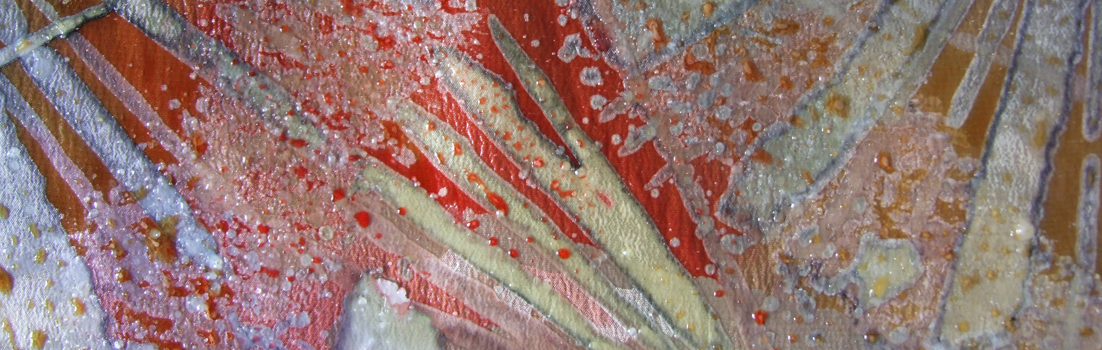
I have been working with steam-fixed dyes on silk crêpe de Chine, using wax-resist. I have layered up the wax and dyes until the fabric is as stiff as a board. Each wax layer is made from hundreds of waxed brush strokes which undulate over the surface. The layers have sometimes been 8 deep. Before I de-waxed the last piece I weighed it out of curiosity because it seemed really heavy. I found that it had lost 107 grams of wax after I had steamed and soaked out the last wax residue. The piece shown above (all the images are from the same piece) took me several days and was very time consuming, but I am pleased with the technique of multi-layered marks.
This particular piece is about the colours of Broome, Western Australia, where the desert meets the sea in an astonishing cymbal-crash of bright rusty red and turquoise blue. The landscape sketch shows patches of mangrove: crocodiles are often seen in the area.