


We made a road trip from Darwin to Perth in late 2012. Ever since, I have been trying to respond to my observations and feelings about Australian colours and landscape through my work. I didn’t want to represent landscape, although one or two pieces have recognisable elements in them, such as trees. I don’t want to blog about my thoughts when I was planning the work except to say that each has to function as a flat or hung painting, and each piece must be wearable.
This, I began to realise, poses a problem. British light + clients don’t always respond well to the colours of Australia as wearable textiles. Australian colours are often vivid, highly contrasting and very, very bright. It’s to do with the intense heat, the light, the colour of the earth, sky and sea. British wearers often choose muted and more subtle shades to wear. These suit our pallid, sun-starved complexions and go very well with incessant rain.
So I have no idea if these vivid scarf-paintings will find a UK market.
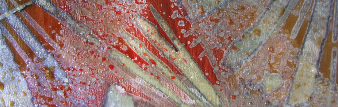
I have been working with steam-fixed dyes on silk crêpe de Chine, using wax-resist. I have layered up the wax and dyes until the fabric is as stiff as a board. Each wax layer is made from hundreds of waxed brush strokes which undulate over the surface. The layers have sometimes been 8 deep. Before I de-waxed the last piece I weighed it out of curiosity because it seemed really heavy. I found that it had lost 107 grams of wax after I had steamed and soaked out the last wax residue. The piece shown above (all the images are from the same piece) took me several days and was very time consuming, but I am pleased with the technique of multi-layered marks.
This particular piece is about the colours of Broome, Western Australia, where the desert meets the sea in an astonishing cymbal-crash of bright rusty red and turquoise blue. The landscape sketch shows patches of mangrove: crocodiles are often seen in the area.

May 6, 2013 at 8:21 pm
These colours are stunning, and I love the layered brushstrokes – gives me the impression of vivid worlds teaming with life. I know what you mean about the light here, but I am glad you went ahead anyway!
May 6, 2013 at 8:49 pm
Thanks, Cally. You seem to have picked up my brushstroke drift. Tell me – do you actively think about British light / wearers etc when you set up your loom, or dye yarn? Or are you responding to a creative impulse and just hope there will be a customer that gets the drift too? For instance, it’s many years since I dyed a scarf predominantly yellow. People don’t buy yellow scarves in the UK. Fortunately, my creative impulses don’t often include a lot of yellow so I don’t have a creative moral crisis to confront.
May 22, 2013 at 9:14 pm
Belatedly tuning back in here… I pretty much do what I want and then see if anyone likes it. I do make an effort to vary my palette rather than sticking to ‘my favourite colours’ all the time – and I guess I hope that that will increase the chances of striking the right note with someone – but I find that when I try too hard to make things that others will like that I end up with something *nobody* likes, not even me. Unfortunately for a textile designer, I am basically fashion blind (as you may have noticed from my typical garb!) and I am often quite surprised by what people do respond to, though it is really rewarding if I have taken a risk with something and someone snaps it up.
May 23, 2013 at 2:25 pm
Interesting. I learned a lesson one year looking at colour-forecasting for fashions and making several scarves – which no-one bought. Honestly, I don’t think what people like us do has much to do with fashion, although I am occasionally asked to make something to go with a suit, hat, whatever, and dutifully oblige.
As you will have observed, my fashion sense does not rise above cave-crone on a strict budget. We are clearly a thoroughly uncool pair.
May 7, 2013 at 9:18 am
The nub is possibly when you qualified the comment about “British light…” with “as wearable textiles”. As a painter, I find that people love bright colours – I often wish they didn’t quite so much. It’s the comment I hear most frequently, “I love the bright colours”; the other one, “How long did that take you?” – quite another issue. Bright colours catch the eye, and mature people, while they might like to look at them, don’t want to BE the attention, hence Northern European camouflage colours. Young people and extroverts are exceptions but they might not have the funds or aesthetic sense to buy your fine textiles.
There was an additional point I had to surmount, speaking as a possessor of one of your fine scarves and living in rural Devon: “This is too fine a thing to suffer the muck and mud(dle) of a country life” but I’ve defeated that and wear it regularly. It hasn’t suffered at all but I wonder if others are also reluctant to risk it.
If people like to look at bright colours but not wear them, would you consider creating your Broome series, not as wearable textiles but as one-off, dare I say ‘pictures’? I think they would reward an exhibition in their own right, and the ‘layering brushwork’ could then be appreciated properly. Howard Hodgkin’s flamboyant paintings are very popular and I can’t see much of a difference in conception. I realise that you’ve probably had these thoughts yourself many times but reading your piece they occurred to me again.
May 7, 2013 at 8:03 pm
Hi Richard
Thanks for taking the time to think and comment. Lots of things to ponder; some I agree with and others not. For instance, I think you are right that people ‘love bright colours’ in the abstract sense. They like to look at them in their gardens – I’m thinking of some particularly garish new-breed rose colours, and the fashion for garden planting using bright, intense themed colours (such as the oranges, greens etc in that Square Garden at Rosemoor). People also put brighter paintings or prints on their walls. But I don’t think the reason they won’t wear them is necessarily because they are adopting Northern European camouflage and are behaving like shy violets. I was only part tongue-in-cheek about our pallid sun-starved complexions and the British light. We northerners don’t always look great in bright or highly contrasting colours.
In Australia, people often do wear bright colours and it isn’t just because they are confidently Australian. It’s because they can. The bright colours instantly belong to a strong light and a more tanned skin holds its own.
You’re right about my having thought about making paintings (to hang, not to wear) in the past. There are some problems, one of which is that prolonged exposure to the elements will fade most dyed silk eventually. I don’t imagine that you ever even think about your acrylic work fading.
The irony is that inch for inch, a painting for the wall will command an infinitely higher price than a wearable textile (assuming one finds the buyer, natch). But I just don’t find myself at ease painting onto a permanently flat surface.
I wonder if we should undertake a small challenge: I’ll teach you how to dye a textile, and you dye a painting of your own using my technique. You let me loose on a small canvas with your acrylics. Might be interesting and we’d learn a thing or two? Something for Art Week??
May 11, 2013 at 9:15 am
Hmm, I’m not sure about your intriguing challenge! For one thing I never use acrylics, always oil, thought you knew that, and while it’s something to think about certainly, I find I tend to avoid challenges these days, finding life itself quite a big enough one on its own. Acrylics dry much too fast for my working methods which involve scraping back and working ‘wet into wet’ ad infinitum; and even now though I seem to work more quickly than in the past, I’ve never got on with acrylics. What you suggest seems more analogous to working with watercolour, another medium I’ve struggled with in the past. I’m afraid I am extremely technically ignorant. The problem of fading you mention is of course much the same as with displaying watercolours. Fugitive oil colours will fade and change over time too but, yes, not nearly so dramatically – it is something I think every painter considers.
I don’t understand your remark about not working on a permanently flat surface… I was thinking that you work exactly as you always do and produce what you do but have a mind to hangings instead of garments. So the same process but a different outcome. You might have to alter the format. Forgive me if I’m talking rubbish.
Isn’t what you suggest about bright colours not looking great set against pallid skin more or less the same, result-wise, as what I was suggesting: that ‘we’ choose a palette that suits us. I didn’t mean to imply that we are therefore “shrinking violets”. Strong colours can look great against a white skin, can’t they, if maybe not a pallid one, and a fashion trend dating back to Elizabethan times (vinegar, chalk and arsenic etc), picked up in modern times by the punk movement, and goths if you think about black against pure white.
On quite another tack, I came across a piece by Pavel Avetisyan, who is the Director of the National Academy of Science in Armenia. He mentions finding a 5.900 year old skirt, woven with straw. It dates back to the 39th century BC. “It is an amazing material with rhythmic colour hues.” I wonder what they used. Thanks for your continuing fascinating entries.
May 11, 2013 at 9:28 am
Apologies, Richard. Of course I knew you used oils and don’t know why I wrote acrylics. What am I like? Blame my pallid sun-starved grey cells.
You are right about the dye technique I use being closer to watercolours. The layering builds up and the last colour shows through the next. So perhaps the challenge isn’t to be.
Briefly… I don’t undersand what my problem with the permanently flat surface is either, but that’s the way I feel. Once the fabric is off the frame it moves around, and that is the aspect that intrigues me. I can paint it flat (it has to be painted flat) but as I work I build in the knowledge that it will never be viewed that way. The marks are based on an understanding that any one area might be isolated as a surface, depending on the way the fabric is draped.
I shall look up the woven straw skirt (as it were). Sounds fascinating.
Thanks for commenting!
May 11, 2013 at 11:43 am
This is a link to more about the straw skirt Richard mentioned. I haven’t managed to find an image.
http://www.stonepages.com/forum/index.php?/topic/4313-prehistoric-skirt-discovered-in-armenian-cave/
May 9, 2013 at 2:57 pm
Very exciting prints Isabella. Those colours are extraordinary and so are the marks you have made
May 11, 2013 at 9:30 am
Thanks Wendy – although they’re not prints. They are one-offpaintings. But I’m glad you like them, whatever they are.