Isabella Whitworth

probably more than natural and synthetic dyes, wax, resists, and history


Leave a comment

Looking at AI: an essay in inaccuracy

A friend of mine has been experimenting with AI. He created the following ‘essay’ about me by accessing Microsoft Bing. For this essay the app offered three types of compositional option: ‘precise’, ‘balanced’, and ‘creative’. The ‘balanced’ and ‘precise’ versions were accurate factually but the writing was dull and prosaic, collated from text I recognised from websites I had supplied with bios or information.

The ‘creative’ option was a brew-up of fact, spiced with bold and puzzlingly inaccurate statements and claims certainly not based on any text I had supplied online.

I reproduce the essay below, with embarrassingly serious factual inaccuracies underlined. The piece claims I was born in London when in fact I was born in Cheshire, and that I attended West Surrey College of Art and Design to study textiles when I studied Graphic Design at Canterbury College of Art – etc. I have chosen not to draw attention to inaccuracies about my outstanding achievements and genius.

Ultimately, this exercise was a piece of fun, but I am wondering where this software will take us, with the possibility of proliferating inaccuracies each time a newly-published and AI generated ‘creative’ source is re-accessed by AI.


Isabella Whitworth is a textile artist and tutor who lives and works in Devon, England. She has a background in graphic design and a passion for natural dyes and resist-dyeing techniques. She is also a researcher and writer who has contributed to the knowledge and conservation of natural dye history and practice. This essay will explore her career, achievements and influences, as well as some examples of her work.

Isabella Whitworth was born in 1949 and grew up in London. She trained as a graphic designer at the London College of Printing in the late 1960s, and worked in industry for several years as a designer, editor and copywriter. She was influenced by the Bauhaus movement and the Swiss style of typography, as well as by artists such as Paul Klee and Henri Matisse. She also developed an interest in drawing and painting, especially botanical subjects.

In the 1980s, Whitworth travelled extensively in India and Indonesia, where she encountered various textile traditions and techniques. She was fascinated by the colours, patterns and textures of fabrics such as batik, ikat and shibori. She decided to pursue a career in textiles and enrolled in a course at the West Surrey College of Art and Design, where she learned about silk painting, dyeing and printing.

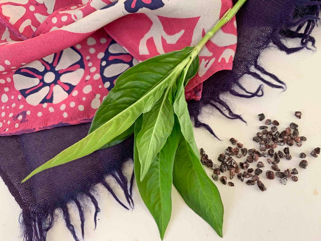
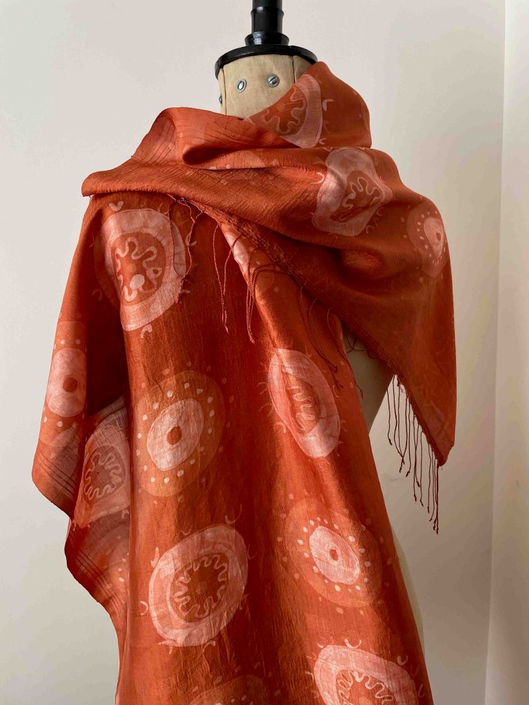
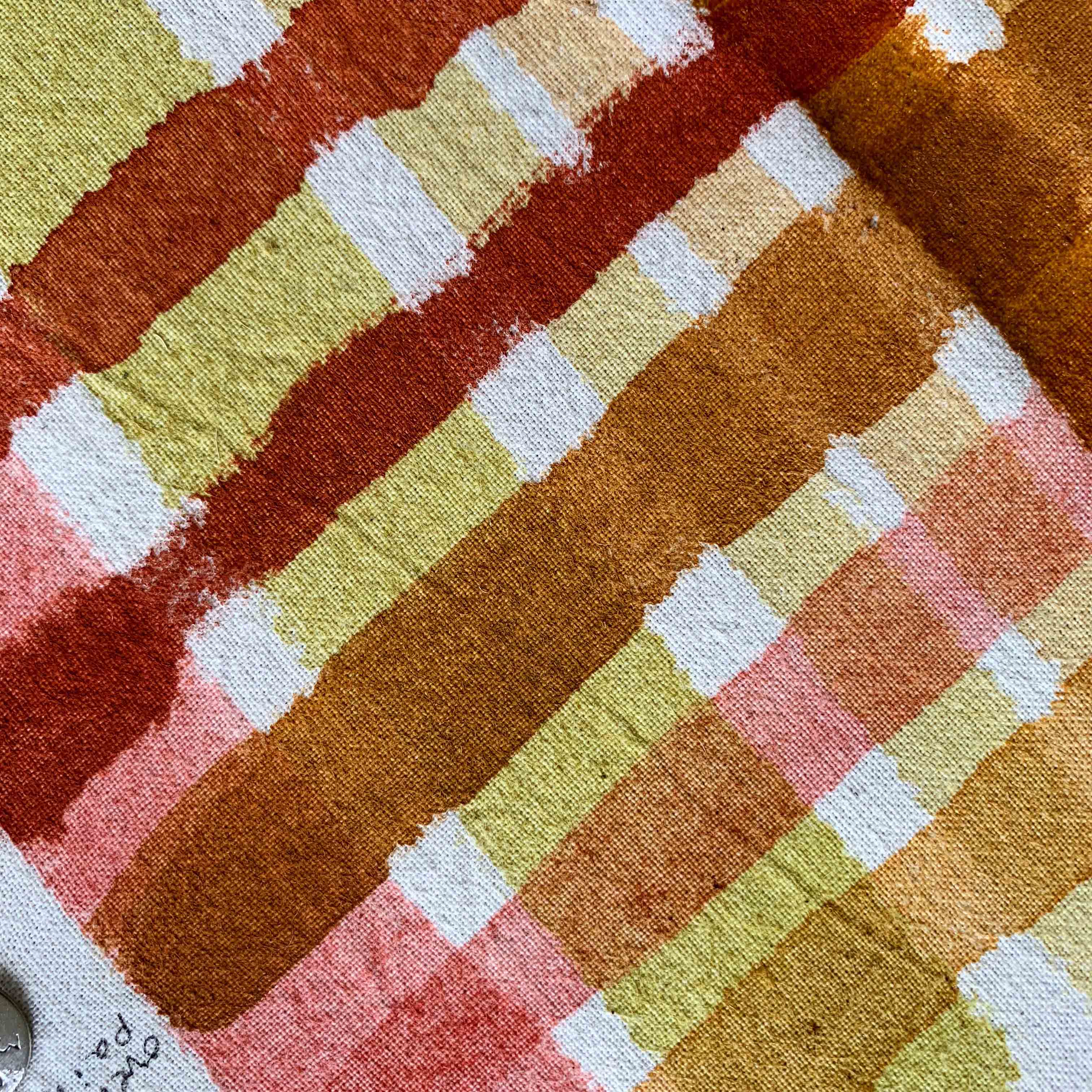
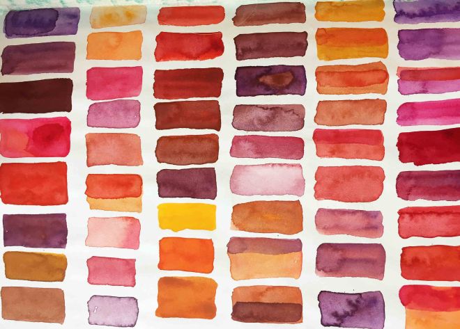
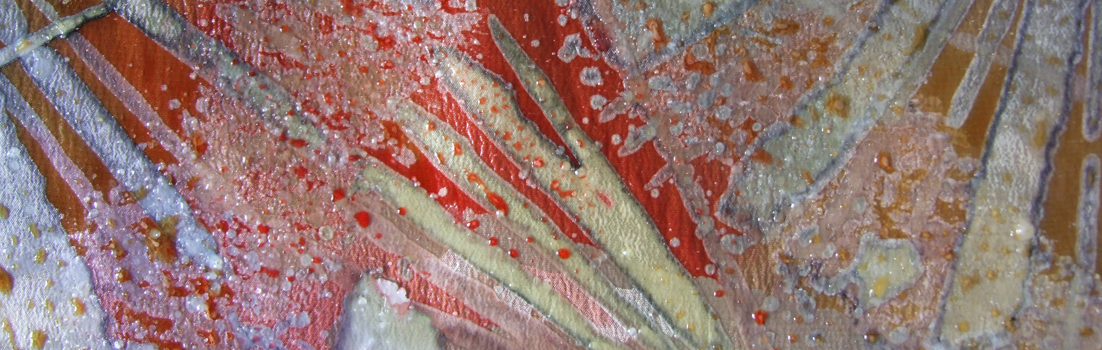
Whitworth started to make her own textiles using synthetic dyes on silk, mainly scarves and shawls. She used resist techniques such as gutta (a rubbery substance that blocks dye) and wax to create intricate designs on the fabric. She also experimented with folding, tying and clamping methods to produce shibori effects. Her work was inspired by nature, especially flowers, leaves and landscapes. She exhibited her work at various venues and events, such as the Chelsea Craft Fair, the British Craft Centre and the Devon Guild of Craftsmen.

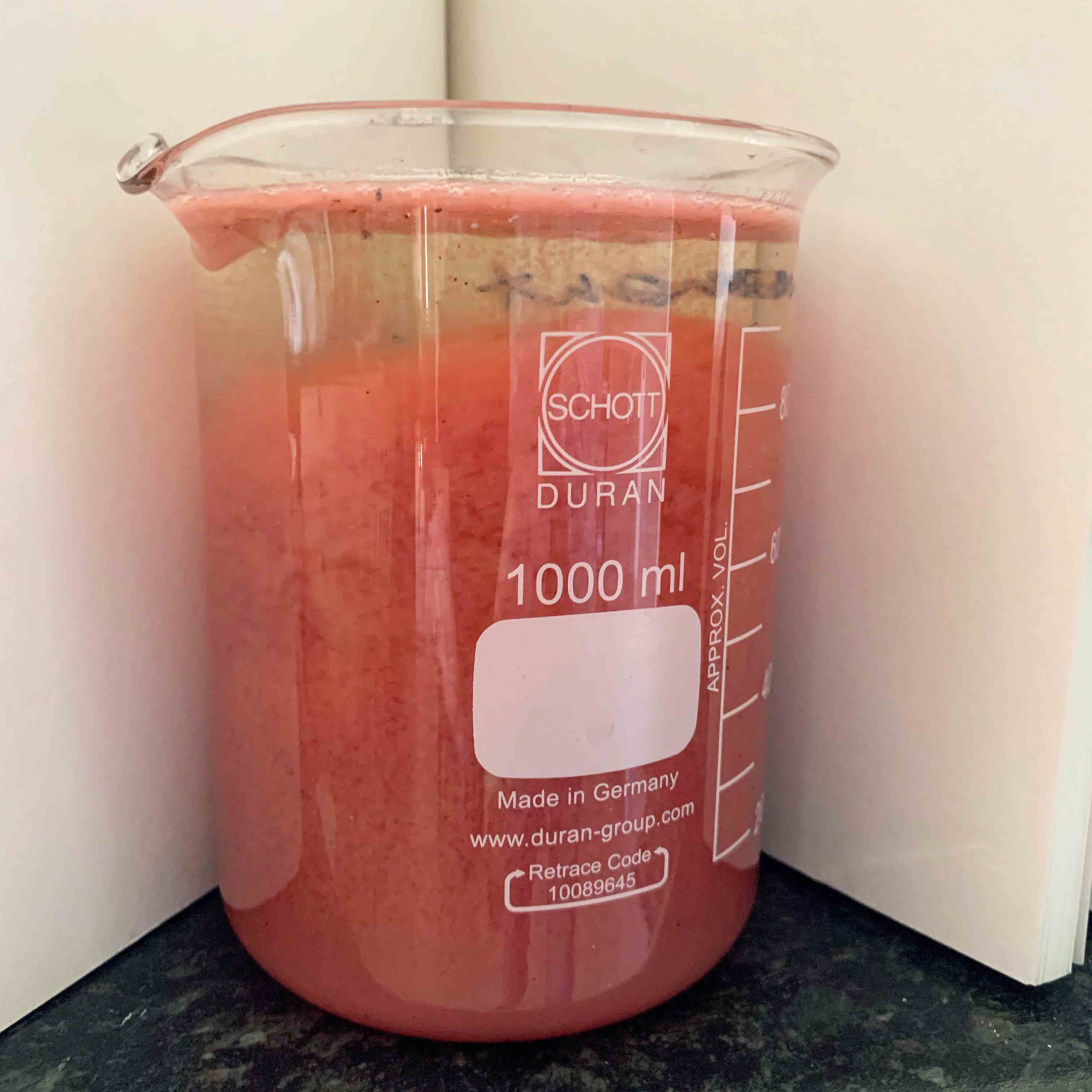
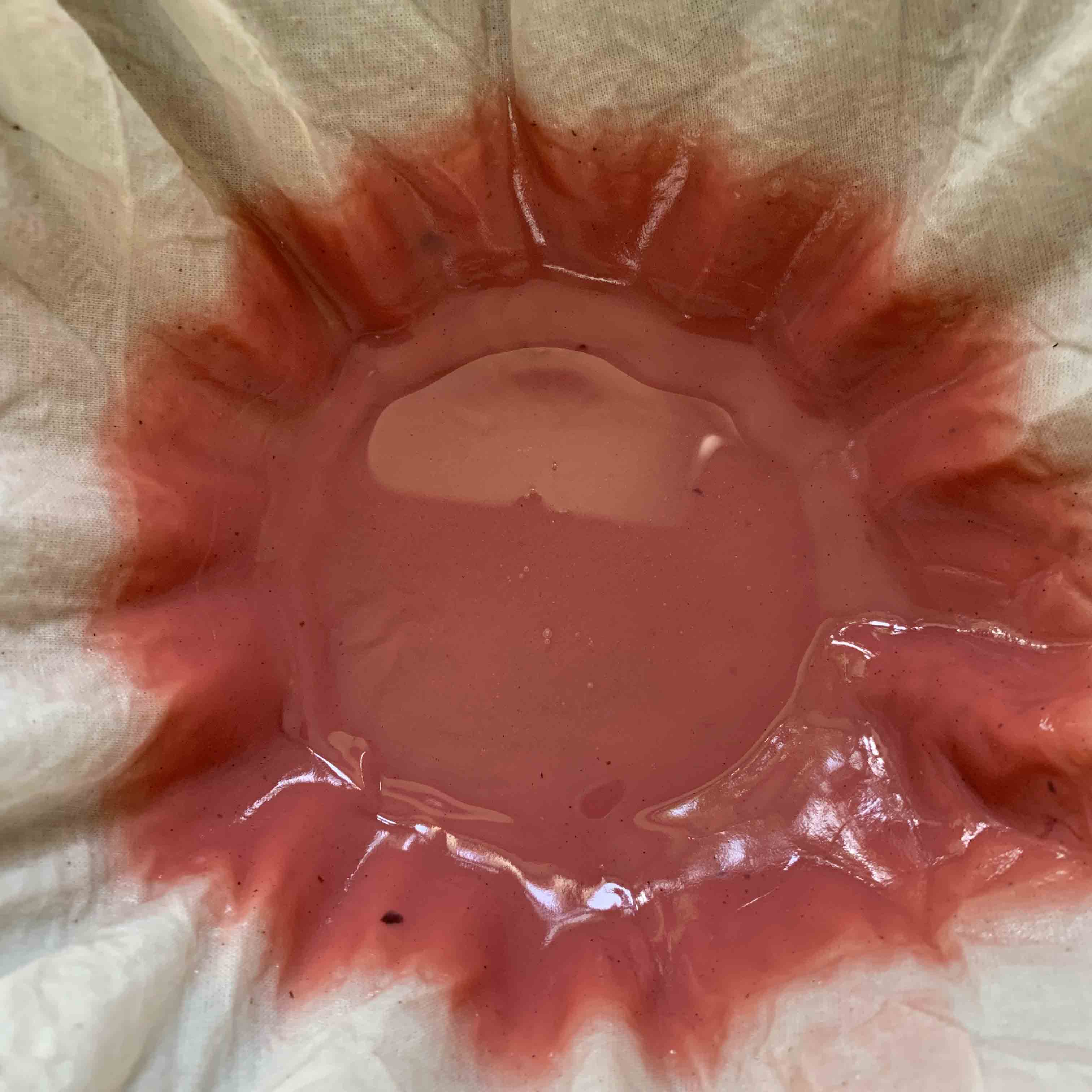
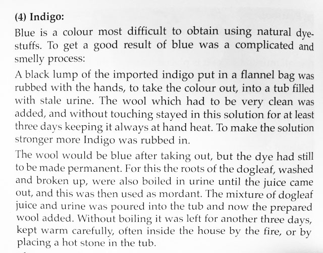
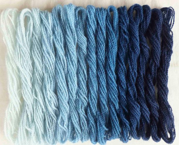
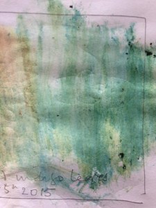
In the early 1990s, Whitworth attended a lecture on indigo given by Jenny Balfour Paul, a leading authority on natural dyes. She was intrigued by the history and culture of indigo, as well as by its unique properties and effects. She decided to explore natural dyes further and began to use them alongside synthetic dyes on her textiles. She also started to grow her own dye plants, such as woad, madder and weld.

Whitworth became particularly interested in orchil, a purple dye obtained from lichens. In 2008, she discovered an industrial archive in her small Devon town that contained documents and samples related to the orchil trade in the 19th century. She realised that this was a rare and valuable source of information that had been largely overlooked by historians and scholars. She embarked on a research project to investigate the history and practice of orchil dyeing, as well as its scientific and cultural aspects.

Whitworth’s research led her to collaborate with many international experts and institutions working in conservation and science. She published several papers on her findings in journals such as Textile History, The Journal for Weavers, Spinners and Dyers, The Journal of Natural Dyes Research Society (India) and The Journal of Natural Dyes (Korea). She also contributed to some major conservation projects involving orchil-dyed textiles, such as the restoration of the 16th century tapestries at Hardwick Hall (UK) and the analysis of the 14th century cope at Sens Cathedral (France).

Whitworth continues to combine studio work, teaching and research. She produces textiles using both synthetic and natural dyes on silk, often blending them to create subtle shades and contrasts. She also experiments with different fibres, such as wool, cotton and linen. Her work is still influenced by nature, but also by historical sources and contemporary issues. Some of her recent themes include climate change, biodiversity loss and social justice.

Whitworth teaches short courses at West Dean College (UK) and at various venues in the UK. She shares her knowledge and skills with students of all levels and backgrounds. She also gives lectures and demonstrations on natural dyes and resist-dyeing techniques at various events and organisations.

Whitworth is an elected member of the Devon Guild of Craftsmen (UK), where she exhibits her work regularly. She has also shown her work at other galleries and museums in the UK and abroad, such as the Fashion Museum (Bath), the Royal Albert Memorial Museum (Exeter), the Museum of East Asian Art (Bath), the National Museum of Korea (Seoul) and the International Shibori Symposium (Japan).

Whitworth is a textile artist who has made a significant contribution to the field of natural dyes and resist-dyeing techniques. She has created original and beautiful textiles that reflect her artistic vision and values. She has also conducted rigorous research that has enhanced the understanding and appreciation of natural dye history and practice. She is an inspiring teacher who has shared her expertise with many students and audiences. She is a respected member of the textile community who has collaborated with many professionals across disciplines.

Isabella Whitworth is an example of a textile artist who has combined creativity, curiosity
and commitment throughout her career.

Source: Conversation with Bing, 30/05/2023
(1) Isabella Whitworth – The Loom Shed. https://theloomshed.com/meet-the-team/isabella-whitworth/.
(2) Our Makers | Isabella Whitworth — MAKE Southwest. https://makesouthwest.org.uk/textiles/isabella-whitworth.
(3) Isabella Whitworth – West Dean College of Arts and Conservation. https://www.westdean.org.uk/study/tutors/isabella-whitworth.


2 Comments

RHS Rosemoor: Course in Natural Dyes

Green leaves of Japanese indigo are shown in top of a pink, white and purple silk scarf with a stylised floral motif. There are small seed-like grains on the right which are cochineal
Top left: wax resist scarf dyed in indigo and cochineal; leaves of Persicaria tinctoria and cochineal grains. Underneath left: fringed wool scarf dyed a deep purple in cochineal and indigo

Teaching has so long been off my radar I can’t quite believe that my first course for 18 months is rapidly approaching. I will be at RHS Rosemoor in North Devon on 25th and 26th September for a hands-on introduction to using natural dyes. With a bit of luck students will end up as bonkers as I am about natural colour and its ancient history – and will leave with a great set of dyed samples and a beautiful, individually-dyed scarf.

For overseas readers, RHS stands for the Royal Horticultural Society. The RHS is the UK’s leading gardening charity and owns five beautiful gardens across the country. RHS Rosemoor is one of them and it’s just up the road from me. I have visited it countless times since I moved to Devon nearly twenty years ago. On my visits I often noticed some of the plants that yield dye colour and thought it would be a wonderfully appropriate place to run a course.

In 2019 I contacted the Education and Learning Manager and found her to be very receptive to the idea. The Manager was the late Sarah Chesters, a bright, funny and delightful gardening expert who was also very knowledgeable about textiles and fibre. She was engagingly interested in all I told her about natural dyeing and came to my house on a memorable day when I was working with Jenny Balfour Paul: we showed her how my indigo crop was processed, shared lunch, and we all laughed a lot.

So I was very saddened to hear that Sarah died earlier this year, and I will actively remember her warmth and humour when I am teaching at Rosemoor.

Booking through RHS Rosemoor here


9 Comments

Mulberry silk

I have been trying to find a more satisfying source of silk than commercial, sparkling white, smooth and ‘perfect’ cloth imported from China. Since last autumn I have been working on mulberry silk, a handwoven ‘heritage’ cloth from India whose export and sale is supporting handweavers in West Bengal. Its natural colour is a pale creamy yellow. Slubs and weave imperfections in the shawls I have chosen are part of their intrinsic beauty.

I mordant the scarves in alum and cream of tartar (unless I’m only dyeing with indigo) and I either dye a pale base or start from the natural silk colour. The wax and dye is worked in layers, with each layer and colour building up a pattern as I block areas out with wax. The designs are loosely based on forms of virus – which are helpful and unhelpful to the human race – and frequently look very pretty through a microscope.

A madder-dyed shawl will be exhibited in the Spring Show at the Devon Guild of Craftsmen, which starts on 29th May

Despite the technique being slow and methodical it isn’t without hazards, mostly due to my senior lapses in concentration. I have overheated the dye vessel (the wax melted); I’ve placed a pattern motif in the wrong place, and I’ve left a small piece of masking tape on the cloth, which efficiently resisted the indigo and left a mark. Because the shawls are expensive I feel very upset when I mess one of them up, but minor wobbles or mistakes reflect the handwoven beauty of the scarves themselves, so I try to be philosophical about it. The cloth is full of slubs, and often shows an uneven density of warp threads which affect the dye take-up. More fibre takes up more dye, so the cloth can have variations in colour. They are utterly fiendish to photograph as they are very lustrous and the colour appears to change all the time.

Shawl below dyed in walnut leaf and indigo

Details of the forthcoming Spring Show at the Devon Guild of Craftsmen here


5 Comments

New book: dye lakes and recipes

Since I started teaching natural dyes at West Dean College, I have had a problem. How could I save, transport and use litres of expensive dye not fully exhausted on the course? I travel with two large beer-making flagons containing indigo, but transporting additional containers of weld, madder and cochineal isn’t feasible – and I hate waste.

For some years I have been working with my friend and colleague Yuli Sømme, who commissions me to dye different shades of wool felt for her company Bellacouche, in Moretonhampstead (see link below). If I have pieces of mordanted and wetted-out felt ready, I can dunk it into the vats on the final night at the College, and by the next morning much of the used dye is exhausted and the felts dyed. I can rinse out the felts and take them home in empty buckets. The exhausted dye can be discarded.

But if students need the vats on the final day, or I am travelling home the day I finish teaching, I don’t have the option of using Yuli’s felt and the leftover dyes.

The Art and Science of Natural Dyes: by Catharine Ellis and Joy Boutrop

A newly-published book by Catharine Ellis and Joy Boutrop has encouraged me to experiment with making lake pigments from the leftover dyes at West Dean. Their suggested process greatly reduces the volume to be transported and involves binding the leftover dye to the alum mordant, thus turning it into a concentrated lake pigment. The pigment is precipitated using alum and soda ash and sinks to the bottom of the vessel, leaving the water on the surface, which can be poured off.

Madderlake2

Making a madder lake. You can see the dye beginning to precipitate and separate from the water

The resulting substance is strained through cloth and when this process is complete, a gooey, paste-y mixture like thick custard remains.

filtering

Straining the madder pigment through a cloth

By reversing the chemical process at home, again using the instructions in the book,  I can dye pieces of wetted-out felted wool – which do not require a mordant.

It is typical of this book, which in its entirety covers a very wide range of natural dye processes, that methods are well-explained, options or alternatives outlined, and reasons given for certain instructions. Recipes are clear and easy to follow and I would have greatly valued the book in my library when I started natural dyeing because of its comprehensive treatment of the subject and a thoroughly researched, straightforward approach. I will write more in future posts because I am still learning so much from the work of these two authors.

Since my West Dean course last month I have made pigments from madder and weld lakes, and tried mixing them with indigo and earth pigments.

pigments

Madder and weld pigments (pink and yellow) and overpaints of earth pigments sienna and ochre (rusts and red-brown) from Roussillon in France. Painted on soya-sized cotton

Links

The Art and Science of Natural Dyes: Principles, Experiments and Results

At time of writing, this book isn’t readily available in the UK. Check this link on the Blackwell’s site to see if it is in stock.

Bellacouche

Yuli Sømme’s company in Moretonhampstead, Devon

West Dean College Short Courses

My next natural dye course at West Dean is March 27 – 29th 2020.


Leave a comment

Dyeing Reds in Amsterdam

safflower_edited-1

Safflower petals before washing

I recently took part in a two-day workshop in Amsterdam, dyeing historical reds on silk at the Rijksmuseum’s Department of Conservation and Restoration. The event was organised by the Cultural Heritage Agency of the Netherlands. Selection for the workshop was by application, and the organisers chose eight international participants known for the variety and extent of their expertise in natural dyeing, and / or their interests in historical dye recipes.

A range of 26 samples was produced using American cochineal, kermes, annatto, brazilwood, madder, safflower and lac. Participants worked in pairs dyeing different sets of dyes: my partner was Paula Hohti of Aalto University, Helsinki, where she is Assistant Professor of History of Art and Culture. We dyed three recipes in total: one for lac and two for safflower. Demineralised water was used throughout.

Lac Our lac recipe was adapted from Edelstein’s translation of the 1548 edition of The Plictho of Gioanventura Rosetti. We prepared and used an alum mordant on Day 1, in which the silk rested overnight. The stick lac we were to use had been extracted over the previous three days. On Day 2 we sieved the lac solution and heated it, adding 25% (to weight of dry fabric) cream of tartar. It was dyed for an hour.

lac

Lac-dyed silk being lifted from the beaker to check for colour. On the right is the beaker containing yellow safflower dye and silk

Safflower We dyed two versions of safflower: yellow and red. Our recipes were adapted from various sources, including Macquer’s Art de la Teinture en Soie. To obtain yellow, safflower florets were washed once and drained, and then soaked again for 30 minutes. After sieving, the resulting extract was used to dye unmordanted silk.

safflower

First washing-out of the safflower florets for yellow dyeing

To obtain red, safflower florets were pre-washed for two weeks to remove all traces of the yellow extract – this process had been completed in advance of the workshop.  We undertook a further sequence of washings until the yellow stopped running and the water was clear. The water was sieved out. Potash was added to obtain pH 10, and the florets squeezed by hand until they appeared pink and transparent and the liquor looked pinky red. This took about half an hour to achieve.

After sieving into a new beaker, unmordanted silk was added and the pH checked (it was around 7). We then added fermented beer (bierken) little by little, continually monitoring pH, until the pH dropped to a crucial pH 5. This threshold pH has a term ‘virer le bain‘ or ‘turn the bath’. We were required not to allow the pH to drop lower or it would damage the silk. The silk then rested in the dye for 10 minutes after which it was washed in Marseilles soap, and water.

Both safflower baths produced strong colours, with the pink having an especially bright ‘pop’. The colour is very light fugitive.

3dyes

Safflower red (left), lac (centre) safflower yellow (right

Everyone, including the three organisers, gave short presentations on their work and research interests. I showed some samples of my orchil dyeing as well as a few pieces of my studio work in natural dyes. Many participants were involved in education, some of us were artists and dyers, others were textile researchers or art historians. These absorbing presentations illustrated what a privilege it was to attend the workshop.

The results of the workshop were recently published at the Spring Symposium of the Textiel Commissie.

assort

Participants were able to take away a sample of each recipe dyed: a total of 26 samples

Participants took home a complete set of all the silks dyed. The organisers also retained a set, which will be catalogued and stored as historical reproductions on reference sheets, together with supporting information on the recipes and preparations. The sheets will eventually be published online through the Cultural Heritage Agency (RCE) website, for the benefit of other researchers.


Thanks With many thanks to organisers Drs. Ana Serrano, Jenny Boulboullé and Art Proaño Gaibor; to the Cultural Heritage Agency of the Netherlands; the Ateliergebouw of the Rijksmuseum; and to all fellow participants at the workshop for their unique and specialist contributions.


Links

Rijksmuseum Conservation and Research

Cultural Heritage Agency of the Netherlands

Textiel Commissie

Paula Hohti has recently been awarded a European Research Council grant for a five year project Re-fashioning the Renaissance: Popular Groups, Fashion and the Material and Cultural Significance of Clothing in Europe 1550 – 1650


7 Comments

A Harris Way of Life

Last month I took a ferry to the Western Isles. There is much to say about the wild, bleak beauty of the islands, and their resilient inhabitants, but this is about Harris Tweed and natural dyes.

crotalspoon

Crotal used to scrape lichen from rocks. Marion Campbell collection, Harris Tweed Knitwear at Drinishader

A well-timed tweet from @HTAarchive advised me not to miss a display at the old Drinishader schoolhouse, on Harris. This relates to the life and work of Marion (Morag) Campbell (1909 – 1996) who once lived nearby and had attended the school as a child.

Marion was visited by a Washington Post journalist in the 1990s, telling him, ‘I’m the last person doing it the really old way — dyeing my own fleeces, carding, making my own yarn, weaving — I even do my own ‘waulking’ to clean the tweed and shrink it a bit. That takes a lot of stamping about in Wellington boots!’

scraping crotal

Marion Campbell scraping crotal lichen, probably Parmelia omphalodes or P. saxatilis. Rephotographed at Drinishader. Regret no photo credit available

In a stylish, purpose-built centre behind the school is a contemporary Harris Tweed exhibition called Clo Mhor (The Big Cloth). It is beautifully designed and presented, contains up-to-date examples of catwalk fashion and high quality local design using Harris Tweed.  The Marion Campbell collection, housed off the shop in the schoolhouse itself, could not appear more different. It comprises a number of woven samples, lengths of tweed, photographs, newspaper articles and other items associated with Marion’s long and active life, all assembled in a cramped, higgledy-piggledy fashion and often a bit dusty. It took a little time to absorb, but was rewardingly full of treasures. I found the crotal spoon Marion used to scrape lichen from the rocks, a waulking board, her loom, and dyed but unspun fleece. Marion used only natural dyes in her work, such as peat soot, crotal from various types of lichen, mugwort, logwood and indigo.

Drinishader schoolhouse is well worth a visit and its location on the Golden Road is exceptionally beautiful.

From the Drinishader shop, I bought a copy of Gisela Vogler’s biography of Marion Campbell, first published in 2002. It’s called A Harris Way of Life. A recipe for indigo dyeing puzzled me as it does not appear to explain familiar processes common to all usage of indigo:

indigorecipe

From ‘A Harris Way of Life’ by Gisela Vogler, first published 2002 by Harris Voluntary Service, West Tarbert, reprinted 2006

The description gives no clues as to where and when reduction (removal of oxygen) takes place although the use of stale urine clarifies that the vat will be alkaline. The statement about mordant is curious (because indigo doesn’t need one), as is the phrase ‘making the dye permanent’, and the specific reference to ‘dogleaf’. Dock is sometimes referred to as dogleaf, and is from the Rumex family.

An interesting exchange between various contacts on Twitter took place when I aired the finding on Twitter, and came up with a revelation for which I thank Anna NicGuaire, (or @A_M_Q on Twitter). In Jean Fraser’s book Traditional Scottish Dyes a similar description is included in an indigo recipe from South Uist. It gives sorrel as the ‘mordant’ ‘to make the colour adhere to the wool’.  (Sorrel is Rumex acetosa).

I later found a similar reference in Ethel Mairet’s 1916 book on vegetable dyes, where she states, ‘Some add a decoction of dock roots the last day, which is said to fix the blue. The wool must then be thoroughly washed.’

The function of sorrel or dock is far from clear in any of the three instances, but it will not be acting as a mordant in the standard sense. Dock does appear in several dye publications I have consulted, but as a colourant.

I have great respect for traditional recipes and expect there to be a reason for the sorrel or dock stages as described. I’d be very interested in anyone’s views.

Links 

Marion Campbell, BEM

Video of Marion Campbell weaving

David Yeadon’s 1990 account of a visit to Marion Campbell for the Washington Post  

Clo Mhor exhibition at Harris Tweed and Knitwear

Thanks

Special thanks to the Twitter community including @HTAarchive, @A_M_Q, @Freyalyn, @ripplescrafts, @TorranIslay, @squeejay


13 Comments

Getting to Blue

In my last blog A Purple Pursuit, I wrote about Browning’s Popularity, in which he referred to shellfish dye in a complex poem on inspiration, skill and genius. What I didn’t say, but others wisely pointed out, was the oddity of Browning referring to the dye as blue throughout the poem. Shellfish dye (from the ‘Tyrian shells’) is quite definitely purple and the colour, history and source of Imperial Purple were well known in Browning’s time. So, why blue?

Who has not heard how Tyrian shells
Enclosed the blue, that dye of dyes

Whereof one drop worked miracles,
And coloured like Astarte’s eyes
Raw silk the merchant sells?

I scratched around many sources but failed to find a historical reference, or image, defining Astarte’s eyes as blue. Maybe I have missed something. But the Resident Poetry Advisor says that Browning was more than capable of implying non-existent references, or even inventing them. This seems most perverse, but Browning was a poet and that’s the kind of thing poets do.

indigo

Author’s indigo-dyed wool yarn, using increasing vat strength

Putting Browning firmly aside, I happened across a reference to William Gladstone’s Studies on Homer and the Homeric Age. Gladstone (1809 – 1908) was a British Liberal politician, three times Prime Minister, living at a time when politicians digested more than soundbites.

Gladstone studied the Iliad page by page, and as he did so he recorded the occurrence of words for colour. What he noticed was rather remarkable. He came across much mention of black, some white, less red, very little yellow, tiny amounts of green…but no blue. Was Homer ‘colourblind’, or unable to perceive colours? Were all Greeks the same, and their perception of colours (and the words to describe them) inherited, building over several generations? It left me wondering whether Astarte’s eyes could have been blue if there wasn’t yet a word for it, which was a head-spinning prospect.

Lazarus Geiger (1829-1870), a philosopher and philologist, took Gladstone’s research further and studied other ancient texts (for instance, Icelandic sagas, Vedic literature, and the original Hebrew version of the Bible) finding that none of them contained a word for blue. Geiger concluded that across ancient cultures, words for colour developed in an oddly consistent order. Black was always first, followed by white, red, yellow, green. Blue came next, eventually.

If this intrigues you, I suggest you listen to the Radiolab broadcast linked below. It makes more sense of it than I can here, but still left me wondering what exactly was being said. One of the programme’s guests is linguist Guy Deutscher. Listen, particularly, to the account of his little daughter trying to name the colour of the sky.

buddhist_edited-1

Author’s watercolour from sketchbook, 1995, recording the many dyed colours and fading shades of Buddhist monks’ robes in Sikkim and North India

My head can’t get itself round the concept that without an object to attach it to, a colour didn’t ‘exist’ and didn’t acquire a name. But that’s partly what is being said and it leads me to dyeing, and the need to name colours. I was dyeing felt last week, trying to achieve a good range of reds. I used different amounts of mordant, varied the percentages of weld, cochineal and madder and overdyed in different sequences. Small variations occurred in the reds and I sought to describe these to a client in words. Colours need adjectives like ‘bright’, ‘dark’, ‘dull’ etc but one inevitably ends up with a comparison to a universally understood coloured object, such as a poppy, a pillarbox, a brick, a patch of rust, a rose. We take this for granted but it’s very sophisticated, relying on a well-established set of understandings. We often need an object when we describe colour.

In her book Tintes y Tintoreros de América, Ana Roquero records the many changes that took place in Central and South American textile practice during the Spanish colonial period. One of the imports from Spain to the New World was an entire vocabulary for textiles. As well as words for machinery, tools, technical terms and cloth and fabric, this included words for colour. These colour words are still alive in parts of Latin America amongst mestizo weavers and dyers, when their use in today’s Spain is long lost.

In this case it’s the itinerant word that has preserved the colour, and I find that fascinating.


Links

Radiolab broadcast ‘Why Isn’t the Sky Blue’ here

The Himba and the perception of colour Anthropology and the Human Condition: here

Books:

Roquero, Ana, 2006, Tintes y tintoreros de América: catálogo de materias primas y registro etnográfico de México, Centro América, Andes Centrales y Selva Amazónica, Ministerio de Cultura, España

Deutscher, Guy, 2010, Through the Language Glass, Heinemann

Comments

Please also check out the very interesting links offered in comments for this page. Many thanks to those who have written and included them


8 Comments

A Purple Pursuit

Orchil: For a few years I have been researching a (mostly) nineteenth century archive relating to a Leeds dye manufacturer. The early fortune and later success of this Leeds company were built on the manufacturers’ skill in the making of a dye called orchil. Orchil is an ancient dye, made from lichens of several varieties, and it dyes silk and wool various shades of purple. It does not need a mordant, a fact that was valuable to the historical dyer as it omitted the expense in the mordant process, and additionally avoided any harshening which mordanting can impose on silk. Purple could normally be achieved with natural dyes only with overdyes, such as indigo over cochineal, but orchil ‘got there in one’.

In its clearest and most beautiful form, orchil dye will give a glorious fuchsia colour and the clarity of this shade is assisted by the purity of the ammonia in which dyestuff is prepared. Historically, orchil was known to impart a freshness and bloom in ‘bottoming’ other dyes – e.g. when used as a base before overdyeing. Orchil was a much used and valuable dye throughout history, although its use is sometimes an enigma. It is often found in costly tapestries, which is surprising as orchil is not at all lightfast – a fact that was well-known.

With the advent of synthetic dyes in the later nineteenth century the use of orchil began to decline. Records in the Leeds archive indicate that large sums of money were still tied up in stocks of lichen in the 1870s and in trying to comprehend the place of orchil in the nineteenth century I found the archive inextricably linked to the history of the colour purple. We will publish in due course but an extract from the abstract of my co-authored paper with Professor Zvi Koren at DHA 32 offers a clue:

One of the more astounding discoveries associated with this archive was that it included a small envelope signed by Charles Samuel Bedford declaring the content of the packet to be ‘Tyrian Purple’. But what was really inside the envelope? Was it truly Tyrian Purple…?

Shellfish dyes: Much has been written on the history of the shellfish dye Tyrian Purple (Imperial Purple, The Purple of the Ancients, murex etc) and its association with wealth and status. There is a lot of utter rubbish online about Tyrian Purple, so beware if you are researching and look for reliable sources, such as those listed in Chris Cooksey’s Tyrian Purple Bibliography, linked below.

Nucella lapillus shells, Somerset

Nucella lapillus shells, Somerset

For the purposes of this particular post, it’s important to realise that long after the method of shellfish dyeing* was lost, probably around the fifteenth century, the reputation of purple as a high status colour lived on. Purple retained a kind of status independent of its original connections to shellfish dyes. There are contemporaneous references to shellfish dyeing (e.g. in Vitruvius, and Pliny the Elder in his Natural History) and something has always been known of the preparation process, although modern interpretations of commentaries vary.

Since the mid nineteenth century chemists, scholars and dyers have researched shellfish dyes and the ancient dye process has been patiently and painstakingly rediscovered. Shellfish dyeing can again be undertaken although it is only seriously done for research purposes: you will see how small some shells can be from the image and only the tiny hypobranchial gland yields dye. In the mid nineteenth century, no-one knew the full process, which is why I found Robert Browning’s poem Popularity (1850s) so interesting when I came across it this week.  Crucially within it is a several-verse reference to Tyrian Purple and shellfish dye. As I couldn’t fathom what the whole poem was about, this reference was a puzzle. I sought out the RPA (Resident Poetry Advisor) who explained it to me, along with some literary context which includes Browning’s life and work, a knowledge of Keats and the poets that imitated him. Popularity is dense and complicated.

Popularity: As I now understand it, and in simple terms, the poem is about inspiration and skill. Browning asks himself about genius, as he did when studying, say, the paintings of Old Masters.  What is genius? Where does it come from? When some ‘poets’ recognised genius in others, as in the work of Keats, they picked up superficial, outward facets of the verse and imitated them. They basked in their hollow cleverness. Browning describes the humbleness of the shells, or conches (‘Mere conchs!’) and celebrates the ‘cunning’ of those who learned how to refine this costliest ‘dye of dyes‘. What’s the humble origin of Keats’ unique genius, he wonders wittily in his last line:

What porridge had John Keats?

Contemporary knowledge in the 1850s

Considering the knowledge that Browning appears to have of dye preparation:

Till cunning come to pound and squeeze
And clarify,—refine to proof
The liquor filtered by degrees

it could be that he knew a little more about the process than was available through classic texts. Henri de Lucaze Duthiers was working on shellfish dyes in the 1850s, but not for dyeing. He was demonstrating the potential to use the molluscs for a photographic printing process. I don’t see enough evidence to draw any conclusions about what Browning knew, but it’s been fun speculating, and a reminder of the magic we dyers experience liberating colour from simple, natural materials.

To read the whole poem Popularity, you can go here, but two key verses are below.

VI.

Who has not heard how Tyrian shells
Enclosed the blue, that dye of dyes
Whereof one drop worked miracles,
And coloured like Astarte’s eyes
Raw silk the merchant sells?

XI.

Mere conchs! not fit for warp or woof!
Till cunning come to pound and squeeze
And clarify,—refine to proof
The liquor filtered by degrees,
While the world stands aloof.


NOTE: *Dyeing, as opposed to smearing. Traditional use of shellfish to colour threads and cloth, such as in Oaxaca, Mexico, is not true vat dyeing, but more akin to  surface smearing.


Links about my research, on this blog

Overview  Dyes, History and a chilly trip to Yorkshire

About orchil: Talking Orchil

My research information: Historical Dye studies


Bibliography

Cooksey, Chris (2013) Tyrian Purple: the first four thousand years, Science Progress, 96(2), p 171 – 186

Jordan, Maria (2012) Recreating the life of a tapestry: Fading dyes and the impact on the tapestry image available online from The Institute of Conservation here

Chris Cooksey’s Tyrian Purple Bibliography

Wikipedia on Tyrian Purple


Thanks

With thanks to Dr Maurizio Aceto for some input on dates, Nigel Phillips for giving me the Nucella lapillus shells in Somerset last summer, and especially to the RPA.


2 Comments

Year Ending

How long have I been dyeing? Not as long as I have been rubbish at maths. A recent experience, when I messed up percentage calculations of mordant, has reminded me how useful it is to keep records. (If you aren’t a dyer, these percentages refer to the mordant weight required against the fibre/fabric weight to be dyed).

My end-of-year project has been to test my Rubia cordifolia, or Indian Madder. I ordered it in the summer from KMA Exports of Tamil Nadu, but haven’t yet had time to use it. A week or so ago I mordanted two Merino wool scarves, calculating the mordant at  8% alum + 5% cream of tartar. Only it wasn’t: my notebook later confirmed I had mordanted at about 1% each. Results on the first set of dyeings were disappointing (it was a surprisingly good red, considering inadequate mordant, but certainly not eye-popping) so I checked out my notes and revealed the serious mistake.

At this dark end of the year I was hoping to dye the cheery Meltdown Orange achieved with Indian Madder on the Carmarthen Association Summer School Workshop, run by Deb Bamford, in 2013. In trying to convey Meltdown Orange on this blog, I hit a regular problem. Colour inaccuracies accrue between camera, screens and editing programmes. Obviously, colour portrayed via a screen isn’t going to look the same as the actual item, but my phone and camera come up with strange slants on reality which I often have to rectify when trying to pin down a ‘true’ colour. It can be vital if I’m working with a researcher or conservator, or a client who needs to know the exact colour of a scarf they propose to buy.

There are three images below. In the image of wool dyed with Rubia cordifolia from Carmarthen (image 1), the colour on my screen is as near as possible to the original yarn I hold up against it. That’s because I fiddled with the settings. I have no idea what you will see.

I had a nerdy idea. With the MyPANTONE app on my phone, I used a photo of the dyed yarn to see how MyPANTONE could analyse the colour range. Image 2 is a screenshot from MyPANTONE. By the time the image has cybered from the yarn to the phone to MyPANTONE to email to an editing programme to WordPress and the screen I see here, it seems that the image had shifted to something stronger and sharper. On the app itself, I had selected what I thought were three typical ‘hues’.  This is done in the same way as an ‘eyedropper’ is used to select colour on an editing programme. The colours I chose were Warm Red C, Pantone 179 C, and Pantone 171 C. They are shown at the bottom of the screenshot (image 2) and seemed a reasonable representation of Meltdown Orange seen through my own, and MyPANTONE’s, eyes.

From a former life in the graphics industry I retain a printed Pantone set of colours. I checked the MyPANTONE colours against my printed set and compared the yarn to each printed colour. Warm Red was ‘too red’, Pantone 179 was brownish and Pantone 171 too weak. But Pantone 172, one shift away from 171, was an accurate representation. This is shown in image 3.

I am not sure what any of that proves, except that colour is a tricky old business.

Silks and wool dyed with various strengths of Indian Madder (and correct mordant)

Silks and wool dyed with various strengths of Indian Madder (and correct mordant)

Reverting to the dyepot story, I repeated the dyeing with correct percentages of mordant and was rewarded by much sharper and more intense orange-reds, on silk and wool. As well as recording the mordant I kept notes on the percentage of dyestuff needed to achieve deep shades on the scarves and found it to be higher than expected – at about 20%. That’s one fifth of a weight, I shall remind myself. I’ll try to do the calculations better next time.

Links: My blog about buying Rubia cordifolia here.

KMA Exports

Deb Bamford (The Mulberry Dyer)

MyPANTONE (for iPhone)

MyPANTONE (for Android)

Pantone UK


2 Comments

Harvesting Japanese indigo

photo

Blue stains which developed after rubbing Japanese indigo leaves onto paper

I planted out my Japanese indigo (Persicaria tinctoria) several weeks ago, having grown it all from seed. This week I picked some leaves and rubbed them on the page of my sketchbook to see if any blue appeared. It did (ignore the buff coloured stain to the left of the image, which is nothing to do with it). From this I knew that I could make a vat from the crop.

I began by picking half a bucketful and testing it as a small vat. I achieved a very good blue, which was used to overdue some cochineal-dyed scarves I had shibori-tied ready and waiting. You can see the result in the gallery below.

On the second vat I used a whole bucketful of leaves, rammed down hard. I just pick the tips, like tea: not the whole stalk. I sometimes weigh the leaves before processing but the material was wet after rain and there didn’t seem much point. I don’t always strip the leaves from stalks either, so a known dry weight is somewhat academic because the stalks don’t, as far as I know, produce any colouring matter.

On the day I dyed the second bucket I live-tweeted the various stages with images and received a good response. I think more and more people are trying to grow, and dye with, their own indigo.

With colleague Christina Chisholm I co-authored a piece on growing and using Japanese indigo for the Journal for Weavers, Spinners and Dyers in 2011. It was a free download and you can still access it here so I don’t have to write it all out again. We included some information on growing the plant in two distinct climates (Devon and north east Scotland). Christina has much more experience with dyeing wool, so fibre dyers might find her comments useful. If I were to be able to edit the article I’d make a couple of additions / amendments: 

1. I have since found that I don’t always see a blue froth when I whisk up the strained dye bath. Instead, the sherry-coloured liquid darkens and looks greener – but the froth is often colourless. Why? No idea. These days I have stopped using soda crystals and use washing soda instead. Maybe that’s the reason. 

2. I have found that leaves are often ready whether or not they have the red/blue tinge shown in the Journal download document. What I have heard since (but don’t know if it’s true) is that you need to use the leaves before the plant produces flowers.  

3. I try to encourage flowers for seeds each year and there is some urgency about this as in the UK the plants die with the first big frost. I mark a few vigorous stalks early on by tying a conspicuous ribbon round each one. Then I can’t pick them by mistake. I let these stalks develop flowers as early as possible.